

Data Visualization for Conjoint Analysis
While choice-based conjoint analysis represents one of the more sophisticated techniques used in market research, presentation of its results commonly consists only of a simulator, and a few pie or bar charts. This leaves its users with only a limited understanding of the key patterns in the data. In this post I show key data visualizations that can be used to extract insight from conjoint studies: utilities plots, small multiples of histograms, correlation heatmaps, substitution maps, and indifference curves.
Utilities (partworths) plots
Utilities plots are the oldest data visualization developed for conjoint analysis. They first appeared in the work of early leading light Paul Green, who referred to them as plots of part-worth. The plot has a number of nice features. First, it allows us to easily see the relative importance of the different attributes, which is defined as the difference between the utility of the highest and lowest levels of each attribute. Second, it makes it easy to see the relative appeal of different attribute levels.
Back in the 1970s and 1980s, charts like the one above were drawn by hand. However, they have fallen from popularity in the computer age, as the labels tend to obscure each other for studies with more than a few attributes. Today, they are typically drawn as bar charts, like in the example from the home delivery market shown below. Today, the utilities are typically shown as averaging 0 with an average importance of 100 (although it is unclear whether this is actually more advantageous).
Small multiples of histograms
While the utilities plots are a great way of seeing averages, most conjoint studies tend to focus on understanding opportunities relating to differences between consumers utilities. This is not shown on utilities plots. A better visualization is to show histograms of the distributions of utilities for each of the attribute levels, as is shown below. This example, which is from the same data as the earlier chocolate utilities, shows a number of features not evident in the utilities plot. For example, the utilities plot at the beginning of the post showed that Origin and Nuts are approximately equal in terms of average importance. However, the histograms below show that there is substantially more variation in terms of utilities for Nuts. This indicates that Nuts represent a strong opportunity for product ranging – brands should sell chocolates with nuts and without nuts – whereas Origin is more of a way of increasing overall appeal than an opportunity for segmentation.
Keep in mind when viewing histograms like this that the variation in each attribute level is relative to the first level. For example, in the case of Nuts, it shows that there is no variation for Almonds, but this is because Almonds are set at 0 for all people, and the other levels are relative to Almonds. Thus, we can see in the case of Hazelnuts that people differ in their relative preference of Hazelnuts versus Almonds, but on average they prefer Almonds (as most of the distribution for Hazelnuts is to the left of Almonds). It can be useful to rearrange attribute levels (e.g., set No Nuts as the baseline level).
Correlation heatmaps
The histograms above are nice for showing the variation within an attribute, but correlation heatmaps are better for showing correlations between utilities. For example, looking at the top-left section, we can see that utilities for Godiva and Lindt are strongly correlated. Reading down the Godiva column (the second column), we can also see that people who prefer Godiva are less interested in sugar-free and USA-origin chocolate.
Substitution maps
A practical problem with correlation heatmaps is that the attribute level that is fixed at 0 is not correlated with anything (as a variable with no variation cannot have any correlation). A simple hack that seems to solve this problem, but doesn’t, is to scale all the utilities to have a mean of 0 (as done in the bar chart utility plot). You do get correlations when you do this, but the correlations themselves largely reflect the mathematics of the scaling rather than the differences between people. A more principled approach is to use a simulator to change the appeal of a different alternative in such a way as to reveal patterns of substitution. From here, you can create a map like the one below. In this substitution map of the market for home delivered goods:
- The size of each circle indicates the magnetism of the different cuisines. So, all else being equal, people are most likely to switch to Pizza, followed by Chinese.
- The closeness of different cuisines shows the relative degrees of switching between them, assuming equal magnetism. So, Indian is closest to Thai, and Thai is close to both Chinese and Indian.
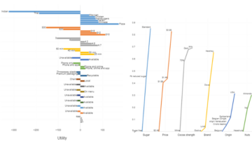
Indifference curves
Indifference curves show the trade-offs between two levels of ordered attributes. In the example below, the indifference curves show how people trade price per diner versus food quality when ordering home delivered food. Tracing the line from the bottom-right corner, which shows a rating of 3/5 for food quality and $10 for the meal, we can see that this has the same level of appeal as a rating of 4/5 at $15, and of a rating of 4.7/5 at $20.
Visualizations like these do a great job at summarizing all the patterns hidden in a simulator, allowing users of conjoint analysis to gain insight into the key ways that preferences in a market vary.
If you’d like to grab a Q demo to see how Q can help you save a heap of time (and errors) on conjoint analysis and so much more, click here!


