The default correspondence analysis charts in Q are two-dimensional scatterplots (scroll down to see an example). However, you can create a three-dimensional plot by writing a small amount of code. This post will demonstrate how!
Get your free Correspondence Analysis eBook!
The data
In this post I use a table of the following Pick Any - Grid.
Correspondence analysis
To create a correspondence analysis plot in Q, follow these steps:
- Create a table. With a grid like this, this is done by creating a SUMMARY table. However, you can also create a crosstab.
- Select Create > Dimension Reduction > Correspondence Analysis of a Table.
- Select the table to be analyzed in the Input table(s) field on the right of the screen.
- Check the Automatic option at the top-right of the screen.
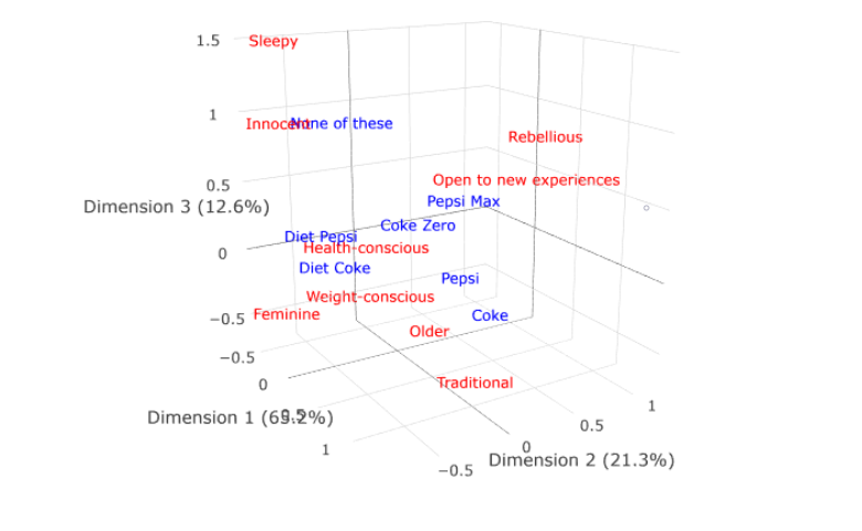
You will end up with a visualization like the one here. Note that this plot explains 65% + 21% = 86% of the variance that can be explained by correspondence analysis. Fourteen percent is not shown. This fourteen percent may contain interesting insights, and one way to see if it does is to plot a three-dimensional labeled scatterplot.
Get your free Correspondence Analysis eBook!
Interactive 3D scatterplot
We now need to write a bit of code - but don't worry! We just need to cut and paste and change a few characters.
- Go to Create > R Output.
- Copy and paste in the code shown after point 4 on this page.
- Replace my.ca with the name of your correspondence analysis. If you right-click on the correspondence analysis in the report tree and select Reference name you will find the name (you can modify the name if you wish).
- Check the Automatic option at the top right of the screen.
rc = my.ca$row.coordinates
cc = my.ca$column.coordinates
library(plotly)
p = plot_ly()
p = add_trace(p, x = rc[,1], y = rc[,2], z = rc[,3],
              mode = 'text', text = rownames(rc),
              textfont = list(color = "red"), showlegend = FALSE)
p = add_trace(p, x = cc[,1], y = cc[,2], z = cc[,3],
              mode = "text", text = rownames(cc),
              textfont = list(color = "blue"), showlegend = FALSE)
p <- config(p, displayModeBar = FALSE)
p <- layout(p, scene = list(xaxis = list(title = colnames(rc)[1]),
           yaxis = list(title = colnames(rc)[2]),
           zaxis = list(title = colnames(rc)[3]),
           aspectmode = "data"),
           margin = list(l = 0, r = 0, b = 0, t = 0))
p$sizingPolicy$browser$padding <- 0
my.3d.plot = p
You will now have a 3D plot like the one below. You can click on it, drag things around, and zoom in and out with the scroll wheel on your mouse.
Explore 3D Correspondence Analysis
Sharing your 3D scatterplot
If you export this visualization to PowerPoint it will just become a picture, and will forget any changes you made. The best way to share this visualization is to export it to Displayr. Sign up is free, and allows you to create and export dashboards to web pages, which can then be shared. Click here to go into a Displayr document which contains the visualizations in this post - click the Export tab in the ribbon to share the dashboard.
See these examples in more detail here, or to learn more, check out our free Correspondence Analysis eBook!