
Q3 2024

Scheduled Reporting
Savvy Displayr users connect their data directly to the source (via API). They can now set the timing for reporting - be it a whole document, a page, or specific calculations, speeding up their documents and controlling who-sees-what and when.
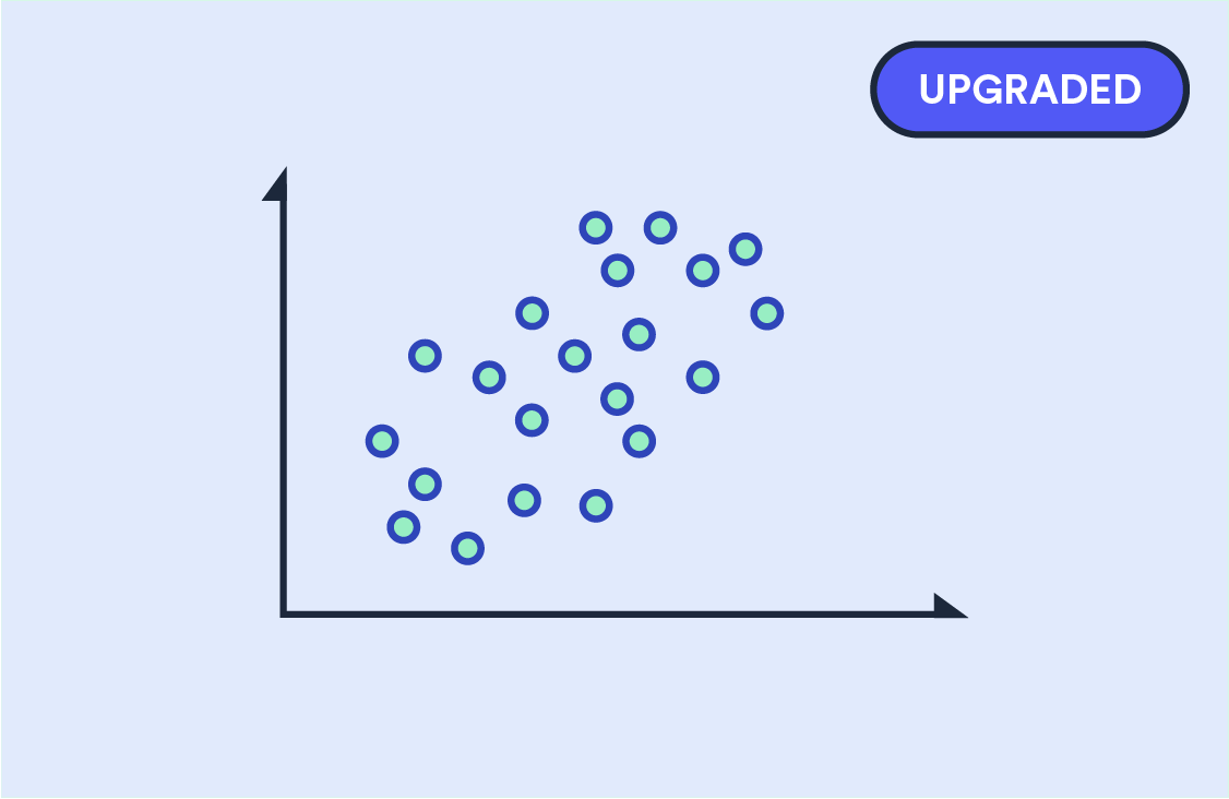
State-of-the-Art Scatterplots
Scatterplot visualizations are in wide use in market research and for good reason - 2 dimensions are invariably better than one. Displayr's library of scatterplots has been ahead of the curve for a long while, being adaptable to many types of data input and making things like adding labels and logos to plot points easy. We've now gone several steps better, automating quadrants (and the ability to shade and label them),making dots and bubble formats easier to control, and more.
Q2 2024

Import tables from Excel Workbooks
You can now import data pre-tabulated in Excel. Once loaded to Displayr, you can format, make calculations and other data manipulations, and create a vast array of visualizations. What's more, if you import those tables again with new data, all your work will automatically update.
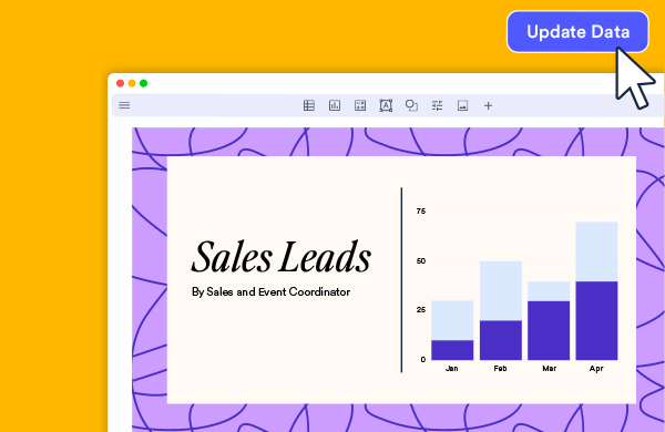
Introducing Data Stories
A standalone app for the general business professional ... import spreadsheets, turn data into bespoke calculations, compelling visualizations, and stories to streamline your reporting. It's like having spreadsheet and presentation software in one
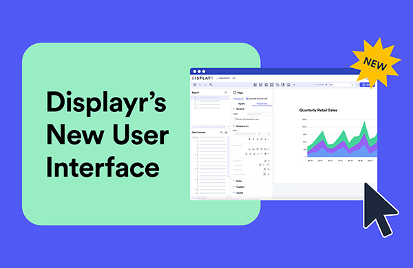
New user interface!
Displayr's updated interface is here! Along with its fresh, bright and modern look, this update introduces a range of enhancements to improve your experience and efficiency in Displayr. This includes an enhanced navigation, a cleaner and more intuitive toolbar, and an optimized work area.

Comments please
Being cloud based, Displayr is already well set up for collaboration. Teamwork can now be taken to a new level with the addition of the Comments panel. Toggle it on anytime and share notes about a page with your colleagues (or even your future self!). It's super-easy to use, just find the icon button at the top-right corner of the screen.
Q1 2024
Excel export updating
To parallel our popular PowerPoint document updating functionality, users can now update any tables in Excel that have previously been exported from Displayr. Any charts or ad hoc calculations present in the spreadsheets will be retained. Any new tables are appended to the report.

Introducing Displayr AI
Rather than releasing a few AI "bells and whistles" we are working hard at Displayr to provide practical, time saving (and safe) AI solutions to pain points in the data setup, analysis and reporting processes. Our first two AI cabs off the rank: automatic creating of categories for text analysis and smart labelling of variables and variables sets on data import.
Q4 2023

Unicom integration
Unicom has been added to the suite of tools supported for direct data integration, which can save a lot of time and effort when it comes to data updating.
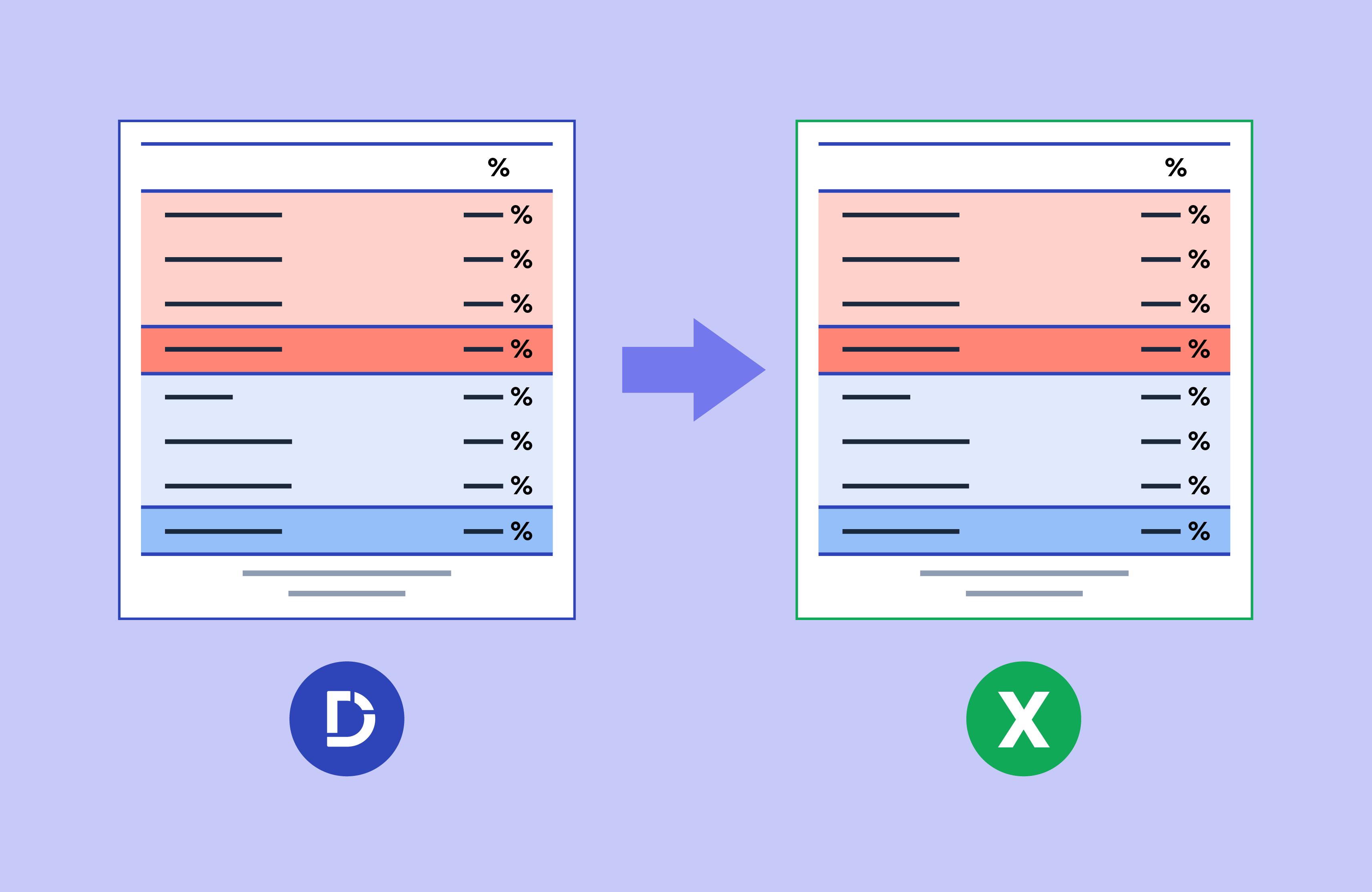
WYSIWYG Excel exports
Hot-on-the-heels of our Q3 release of Excel-like formatting of tables, formats are now reflected in Excel once exported, what you see is what you get.
Q3 2023

Excel-like formatting of Tables
By popular demand – Add borders, customize shading and adjust styling to entire tables or selected cells; just like in Excel.
Q2 2023

Calculation grids
This new feature allows for the creation of tables that can be a mix of text, values, or calculations. It is also now possible to create a table that draws in data from multiple other tables throughout a Displayr document.
Q1 2023

Automatically translate when categorizing text!
Translate and categorize text data in the same workflow with the push of a button! Researchers who conduct surveys in languages other then their own and collect text data now have the convenience of being able to translate and categorize all in one spot. This saves a lot of time compared to using other translation apps (like Google) or doing the translations elsewhere in Displayr.
Q4 2022

Faster Categorization of Text Data
Displayr's "Semi-Automatic" text categorization creates a draft code frame and assigns responses for you up front - you just need to fine tune the code frame and it's ready to go. Text categorization algorithms also significantly upgraded, including those for multiple response code frames and spontaneous brand awareness questions.
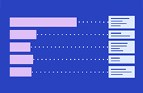
Bar Charts with Automatic Highlights
No more manually adding labels or call-outs to a classic bar chart and typing in interesting results. With Displayr's 'Bar with Skews' visualization you can automatically show significant results. And if the data changes, the highlights do too. Show in one chart what would normally take many.
Q3 2022

Google Analytics Tracking
If you publish Displayr dashboards to large or engaged audiences, see how they interact with them, so you can improve over time
Q2 2022
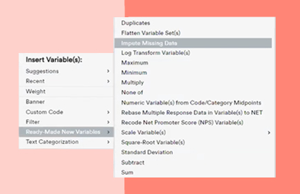
Data Imputation
Got a data set with some survey error or poor quality controls? No problem - Displayr has algorithms to estimate and replace missing data to get you through
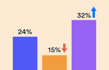
Show significance highlights on a wider range of visualizations
Significance highlights can now be easily added to R versions of Bar, Column, Line and Radar visualizations. Just select the visualization and look for the “Significance” settings in Properties > APPEARANCE.
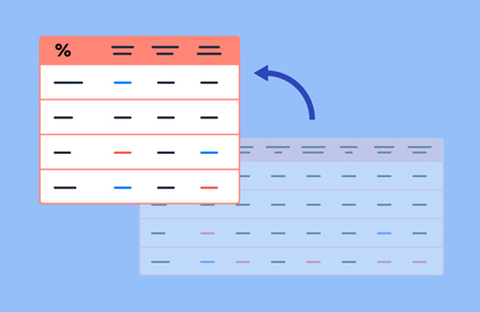
Automatically transform variables
Save time and sharpen your data - Displayr can instantly transform numeric variables into categories, convert geographic variables into logical groups, and simplify variables based on patterns in data.
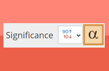
Custom or planned significance tests
Go beyond Displayr's automated significance highlighting and test specific hypotheses or results contained within a table - simply select the desired cells and hit the "Alpha" button in the Object Inspector. Displayr will apply the appropriate test for your data and interpret the results for you!
Q1 2022
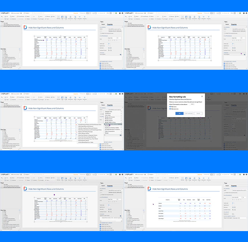
Automatically hide non-significant row and columns in tables
You can now quickly simplify an otherwise complex crosstab without the need to manually select and hide rows and columns, to help build the story in your data.
Properties > RULES > Modify Whole Table or Plot > Hide Non-Significant Rows and Columns

Add calculations directly to visualization drop-downs
Save workflow steps (and therefore time) and speed up your documents by adding custom formulas, custom selections etc. directly into the drop down boxes when you build visualizations.
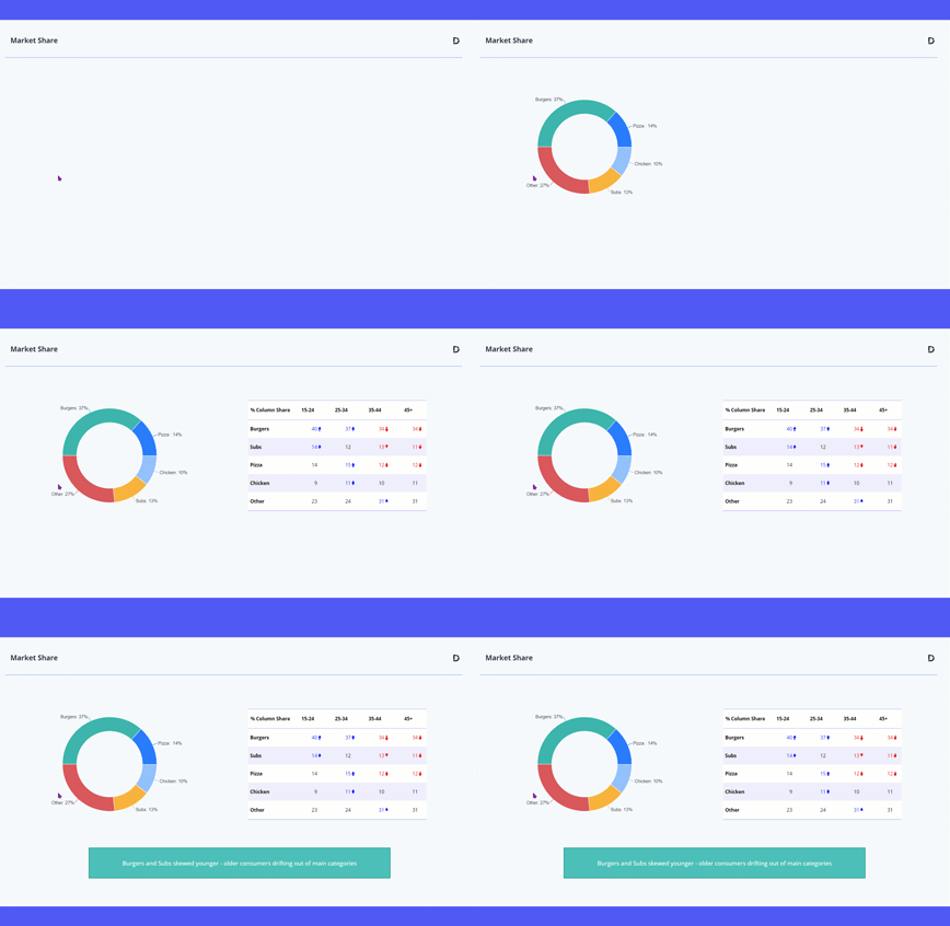
Animate when presenting in View mode
Many users like the benefits of having an interactive, menu driven presentation when doing so in View mode. We've now added a basic animation function to further enhance this experience.

Advanced significance testing
We've boosted (significantly!) statistical testing options and how they can be displayed. Go to Properties > Significance > Advanced.
Introducing the dependency graph
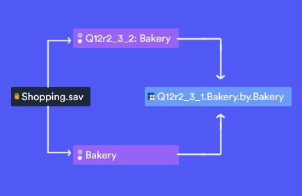
Simply right click on an item in Displayr, select "Dependency Graph", and a diagram magically appears representing the inputs for that item and any downstream outputs. It's a great way to navigate and optimize performance in those complex documents.

Custom fonts
Displayr has a range of popular fonts built in but now you can add any true type font to customize your dashboards and exports.
Q4 2021

Format painter
Popular in other design applications (like PowerPoint), this functionality has now been added to Displayr. Just select a shape, text, or calculation, click (or double-click for multi-pasting) Format Painter in the menu bar, then click on the object(s) that you want to reformat. Once you have a format you like, it saves a lot of time!
Calculate anything In Displayr
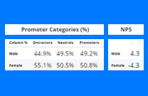
It’s now even easier to use Displayr to perform all your analyses, no matter how complex. With point-and-click functionality, you can easily create calculations from variables or table references (cells, rows, columns).
You can do anything from standard operations (add, subtract, etc.) to the complex functions you find in Excel.

Introducing the dynamic text box
Dynamic text boxes allow you to create text that automatically updates when the data changes. Boom.
New templates for presenting data
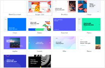
Take your presentations up a notch with one of our 12 beautifully designed presentation templates. Add your company template and be on-brand from step one.
Automatic data stacking
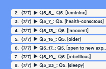
You can now instantly stack your data and automatically update your stacked file when new data comes in. Search: "Stack" in the Displayr app.
Incase you missed it
Check out our latest webinars and learn some new analysis and reporting techniques.
Combine data files
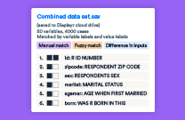
Displayr automatically knits together data files to add new cases or variables while seamlessly updating analysis and reports.

Work much faster with large data files
You can now compress large data files in Displayr by converting them to the *.QDat format, significantly improving performance and speed.

New: infographic dashboard example
Perfect for packing loads of insight into a small space. Explore our latest example infographic dashboard.
Q1 2024

Excel export updating
To parallel our popular PowerPoint document updating functionality, users can now update any tables in Excel that have previously been exported from Displayr. Any charts or ad hoc calculations present in the spreadsheets will be retained. Any new tables are appended to the report.

Introducing Displayr AI
Rather than releasing a few AI "bells and whistles" we are working hard at Displayr to provide practical, time saving (and safe) AI solutions to pain points in the data setup, analysis and reporting processes. Our first two AI cabs off the rank: automatic creating of categories for text analysis and smart labelling of variables and variables sets on data import.
Q4 2023

Unicom integration
Unicom has been added to the suite of tools supported for direct data integration, which can save a lot of time and effort when it comes to data updating.

WYSIWYG Excel exports
Hot-on-the-heels of our Q3 release of Excel-like formatting of tables, formats are now reflected in Excel once exported, what you see is what you get.
Q3 2023

Excel-like formatting of Tables
By popular demand – Add borders, customize shading and adjust styling to entire tables or selected cells; just like in Excel.
Q2 2023

Calculation grids
This new feature allows for the creation of tables that can be a mix of text, values, or calculations. It is also now possible to create a table that draws in data from multiple other tables throughout a Displayr document.
Q1 2023

Automatically translate when categorizing text!
Translate and categorize text data in the same workflow with the push of a button! Researchers who conduct surveys in languages other then their own and collect text data now have the convenience of being able to translate and categorize all in one spot. This saves a lot of time compared to using other translation apps (like Google) or doing the translations elsewhere in Displayr.
Q4 2022

Faster Categorization of Text Data
Displayr's "Semi-Automatic" text categorization creates a draft code frame and assigns responses for you up front - you just need to fine tune the code frame and it's ready to go. Text categorization algorithms also significantly upgraded, including those for multiple response code frames and spontaneous brand awareness questions.

Bar Charts with Automatic Highlights
No more manually adding labels or call-outs to a classic bar chart and typing in interesting results. With Displayr's 'Bar with Skews' visualization you can automatically show significant results. And if the data changes, the highlights do too. Show in one chart what would normally take many.
Q3 2022

Google Analytics Tracking
If you publish Displayr dashboards to large or engaged audiences, see how they interact with them, so you can improve over time
Q2 2022

Data Imputation
Got a data set with some survey error or poor quality controls? No problem - Displayr has algorithms to estimate and replace missing data to get you through

Show significance highlights on a wider range of visualizations
Significance highlights can now be easily added to R versions of Bar, Column, Line and Radar visualizations. Just select the visualization and look for the “Significance” settings in Properties > APPEARANCE.

Automatically transform variables
Save time and sharpen your data - Displayr can instantly transform numeric variables into categories, convert geographic variables into logical groups, and simplify variables based on patterns in data.

Custom or planned significance tests
Go beyond Displayr's automated significance highlighting and test specific hypotheses or results contained within a table - simply select the desired cells and hit the "Alpha" button in the Object Inspector. Displayr will apply the appropriate test for your data and interpret the results for you!
Q1 2022

Automatically hide non-significant row and columns in tables
You can now quickly simplify an otherwise complex crosstab without the need to manually select and hide rows and columns, to help build the story in your data.
Properties > RULES > Modify Whole Table or Plot > Hide Non-Significant Rows and Columns

Add calculations directly to visualization drop-downs
Save workflow steps (and therefore time) and speed up your documents by adding custom formulas, custom selections etc. directly into the drop down boxes when you build visualizations.

Animate when presenting in View mode
Many users like the benefits of having an interactive, menu driven presentation when doing so in View mode. We've now added a basic animation function to further enhance this experience.

Advanced significance testing
We've boosted (significantly!) statistical testing options and how they can be displayed. Go to Properties > Significance > Advanced.

Introducing the dependency graph
Simply right click on an item in Displayr, select "Dependency Graph", and a diagram magically appears representing the inputs for that item and any downstream outputs. It's a great way to navigate and optimize performance in those complex documents.

Custom fonts
Displayr has a range of popular fonts built in but now you can add any true type font to customize your dashboards and exports.
Q4 2021

Format painter
Popular in other design applications (like PowerPoint), this functionality has now been added to Displayr. Just select a shape, text, or calculation, click (or double-click for multi-pasting) Format Painter in the menu bar, then click on the object(s) that you want to reformat. Once you have a format you like, it saves a lot of time!

Calculate anything In Displayr
It’s now even easier to use Displayr to perform all your analyses, no matter how complex. With point-and-click functionality, you can easily create calculations from variables or table references (cells, rows, columns).
You can do anything from standard operations (add, subtract, etc.) to the complex functions you find in Excel.

Introducing the dynamic text box
Dynamic text boxes allow you to create text that automatically updates when the data changes. Boom.

New templates for presenting data
Take your presentations up a notch with one of our 12 beautifully designed presentation templates. Add your company template and be on-brand from step one.

Automatic data stacking
You can now instantly stack your data and automatically update your stacked file when new data comes in. Search: "Stack" in the Displayr app.
Incase you missed it
Check out our latest webinars and learn some new analysis and reporting techniques.

Combine data files
Displayr automatically knits together data files to add new cases or variables while seamlessly updating analysis and reports.

Work much faster with large data files
You can now compress large data files in Displayr by converting them to the *.QDat format, significantly improving performance and speed.

New: infographic dashboard example
Perfect for packing loads of insight into a small space. Explore our latest example infographic dashboard.

