
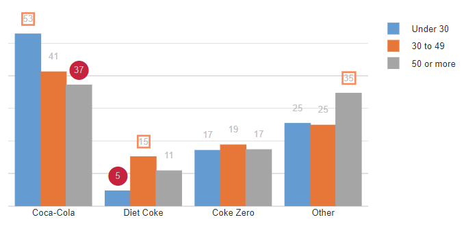
Arrows, words, and other annotations can be added to bar charts, column charts, and scatter plots.
Example
For example, the column chart below uses boxes and filled circles to show statistical significance.
Worked example: adding arrows
There are two stages to adding annotations:
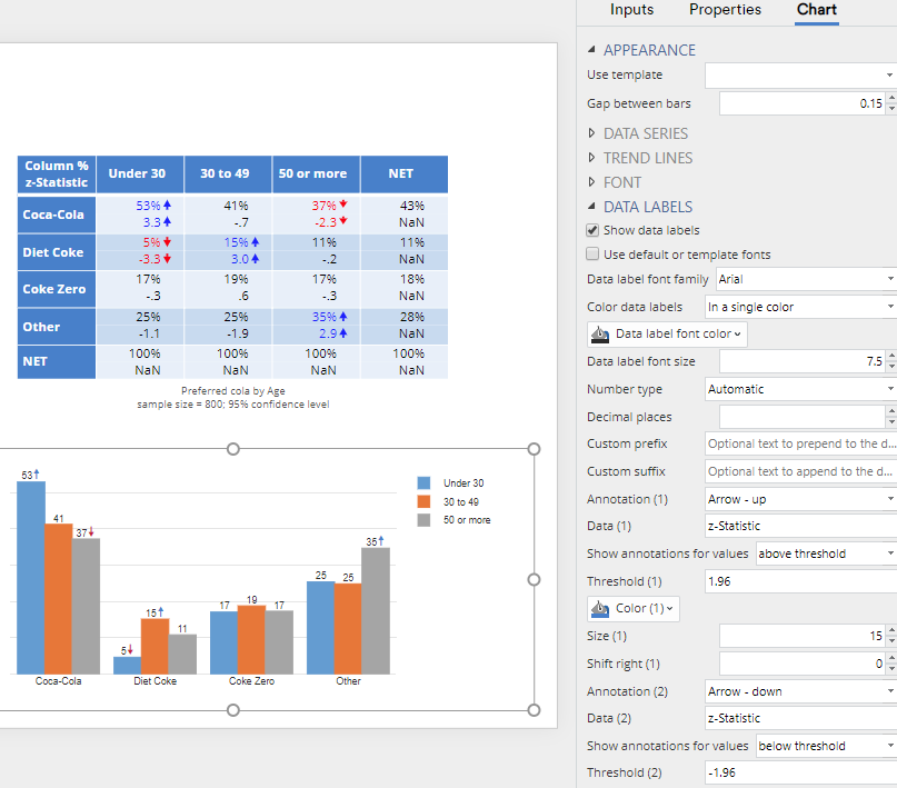
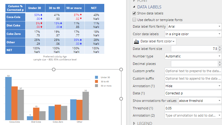
- The table that is used to create the visualization needs to be modified to contain the relevant data for use in creating the annotations. In the table below, z-Statistics have been added to the table (by clicking on the table and selecting from the object inspector > STATISTICS > Cells: z-Statistics).
- The annotations need to be added to, or instead of, data labels on the visualization, by Checking Chart > DATA LABELS > Show data labels (see below).
For setting up the arrows,
- Set Annotations (1) to Arrow – up
- Type z-Statistic in the Data (1) field. You must type in something that is visible in the top-left of the table (i.e., in this case, either Column % or z-Statistic).
- An upward arrow occurs when the z-Statistic is above 1.96, so Show annotations for values is set to above threshold and Threshold (1) to 1.96.
- The same process is used for the down arrows, except with below threshold and -1.96.
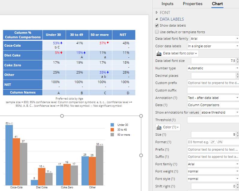
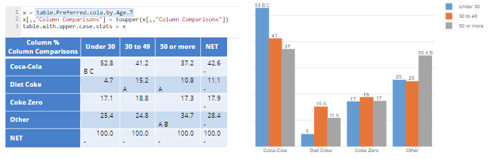
Using letters for statistical testing
The process for using letters on statistical tests is essentially the same as with arrows, except that:
- We add the letters to the table using either STATISTICS > Cells or Appearance > Highlight Results > Compare columns
- Data (1) is set to Column Comparisons
Later in the post another example shows how to change all the letters to uppercase.
Borders/boxes, filled circles, empty circles, and shadows/smudges
In addition to arrows and text, it is possible to add a border around the labels, which appears as a box, filled and empty circles, and shadows (smudges). These are selected from Annotation (1). There are formatting options for controlling their size, colors, and line thicknesses. An example is shown at the beginning of the post.
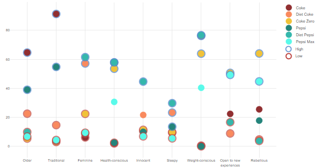
In the example below, a scatterplot has been created from a table. The scatterplot was created by setting Chart type to Scatter and checking Inputs > DATA MANIPULATION > Input data contains y-values in multiple columns. The High and Low elements of the legend were manually added as shapes and textboxes.
Hiding labels
By setting Annotation (1) to Hide, rules can be used to hide annotations. For example, in the chart below, all non-significant labels have been hidden.
Creating custom statistics for annotations
All the examples so far have used existing tables and their statistics to create the annotations. However, it’s possible to create new tables via R code.
The example below modifies a table called table.Preferred.cola.by.age.7, by making all the column comparisons appear as uppercase. This modified table is then used as the input to the visualization.
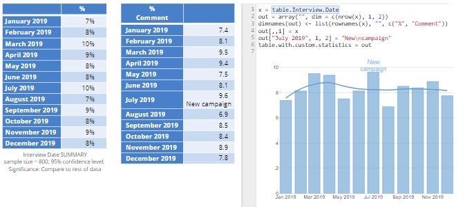
This last example creates a table, with a completely new statistic, called Comment and passes this through to the bar chart, with two annotations. Annotation (1) is set to Hide (to hide the labels) and Annotation (2) to Text – after label with Data (2) set to Comment.
Looking at the R code used to create the table with the comment, key features are:
- A 3-dimensional array is created called out (this is the required structure of a table for use with annotation). Note that this three dimensional array is a table, where there are multiple results in each cell of the table. In this case, the table has 12 rows and 1 column, where nrow(x) is the 12 rows of the table called table.Interview.Date (shown on the left). The first result in the cells of the table is % and the second is Comment.
- The Comment has been set to blank, except for July 2019, which has been set as New\ncampaign, where \n is the code for a new line.
Online tutorial
Click here to go to an online tutorial on adding annotations to visualizations.