Want to create a BCG matrix for your data? Here, you’ll learn how to create this popular dashboard once, to then re-use it in many scenarios.
What is a BCG Matrix?
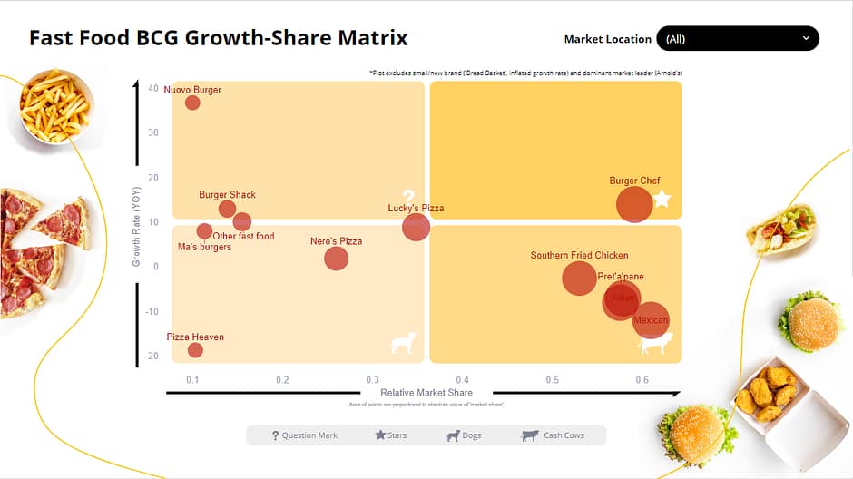
A quick Google search on “BCG Matrix” demonstrates it’s one of the most popular strategic tools around. Courtesy of the Boston Consulting Group, it plots relative market share against growth rate, to help determine marketing or resource allocation effort:
- Invest in “Stars”
- Milk (maintanance-level investment) “Cash Cows”
- Reduce investment in “Dogs”
- Strategize high-growth/low share “Question Marks”
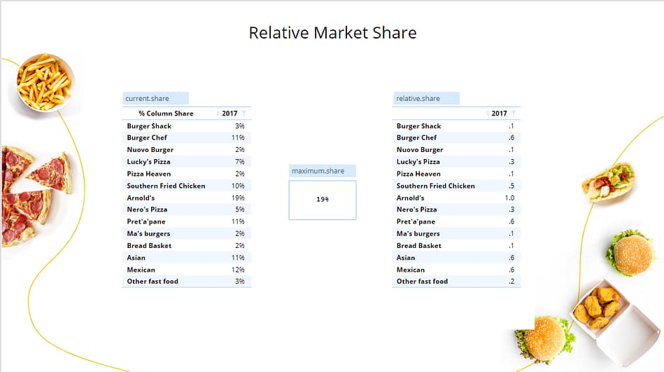
It can be used to study either your own portolio or an entire market, to help qualify the strength of competitive threats or opportunities. Here is an example for a fictituous fast food market:
How to create a BCG matrix
With the required data at hand, it’s not that hard to create a BCG matrix in Excel and dress it up in PowerPoint. But what if you wanted to replicate the matrix for different geographic markets or revisit it when you have new data? That’s potentially a lot of time and effort. Displayr makes it easy to create a dynamic BCG matrix. You can easily switch between markets (or any other filters) and have it update automatically overtime, when new data is added.
This is enabled by your data, you workings, and the output all being connected and in the one place. Changes in to any item automatically impact other items “downstream”.
If our brand is “Burger Chef” the strategic position is vastly different in North and South America, requiring different marketing solutions.
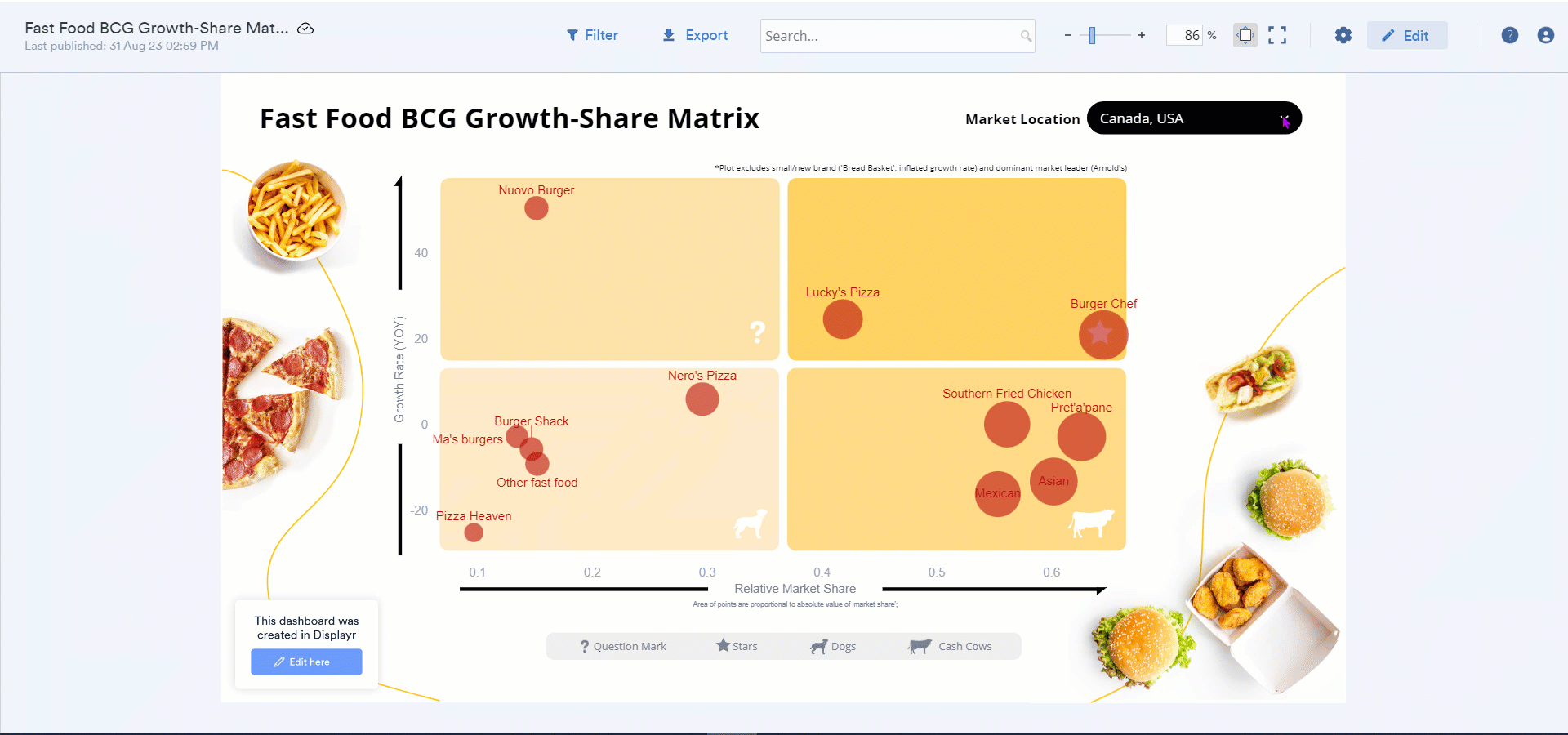
You can access this dashboard, explore its workings, and see how the dynamic matrix was built in Displayr here. The key steps in the process are also set out below …
_______________________________________________________________________________
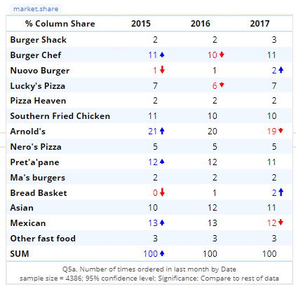
1 Source some market share data
Here we’ve used occasion counts to calculate share, and shown this overtime. With the table selected, we’ve renamed it “market.share” in the Object Inspector (so it’s easy to find in drop down lists, etc).
2 Calculate the x-axis (relative market share)
- In our case we want to matrix to update annually so it’s ready for each new phase of strategic planning. We created a table using Table > Select > Input “market.share”, then Select columns by > Last columns (1), so it’s always showing the most recent market share.
- With “current.share” selected, Calculation > Maximum > Maximum Each Column, name this calculation “maximum.share“
- Select “current.share” table first, then holding down Shift, select “maximum.share” output, Calculation > Divide. The selection order makes things more efficient when using mathematical functions. Name the new output “relative.share“
3 Calculate the y-axis (year-on-year growth rate)
- Find the “market.share” table in your document (Step 1) and duplicate it. It will automatically be named “market.share.2“. Rename it “absolute.change“. Move it to a new page or working space.
- With the table selected, Rules > Table Computations > Different Between Pair of Columns. In the Rule settings, select “Last Column” as Column 1 input and “2nd Last Column” as Column 2 input. Again, in this way the data will always be up to date when it changes. Label the new column “Change YOY“.
- An easy way to calculate relative change, our target metric, is to insert Calculation > Custom Code, then click on items to reference them or simply start typing their name. This is the end result of the custom code needed:
absolute.change[, 4]/(current.share-absolute.change[, 4])*100.Here’s how easy it is to do ….
4 ‘Rough-in’ the matrix
- Visualization > Bubble > Labelled Bubble, then click and drag the cursor to locate the chart
- Inputs > DATA SOURCE > X coordinates > relative.share, Y cordinates > growth.rate, Sizes > current.share
- We opted to exclude a couple of outliers – Arnold’s, as it’s the known dominant leader and Bread Basket as it’s new and has an artificually high growth rate. In Inputs > ROW MANIPULATIONS > Rows to ignore add Arnold’s, Bread Basket
- In Chart, tidy up as required – add data and axes lables, remove grid lines, etc.
5 And finally, add a control
- Anything > Filter > Control > Combo Box (Drop Down) on an Output, select the variable “Market” and allow the user to select more than one category when prompted. A new variable will be created called “Combo Box Filter Market” which you can rename if you wish.
- Find the the two source tables market.share and absolute.change, select them and apply the combo box filter via Inputs > Filter(s)
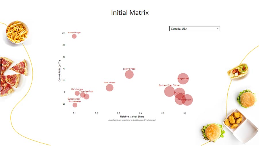
After Steps 4 and 5 you will have a working framework as per below. We then handed the document to our designers to create the final version (as shown above), ready for publishing. Before publishing you would Hide all the working steps above (hiding either the pages they are on or the individual items if they are below the main dashboard).