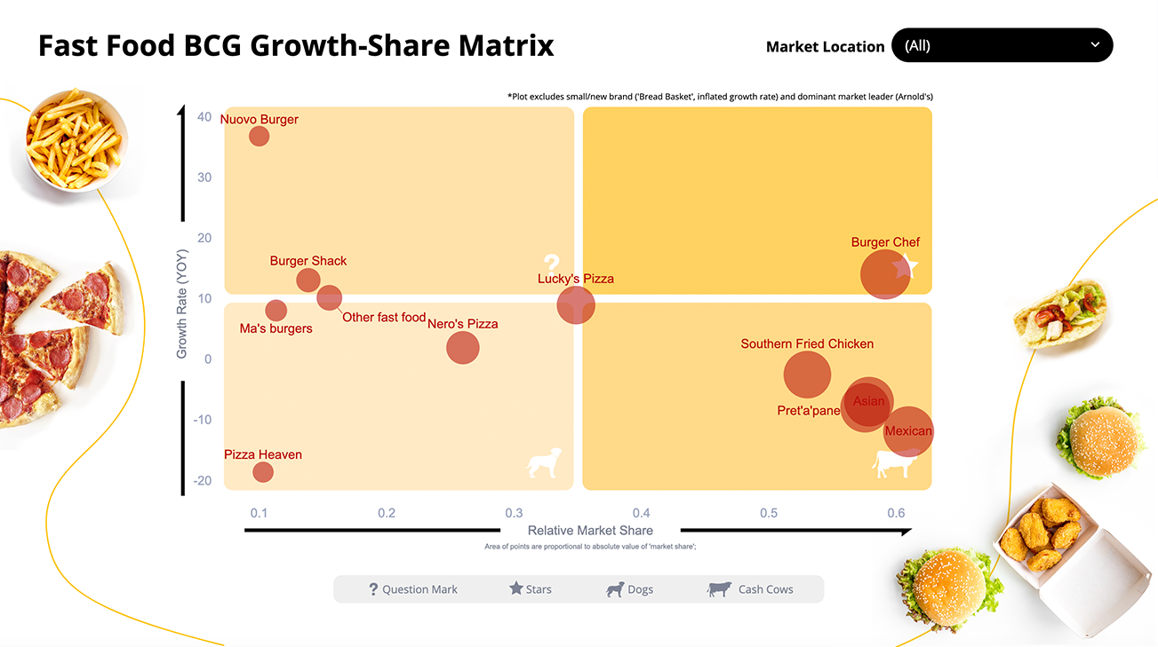
BCG Growth Share Matrix: Fast Food Spotlight
This dashboard allows you to study the “portfolio” of fast food offers across different market locations. The dashboard uses the classic BCG matrix framework, plotting brands in terms of relative market share and annual growth, in a visually appealing way.
Unlike many BCG matrix visuals that stay the same even as markets evolve, our dashboard keeps pace with the times because it’s connected to the underlying data. Plus, it lets you compare different locations, giving you a broader perspective.
With the help of an interactive filter, you can easily select the location you want to study. This is made possible by the dashboard being directly linked to the source data. Because of this linkage, the dashboard will automatically update whenever the data is updated (for example, time periods added in a tracking study).
All elements of this dashboard were created within Displayr, making it easy to customize and use for your analysis. To get started, simply click on “make a copy” and start exploring.
The BCG Growth-Share Matrix framework was developed by the Boston Consulting Group.