Grocery Store Net Promoter Score Dashboard

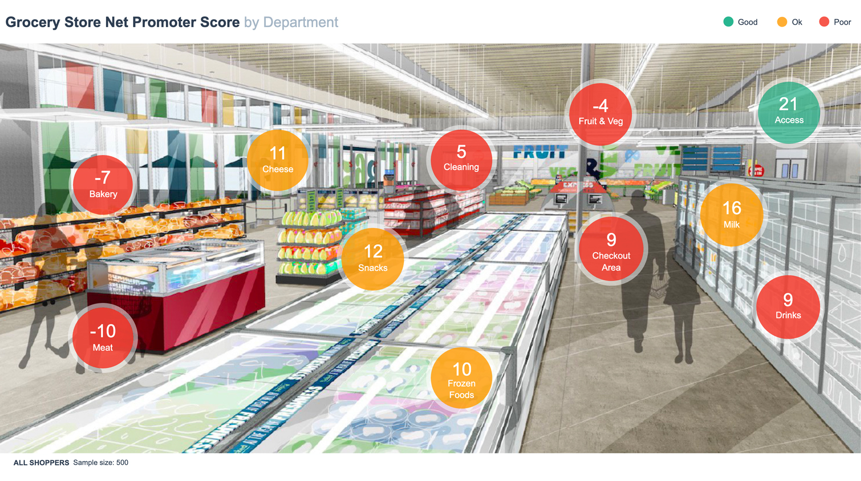
This dashboard measures the Net Promoter Score® of a grocery store by department. It uses color-coding of circles based on underlying data (they change when the data is filtered using the Filters menu in the top right). They use a traffic light system with green to indicate high numbers and red to indicate low numbers.

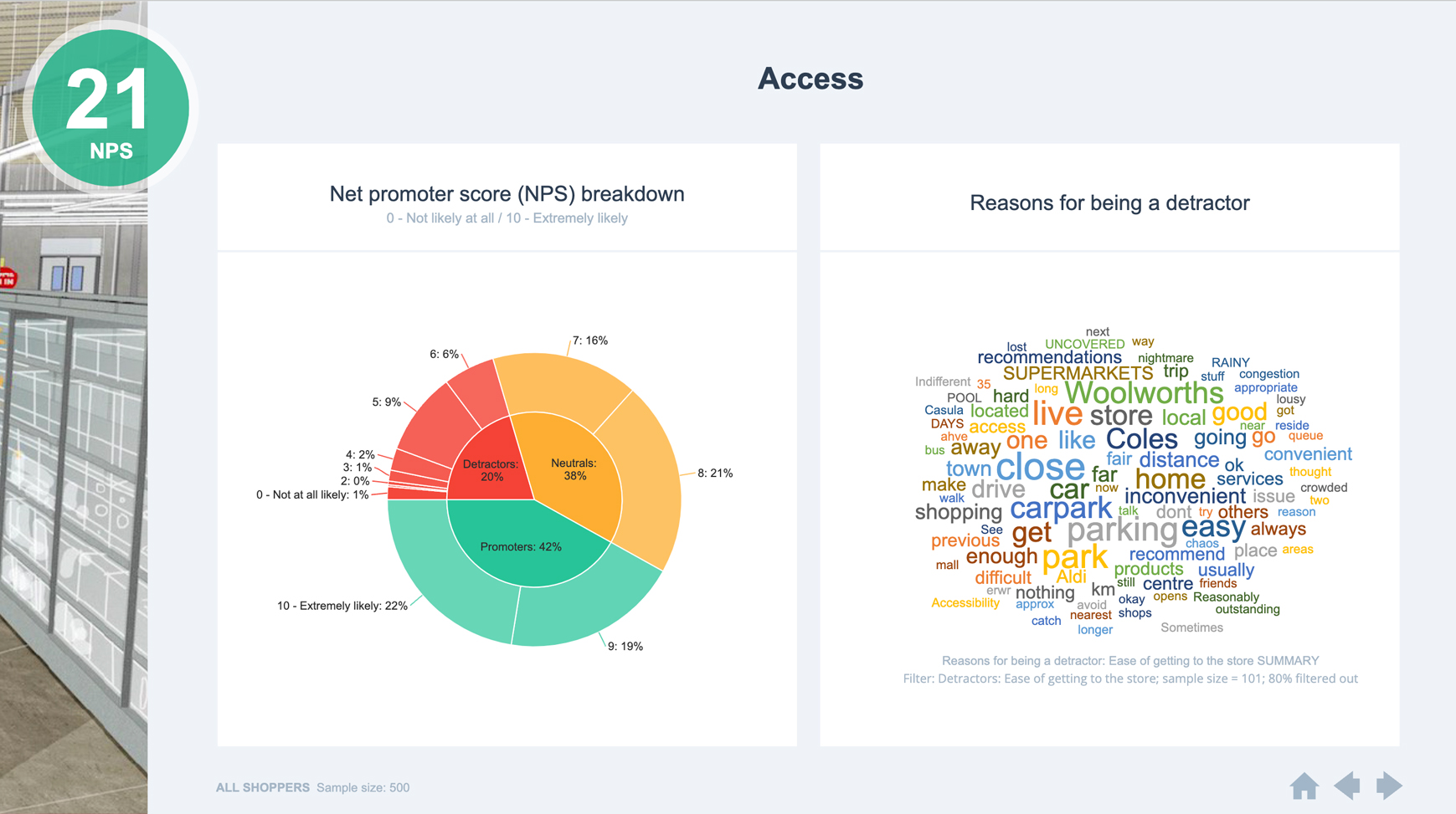
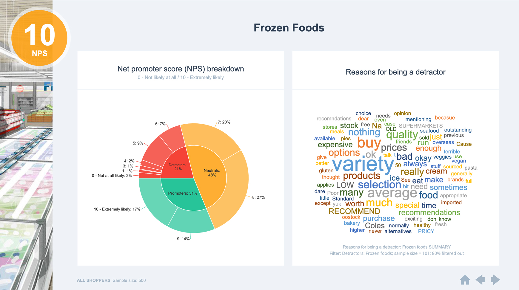
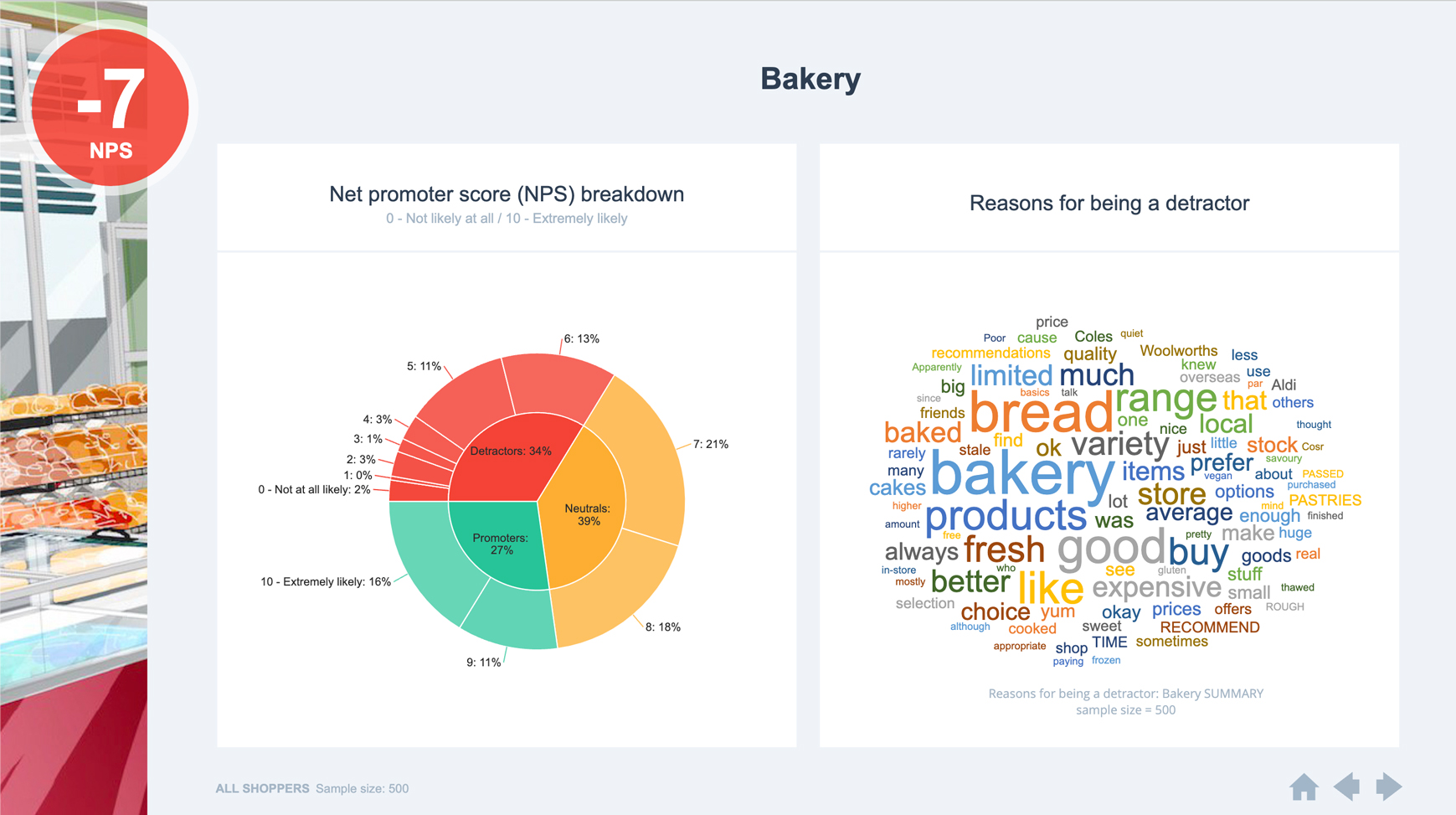
This dashboard also uses hyperlinked drill-down menus, whereby the user clicks on the circle for a department and is taken to another page that shows more information about that department.

Take a look at this dashboard in action

Grocery Store NPS Dashboard
Matt Hubbard

“Displayr is at least 50% faster than just creating a PowerPoint presentation. In some cases, I think it’s even higher than 50%.”

Matt Hubbard VP Data & Analytics, Cygnal
Cookies help us provide, protect and improve our products and services. By using our website, you agree to our use of cookies (privacy policy).
close-image

Register now
close-link

Ready to chat?
Book a time to learn more about how Displayr will cut your analysis and reporting time in half.

Book your time here
close-link