

While most visualizations have built-in color palettes, more often than not you’ll want or need to customize them. Having a color palette set up BEFORE you start making a dashboard in Displayr will not only help you craft a beautiful dashboard, it will save you a lot of time in the long-run! We highly recommend doing this as a preparation step before you embark on creating your Displayr document.
There are numerous reasons why you might want to customize your colors. Perhaps you need to conform to design, brand or client guidelines. Perhaps you just want to satisfy your own design aesthetics and taste. Setting up a color palette (i.e. a list of the codes), before you start building your dashboard will help you make a beautiful document or report far more efficiently – both in terms of working out nice colors (for the design element), but also giving you a list of codes you can conveniently reference when you need to.
What are HEX color codes?
The visualizations in Displayr require you to use HEX codes when you want to customize the color palette. HEX codes are a six digit string of letters/characters that encode a specific color. RGB can encode colors too – they use a combination of three numbers separated by a comma (red,green,blue). In some cases, you can specify one specific custom color using RGB or HEX. For the visualizations where you are specifying a list of colors (i.e. multiple colors at once), this is where HEX comes into play. As the visualizations and charts universally can use HEX for custom coloring, the goal is to get a list of HEX codes in a palette.
The purpose of this post is two-fold:
- Recapping how to customize the colors in visualizations in Displayr
- How you can set up a color palette for use in Displayr (with both RBG and HEX codes)
Make sure you check out the shortcuts to making a color palette at the end of this post.
How to customize the colors in Displayr
In Displayr, you need to create the visualization first before customizing your colors. Once you have inputted your data and created your visualization, click on it and then go over to its Object Inspector (on the right). Under the Charts > DATA SERIES > Color palette you should see an option in the drop-down for “Custom palette”. Selecting this will then display the Custom palette input box, as shown below:
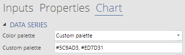
In the default input box, there are two codes (in HEX codes). They start with a hash/pound # and are separated by commas.
Important note: You need to input the color codes in the order of the data series.
So in the above example, your first series will appear as #5C9AD3 (which is a darkish grey-blue), and then the next one will appear as #ED7D31 (a burnt orange). If you have more data series than the codes given above, then Displayr will recycle the colors. So if I had 6 series with the above, I’d get blue, orange, blue, orange, blue, orange (which wouldn’t look great). I’d need to input a full selection of 6 hex codes to get something distinctive for each series.
In other charts, namely the charts found under Insert > Chart, you can see that you can specify both RGB and HEX codes when you select a custom color (below). Having the HEX codes facilitates an easy copy/paste into the box at the bottom that begins with a #
How to make a color palette
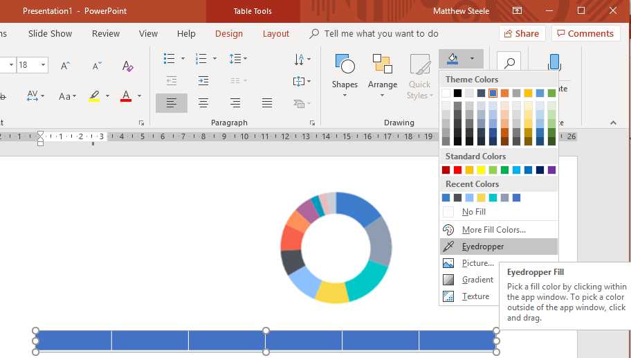
An efficient and easy way to make a color palette is in PowerPoint. Open a PowerPoint slide, and create a neutral table with a single row and as many rows as colors as you want in the palette. (Insert > Table in the PowerPoint ribbon). Then select a cell of the table and go to the paint bucket (under Home > Drawing in the PowerPoint ribbon) to put in whatever colors you want (typically using More fill colors).
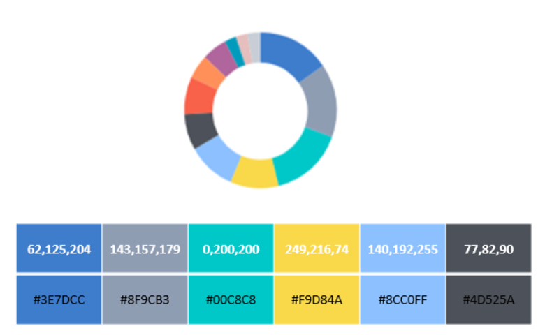
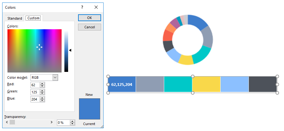
A very common and useful short-cut is to pinch colors from another object (because why reinvent the wheel if you don’t need to?). In the example below, I’m borrowing from a donut chart I found in another presentation. I then select the first cell in the table, and use the Eyedropper tool to color in my cells.
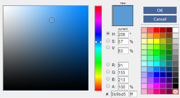
Then you’ll need the codes. Unfortunately PowerPoint doesn’t have the HEX codes, just the RGB codes. But you can convert RGB to HEX later, so you’ll need the RGB to start with for each cell/color. Select the cell, push the paint bucket again, and then go to More Fill Colors… You should see a window like the below, with the color selected, and showing you the RGB code. Copy that code into the cell as I have done for the first one.
When you have all the RGB codes, create a new row in your table in PowerPoint (Table Tools > Layout > Insert Below). Then go to a website like this that converts RGB to HEX (there are many other options if you want to search for them). Put in your RGB code, and convert to the HEX code, like below:
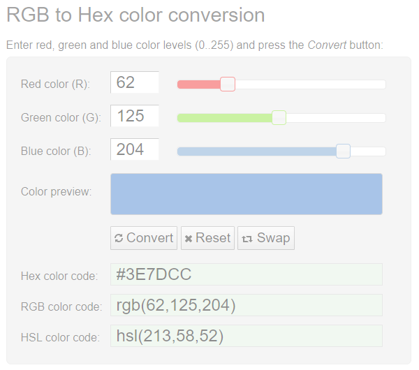
You’ll take the code with the hash/pound in front of it (#3E7DCC) and copy/paste that into your second row in PowerPoint. I’ve done that for all my 6 colors in the below:

Now I’ve got a color palette ready for Displayr – this has been a little bit of fiddling around, but a stitch in time will now save you nine!
Short-cuts
If you have Adobe Photoshop, the eyedropper will give you the HEX codes directly, without the need to go to a converting website, like in the link above.
There are also some ready-made (Hex code) color palettes if you want to just get a ready-made palette (there are 1000’s of them).
I hope you found this post helpful! Check out more tips on “Using Displayr” and happy color picking!