

In this post, I show you how to use Displayr to create a Sankey diagram when your data is set up as a table (e.g., in Excel).
Step 1: Create a Tidy table
The very first step in creating visualizations is to get the data in a useful format. The screenshot below shows a table from Excel. The basic format is right. The columns will become the different nodes of the Sankey diagram (the things that get connected). There is also a single column showing the relative size of the connections between the nodes. In this example there are two columns of nodes, Origin and territory of asylum, but we can have more columns.
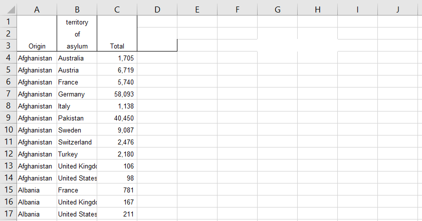
While on face value this table looks relatively neat, it has a few uglies in it, and we need to fix them:
- Can you see how the headings go over three rows? This is a big problem, because while to a human the distinction between the headings and data is obvious, software is not smart enough to know that asylum is the third row of the heading, rather than a country! So, we need to reformat the data so that the headings are all in row 1.
- Can you also see the absence of some of the grid lines in columns G and H? This tells me that there is probably some invisible text (e.g., perhaps spaces), which will also confuse software. To tidy this up we need to delete all the columns to the right of column C.
- As a pretty general rule, when data is messy like this there is also messy at other places. So, we should carefully scan it row by row and, at the bottom of the data, delete the bottom few rows to make sure there are no problems.
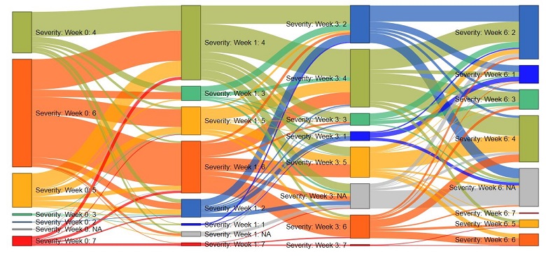
Create your own Sankey Diagram
Step 2: Create the sankey diagram
- In Displayr, go to Insert > Visualization > Sankey Diagram
- In the Object Inspector, press Inputs > DATA SOURCE > Paste or type table
- Paste in the table and check the option Inputs > DATA SOURCE > Last column contains weights
If you have a lot of categories it may take a while to calculate.
Step 3: Making the sankey diagram useful
- By default, Displayr groups together small nodes. You can modify the extent of the grouping using the Maximum number of categories option.
- If you have a lot of very small nodes it can make the sankey diagram look too busy. The simplest solution to this is to filter the tree, by clicking the New button in FILTERS & WEIGHT and filtering using the variable used to weight the sankey diagram.
- Modify the colors using the options in Inputs > APPEARANCE
You should now have a sankey diagram! If you encounter any issues, please don’t hesitate to contact us.
See how easy it is to create your own Sankey diagram in Displayr – just follow the prompts!