
How To Visualize Distributions with Heatmap-Colored Density Plots in R
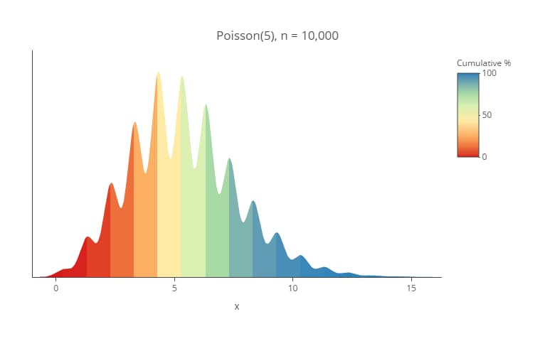
You can use Displayr’s density plot maker to create your own density plot for free. Lots of different visualizations have been proposed for understanding distributions. In this post, I am going show how to create my current favorite, which is a density plot using heatmap shading. I find them particularly useful for showing duration data. […]
How to Make a Density Plot in Displayr
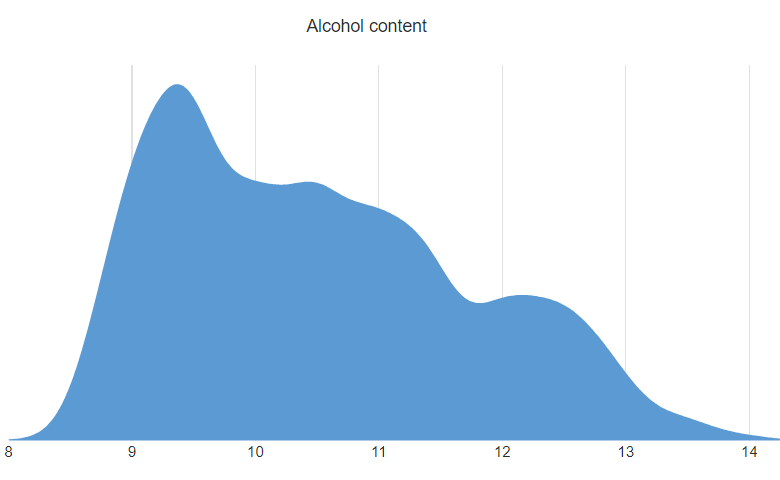
Density plots can be a great tool for trying to understand the shape of the distribution of some data. They do not plot the data directly, but instead use an algorithm to first estimate the shape of the distribution before drawing it. In this post I show you how you can create a density plot […]