

You can use Displayr’s density plot maker to create your own density plot for free.
Lots of different visualizations have been proposed for understanding distributions. In this post, I am going show how to create my current favorite, which is a density plot using heatmap shading. I find them particularly useful for showing duration data.
Example: time to purchase
The table below shows the number of days it took 200 people to purchase a product, after their first trial of the product. The average time taken is 131 days and the median is 54 days. The rest of the post looks at a number of different ways of visualizing this data, finishing with the heated density plot.
Density plot
One of the classic ways of plotting this type of data is as a density plot. The standard R version is shown below. I have set the default from argument to better display this data, as otherwise density plots tend to show negative values even when all the data contains no negative values.
plot(density(days, from = 0),
             main = "Density plot",
             xlab =  "Number of days since trial started")
This plot clearly shows that purchases occur at relatively close to 0 days since the trial started. But, unless you use a ruler, there is no way to work out precisely where the peak occurs. Is it at 20 days or 50 days? The values shown on the y-axis have no obvious meaning (unless you read the technical documentation, and even then they are not numbers that can be explained in a useful way to non-technical people).
We can make this easier to read by only plotting the data for the first 180 days (to = 180), and changing the bandwidth used in estimating the density (adjust = 0.2) to make the plot less smooth. We can now see that the peak is around 30. While the plot does a good job at describing the shape of the data, it does not allow us to draw conclusions regarding the cumulative proportion of people to purchase by a specific time. For example, what proportion of people buy in the first 100 days? We need a different plot.
plot(density(days, from = 0, to = 180, adjust = 0.2),
             main = "Density plot - Up to 180 days (86% of data)",
             xlab =  "Number of days since trial started")
Survival curve
Survival curves have been invented for this type of data. An example is shown below. In this case, the survival curve shows the proportion of people who have yet to purchase at each point in time. The relatively sharp drop in the survival function at 30 is the same pattern that was revealed by the peak in the density plot. We can see also see that at about 100 days, around 26% or so of people have “survived” (i.e., not purchased). The plot also reveals that around 14% of customers have not purchased during the time interval shown (as this is where the line crosses the right-side of the plot). To my mind the survival plot is more informative than the density plot. But, it is also harder work. It is hard to see most non-technical audiences finding all the key patterns in this plot without guidance.
library(survival)
surv.days = Surv(days)
surv.fit = survfit(surv.days~1)
plot(surv.fit, main = "Kaplan-Meier estimate with 95% confidence bounds (86% of data)",
     xlab = "Days since trial started",
     xlim = c(0, 180),
     ylab = "Survival function")
grid(20, 10, lwd = 2)
Heated density plot
I call the visualization below a heated density plot. No doubt somebody invented this before we did, so please tell me if there is a more appropriate name. It is identical to the density plot from earlier in this post, except that:
- The heatmap coloring shows the cumulative proportion to purchase, ranging from red (0%), to yellow (50%, the median), to blue (100%). Thus, we can now see that the median is at about 55, which could not be ascertained from the earlier density plots.
- If you hover your mouse pointer (if you have one) over the plot, it will show you the cumulative percentage of people to purchase. We can readily see that the peak occurs near 30 days. Similarly, we can see that 93% of people purchased within 500 days.
HeatedDensityPlot(days, from = 0,
                  title = "Heated density plot",
                  x.title = "Number of days since trial started",
                  legend.title = "% of buyers")
Below I show the plot limited to the first 180 days with the bandwidth adjusted as in the earlier density plot. The use of the legend on the right allows the viewer to readily see that only a little over 85% of people have purchased.
HeatedDensityPlot(days, from = 0, to = 180, adjust = 0.2,
                  title = "Heated density plot - Up to 180 days (86% of data)",
                  x.title = "Number of days since trial started",
                  legend.title = "% of buyers")
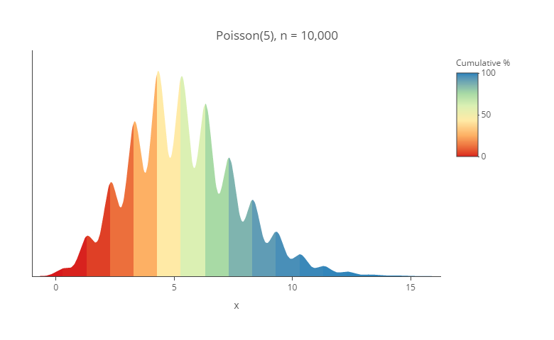
Bonus: they are awesome for discrete data
The visualization below shows randomly-generated data where I have generated whole numbers in the range of 0 through 12 (i.e., one 0; six 1s, seven 2s, etc). In all the previous heated density plots the color transition was relatively smooth. In the visualization below, the discrete nature of the data has been emphasized by the clear vertical lines between each color. This is not a feature that can be seen on either a traditional density plot or histogram with small sample sizes.
set.seed(12230)
x = rpois(100, 5)
HeatedDensityPlot(x, from = 0,
                  title = "Poisson(5), n = 100",
                  x.title = "x")
Conclusion
The heated density plot is, to my mind, a straightforward improvement on traditional density plots. It shows additional information about the cumulative values of the distribution and reveals when the data is discrete. However, the function we have written is still a bit rough around the edges. For example, sometimes a faint line appears at the top of the plot, and a whole host of warnings appear in R when the plot is created. If you can improve on this, please tell us how!
The code
The R function used to create the plot is shown below. If you run this code you will get a plot of a normal distribution. If you want to reproduce my exact examples, please click here to sign into Displayr and access the document that contains all my code and charts. This document contains further additional examples of the use of this plot. To see the code, just click on one of the charts in the document, and the code should be shown on the right in Properties > R CODE.
HeatedDensityPlot <- function(x,
                              title = "",
                              x.title = "x",
                              colors = c('#d7191c','#fdae61','#ffffbf','#abdda4','#2b83ba'),
                              show.legend = TRUE,
                              legend.title = "Cumulative %",
                              n = 512, # Number of unique values of x in the heatmap/density estimation
                              n.breaks = 5, # Number of values of x to show on the x-axis. Final number may differ.
                              ...)
{
    # Checking inputs.
    n.obs <- length(x)
    if (any(nas <- is.na(x))) {
        warning(sum(nas), " observations with missing values have been removed.")
        x <- x[!nas]
        n.obs <- length(x)
    }
    if (n.obs < 4)
        stop(n.obs, " is too few observations for a valid density plot. See Silverman (1986) Density Estimation for Statistics and Data Analysis.")
    # Computing densities
    dens <- density(x, ...)
    y.max <- max(dens$y) * 1.1 # To ensure top of plot isn't too close to title
    x.to.plot.true <- x.to.plot <- dens$x
    y.seq <- c(0, y.max/2, y.max)
    y.to.plot <- dens$y
    range.x = range(x)
    cum.dens <- ecdf(x)(x.to.plot)# * 100
    #Due to plotly blug that misaligns heatmap with ensuing white line,
    #putting blanks at beginnig of data.
    n.blanks <- 10
    cum.dens <- c(rep(NA, n.blanks), cum.dens)
    diff <- x.to.plot[1] - x.to.plot[2]
    blanks <- diff * (n.blanks:1) + x.to.plot[1]
    x.to.plot <- c(blanks, x.to.plot)
    y.to.plot <- c(rep(0, n.blanks), y.to.plot)
    # Creating the matrix of heatmap values
    cum.perc <- cum.dens * 100
    z.mat <- matrix(cum.perc, byrow = TRUE, nrow = 3, ncol = n + n.blanks,
                    dimnames = list(y = y.seq, x = x.to.plot))
    # Specifying the colors
    col.fun <- scales::col_numeric(colors, domain = 0:1, na.color = "white")#range.x)
    x.as.colors <- col.fun(cum.dens)
    z.to.plot.scaled <- scales::rescale(cum.perc)
    color.lookup <- setNames(data.frame(z.to.plot.scaled, x.as.colors), NULL)
    # Creating the base heatmap.
    require(plotly)
    p <- plot_ly(z = z.mat,
                 xsrc = x.to.plot,
                 ysrc = y.seq,
                 type = "heatmap",
                 colorscale = color.lookup,
                 cauto = FALSE,
                 hoverinfo = "none",
                  colorbar = list(title = legend.title),
                 showscale = show.legend)
    # Placing white on top of the bits of the heatmap to hide
    p <- add_trace(p,
                   x = c(1:(n + n.blanks), (n + n.blanks):1),
                   y = c(y.to.plot, rep(y.max * 1.10, n + n.blanks)),
                   fill = "tonexty",
                   hoverinfo = "none",
                   showlegend = FALSE,
                   type = "scatter",
                   mode = "line",
                   showscale = FALSE,
                   line = list(color = "white", width = 0),
                   fillcolor = "white")
    # Adding the tooltips
    p <- add_trace(p,
                   x = 1:(n + n.blanks),
                   y = y.to.plot,
                   name = "",
                   hoverinfo = "text",
                   text = sprintf(paste0(x.title,": %.0f %% < %.1f"), cum.perc, x.to.plot),
                   type = "scatter",
                   mode = "lines",
                   line = list(color = "white", width = 0),
                   showlegend=FALSE,
                   showscale=FALSE)
    p <- plotly::config(p, displayModeBar = FALSE)
    # Formatting the x axis
    x.text <- pretty(x.to.plot, n = n.breaks)
    x.tick <- 1 + (x.text - x.to.plot[1]) / (x.to.plot[n + n.blanks] - x.to.plot[1]) * (n + n.blanks - 1)
    p <- layout(p, title = title,
                xaxis = list(title = x.title, tickmode = "array", tickvals = x.tick, ticktext = x.text),
                yaxis = list(title = "", showline = FALSE, ticks = "", showticklabels = FALSE, range= c(0, y.max)),
                margin = list(t = 30, l = 5, b = 50, r = 5))
    p
}
Acknowledgements
My colleague Carmen wrote most of the code. It is written using the wonderful plotly package.
