How To Use Sparklines To Show Trends In Charts
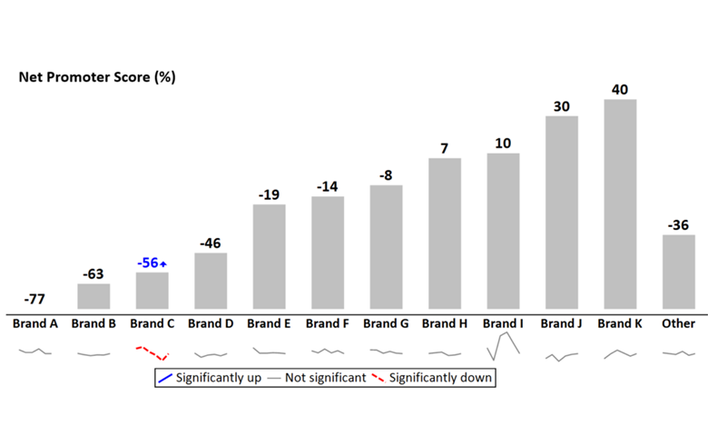
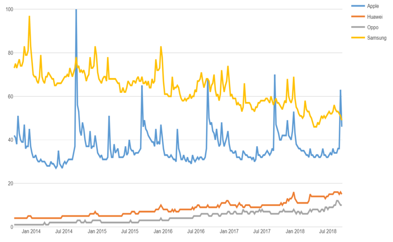
Adding sparklines to a line chart that has multiple series of data can vastly improve readability and interpretation. Line charts are one of the standard charts used in tracking market research. But, as soon as they have more than a couple of series of data, they tend to be awful. This is aptly illustrated by […]
How to Create a Line Graph in Displayr
Line charts are great for comparing data trends over time. They’re often best-used when you have a small number of series to compare. Adding more lines to a chart can make them difficult to read, as lines begin to obscure other lines. One way around this is to use a small multiples line chart in […]