Line charts are great for comparing data trends over time. They’re often best-used when you have a small number of series to compare.
Adding more lines to a chart can make them difficult to read, as lines begin to obscure other lines. One way around this is to use a small multiples line chart in which each line is shown as a separate panel, so that they don’t obscure one another. In this post I show you two ways to create a line chart in Displayr.
Remember, you can create a line graph for free using Displayr’s online line graph maker!
Preparing your data
Typically, for a line chart you need to have a series of figures arranged in a particular order. Often, the best order to use is time. Order is important for a line chart, as the connectedness of the line implies some flow or progression. If you don’t have this, you may be better off using a different chart type.
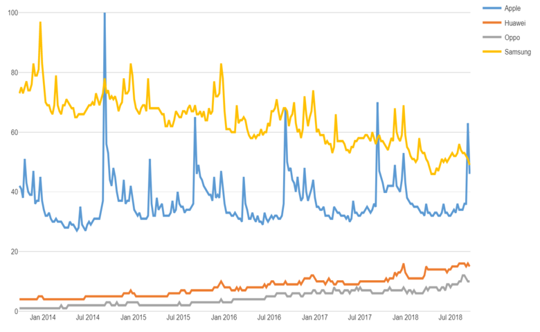
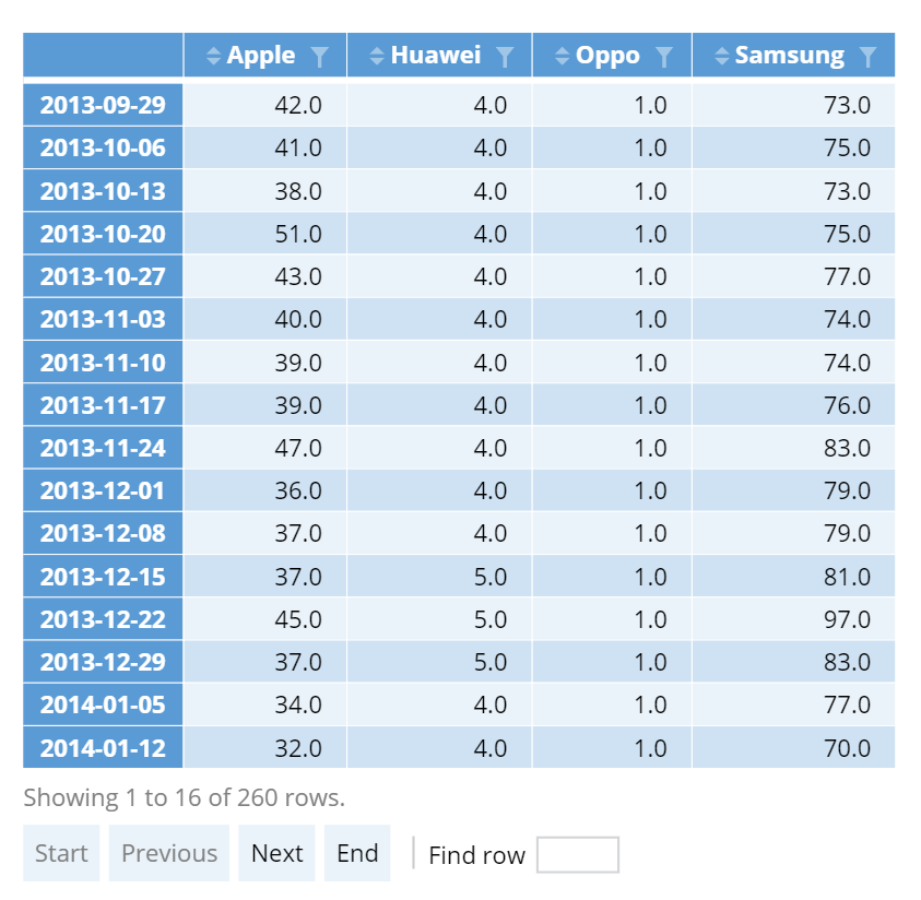
You should arrange the data for your chart as a table, with the columns representing the series that you want to plot, and the rows representing the dates, points in time, or categories which are to be shown along the horizontal axis. In this post I’ll use the example of Google trends data for four technology brands for the past five years. In the table below, I have the four brands as the columns. Each row contains a figure which represents the relative search popularity of each brand in a calendar week. Displayr orders the rows chronologically.
You can add your own Google Trends data to your Displayr document using Insert > More > Data > Google Trends.
Other methods of creating data tables in Displayr include:
- Pasting data directly in. This is done by using Home > Paste Table, using the Paste or type data button that will appear in the Object Inspector on the right side of your screen.
- Adding stock price data with Insert > More > Data > Stock Prices.
- Computing a table with R code. Select Insert > R Output, enter your code in the R CODE section of the Object Inspector on the right and click Calculate . Your code should return a data frame, matrix, vector, or table object.
- Dragging variables from under the Data Sets section on to your page. See below for more on this.
Creating the line chart visualization
Once you know which data you want to plot you can go ahead and create your line chart.
- Select Insert > Visualization > Line Chart.
- Choose your DATA SOURCE in the Object Inspector on the right. If you’ve added a table above, select it in the Output in ‘Pages’ box. If you just want to paste your table in directly, click the Paste or type data button.
- Tick the Automatic box. Any changes in your data or settings will then be shown automatically.
The line chart for my google trends data looks like this:

We see quite a drop in popularity for Samsung searches, fairly steady searches for Apple with large annual spikes, and growing interest in both Oppo and Huawei (I suspect it would look quite different on Chinese Google!).
You can find options for formatting in the Charts section on the right of the screen, and additional options for manipulating the data in the Insert section. For line charts you can:
- Add trend lines for each series, showing either the linear trend or one of a variety of smoothed trends (e.g. LOESS).
- Create a small multiples version of the chart (where each series is shown in a separate panel).
Using the built-in statistical engine
If you have a data set containing raw data then you can take advantage of Displayr’s built-in statistical engine to create your input table, or even to generate a chart directly. You can add your data set using Home > New Data Set, and choosing from one of the many sources. You can get more information about adding data sets in Displayr from Introduction to Displayr 2: Getting Your Data into Displayr.
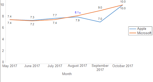
In this example I have added a survey data file from my computer. The survey asked people various questions about how they view different tech brands, like Apple, Google, Microsoft, and so on. I have some scores for how satisfied people are with their Apple and Microsoft products, and I want to show how these scores are looking over time to see if there are any trends.
- Select Home > Chart. This will add a blank chart output to the page.
- Select my Date variable in the Inputs > DATA > Show menu in the Object Inspector on the right.
- Select the variable set for my Apple and Microsoft scores in Inputs > DATA > By.
- Choose formatting options from the Chart section on the right.