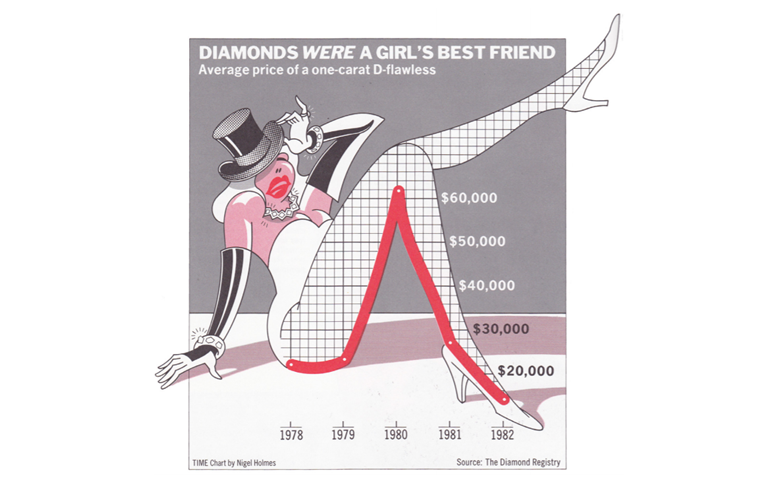
There is a war in the world of visualization. It is about chartjunk. Designers like to create charts like the one above. Many data viz experts think that such visualizations are appalling, calling the illustrations “chartjunk”. You do not need a great imagination to hear the sneer in Edward Tufte’s voice. In Envisioning Information, pages 24 to 35, when he writes about the chart above:
Consider this unsavory exhibit … chockablock with cliché and stereotype, coarse humor, and a content-empty third dimension. It is the product of a visual sensitivity in which a thigh-graph with a fishnet-stocking grid counts as a Creative Concept….
Lurking behind chartjunk is contempt both for the information and for the audience. Chartjunk promoters imagine that numbers and details are boring, dull, and tedious, requiring ornament to enliven. Cosmetic decoration, which frequently distorts the data, will never salvage an underlying lack of content. If the numbers are boring, then you’ve got the wrong numbers. Credibility vanishes in clouds of chartjunk; who would trust a chart that looks like a video game? Worse is contempt for our audience, designing as if readers were obtuse and uncaring. In fact, consumers of graphics are often more intelligent about the information at hand than those who fabricate the data decoration. And, no matter what, the operating moral premise of information design should be that our readers are alert and caring; they may be busy, eager to get on with it, but they are not stupid. Clarity and simplicity are completely opposite simple-mindedness. Disrespect for the audience will leak through, damaging communication. What E. B. White said of writing is equally true for information design: “No one can write decently who is distrustful of the reader’s intelligence, or whose attitude is patronizing.”
In The Functional Art: An Introduction to Information Graphics and Visualization, Albert Cairo provides a wonderful visual way of understanding the logic of Tufte’s argument. We are quicker to interpret the image on the right than the ones on the left, precisely because it is simpler.
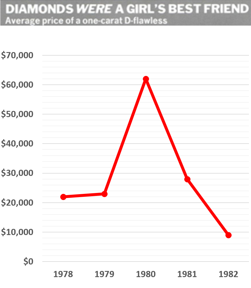
Following Tufte’s advice, we can simplify the diamond pricing visualization above to the simple line chart on the right. However, in this case Tufte has it wrong (well, perhaps half-wrong, as it hurts to criticize one of the greats).
If the role of visualization is to allow fast and accurate comprehension, this chart should be superior to the first. However, a good visualization is about more than just comprehension.
The obvious point of overlying the line chart on the dancer’s leg is to attract attention. Tufte writes that “the operating moral premise of information design should be that our readers are alert and caring”. Perhaps this was true when Tufte wrote this in 1990, but I doubt it. Information overload is the norm, and care is the victim of information overload.
Visualizations that do not fight for attention will often not be viewed. So a slightly misleading but highly attractive visualization will generally be the more successful form of communication (consider how popular infographics now are). The diamond visualization was created to appear in Time magazine, with the goal of stopping the reader from flipping through pages. Today, analyses of retweeting and Facebook shares show that titillation and conspiracy theories, not dry and honest facts, garner the most interest.
There is little doubt that Tufte knows this. His comments on chartjunk are filled with bile and venom. And contempt. In his desire to engage the reader with the topic, to ensure that his point is not missed, Tufte uses all the same tricks employed in the visualization that he criticizes. Would it be too cruel to note the irony of Tufte’s use of wordjunk to criticize chartjunk?
The second bit of genius in the visualization is that he has explained the shape to us. As I discussed in The 5 second rule and the need to create instantly recognizable visualizations, we are much better at interpreting visualizations that are familiar to us. Overlaying the chart on the bent leg of the dancer allows our associative memory to come into play. Rather than having to remember an unusual curve, we can instead just summon up our recollection of a bent leg.
Perhaps you can recall the basic shape of the data, without having to scroll to the top of the page. Can you recall the line curving around her posterior? The line then goes up to her knee. Then it drops sharply down, but the angle shifts a little at the ankle. You can recall and visualize all of this due to the design of the original visualization.
The visualization of diamond prices, chartjunk and all, has succeeded in its ultimate goal of communication.