

The tables in Displayr include arrows and font colors to highlight interesting results. These arrows are also available on many of the charts. Adding similar arrows (and other symbols) to a page is a great way to make your dashboards more impactful. In this article, I show you how to get the arrows out out the tables and put them onto your page so that you can display them side-by-side with your key results. Most importantly, such arrows can update themselves when the dashboard page is filtered. We also look briefly at how you can use other statistical tests that are available in R.
Preparing your tables
Tables are often the work-horse when designing dashboards in Displayr. They automatically compute statistics from your raw data. Now, I don’t mean to disparage the tables, but I usually hide them out of the way and let them work in the background to feed into the more attractive elements of my dashboards. In particular, I use tables to supply results to the options from Insert > Visualization, and I use R code to pluck out and format the results that I want to highlight (for an example, see this post).
The tables in Displayr have the added benefit of behind-the-scenes algorithms that work out which results are most interesting. Fortunately, all of the information that is needed to display the arrows and font colors on the table is available for you to access in code.
The first step in showing arrows from a table is to set up a table which displays all of the relevant statistics.
- Drag a Variable set from Data Sets on to the page.
- (Optional) Drag a second variable set from Data Sets into the Columns box of your new table.
- (Optional) Modify the table using the options in Data Manipulation > Rows/Columns as needed.
- With the table selected, go to the STATISTICS > Cells section of the Object Inspector and add the Corrected p and z-Statistic.
- Go to the Appearance section in the ribbon at the top of the screen, and select Hide. This prevents the table from being shown on the published dashboard.
- Drag the table off of your page so that it does not obscure the objects on the rest of the page.
The Corrected p is used to determine if a cell should be highlighted, and the z-Statistic determines if the arrow should point up or down.
The next step you should take depends on whether your table has the statistics shown side-by-side, or if it has the statistics stacked on top of each other within each cell. The layout of the table affects the way you refer to the table in R code.
Taking arrows from a table with a single columm
If you have a single-column summary table, the statsitics will be placed side-by-side, and it will look like this:
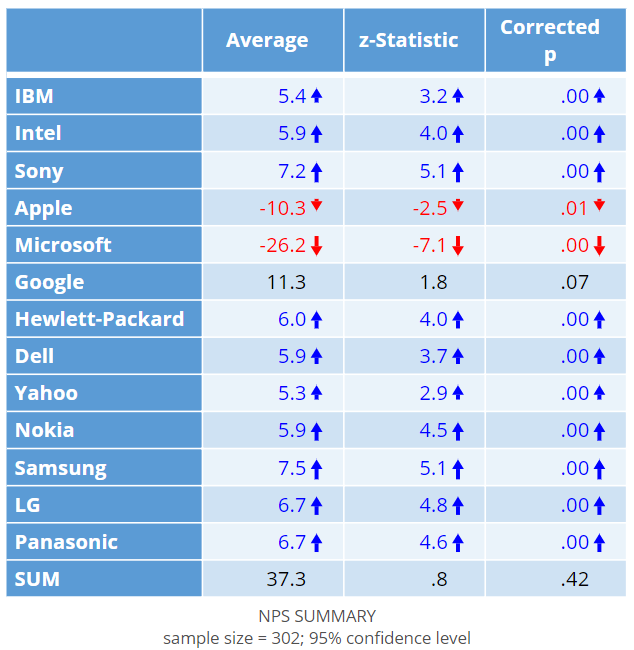
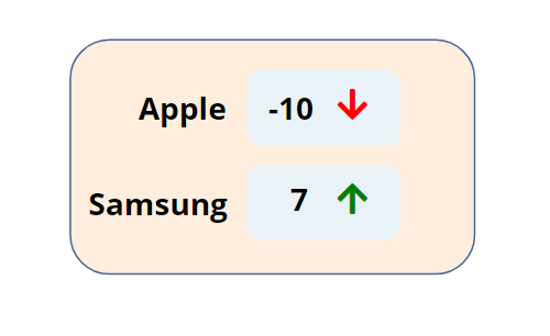
In this example, we have a battery of NPS scores for different tech brands. We will create an arrow to tell us if the NPS score for Apple is significantly high or low according to the table.
To add the arrow for Apple’s NPS to your page:
- Select Insert > R Output.
- Paste in the R CODE from below.
- Modify the second line of code so that input.table refers to the name of the table. You can find the name of the table by clicking the table and looking in Properties > GENERAL > Name in the Object Inspector on the right hand side of the screen. In this example, the Name of my table is table.NPS.
- Modify the third line of the code to correspond to the row label of the result you want to use. In this example, I refer to the row label Apple.
- Tick Automatic.
# Change these when you choose which result to show
input.table = table.NPS
row = "Apple"
threshold = 0.05

# Get the p value & z-statistic
p.value = input.table[row, "Corrected p"]
z.score = input.table[row, "z-Statistic"]

# Specify the format for the red down-arrow
# and the green up-arrow
green.up = '<font color="green" style="font-size: 16pt"><i class="fas fa-arrow-up"></i></font>'
red.down = '<font color="red" style="font-size: 16pt"><i class="fas fa-arrow-down"></i></font>'

# Choose icon based on the table statistics
if (p.value > threshold) {
    icon = NULL # Not significant, no icon
} else if (z.score >= 0) {
    icon = green.up # Significantly high
} else if (z.score < 0) {
    icon = red.down # Significantly low
}

# Leave this part unchanged
fontawesome_css <- '<link rel="stylesheet" href="https://use.fontawesome.com/releases/v5.2.0/css/all.css" integrity="sha384-hWVjflwFxL6sNzntih27bfxkr27PmbbK/iSvJ+a4+0owXq79v+lsFkW54bOGbiDQ" crossorigin="anonymous">'
rhtmlMetro::Box(text = paste(fontawesome_css, icon), text.as.html = TRUE)
You don’t need to modify the rest of the code. This code does the following things:
- Gets the p-value and z-Statisic from the specified row of the table.
- Defines the character to use for the up arrow and down arrow. For more on this, see our previous post Adding Icons to Dashboards Using “Font Awesome.
- Checks the p-Value against a pre-defined threshhold to determine if an arrow should be shown. The pre-defined value is 0.05 to correspond with Displayr’s default setting.
- Checks whether the z-Score is positive or negative, and chooses an up or down arrow respectively.
- Draws the arrow.
Laying out a pair of these, along with some numbers generated dynamically from the data, allows me to place my results on the page, together with arrows. All of these will update when the person viewing my dashboard filters the data.
Taking arrows from crosstabs and grids
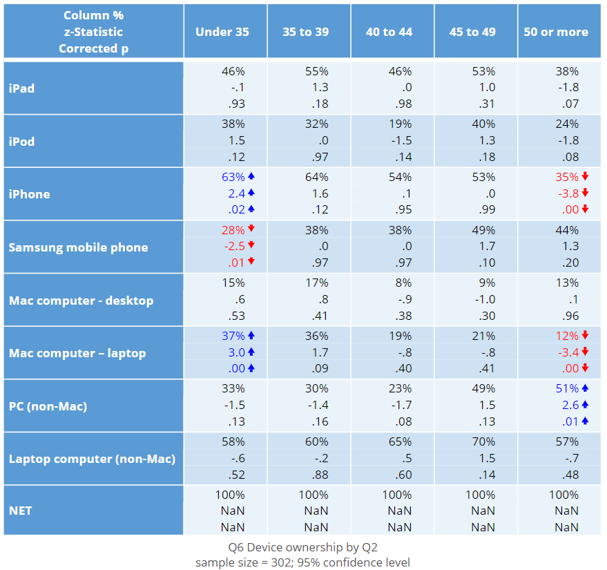
If you have a grid-shaped summary table or a crosstab, your statistics will be placed on top of one another within each cell. In this case your table will look something like this:
To add the arrow for Apple’s NPS to your page:
- Select Insert > R Output.
- Paste in the R CODE from below.
- Modify lines 2, 3, and 4 to reference the table and cell you want to use.
- Tick Automatic.
# Change these when you choose which result to show
input.table = ownership.by.age
row = "iPhone"
column = "Under 35"

# Get p value & z-statistic
p.value = input.table[row, column, "Corrected p"]
z.score = input.table[row, column, "z-Statistic"]
threshold = 0.05

# Specify the format for the red down-arrow
# and the green up-arrow
green.up = '<font color="green" style="font-size: 16pt"><i class="fas fa-arrow-up"></i></font>'
red.down = '<font color="red" style="font-size: 16pt"><i class="fas fa-arrow-down"></i></font>'

# Choose icon based on significance
if (p.value > threshold) {
    icon = NULL # Not significant, no icon
} else if (z.score >= 0) {
    icon = green.up # Significantly high
} else if (z.score < 0) {
    icon = red.down # Significantly low
}

# Leave this part unchanged
fontawesome_css <- '<link rel="stylesheet" href="https://use.fontawesome.com/releases/v5.2.0/css/all.css" integrity="sha384-hWVjflwFxL6sNzntih27bfxkr27PmbbK/iSvJ+a4+0owXq79v+lsFkW54bOGbiDQ" crossorigin="anonymous">'
rhtmlMetro::Box(text = paste(fontawesome_css, icon), text.as.html = TRUE)
The difference between this and the previous code is that both row and column labels must be specified when finding the p-value and z-Statistics.
R-based tests
The R language specializes in statistics and has a range of functions available for conducting your own tests. You can use such tests to draw arrows. For example, the following snippet of code conducts a Welch Two-Sample t-test using a numeric variable (Apple NPS, Q3_01) and a binary variable (iPhone ownership, Q6_03) and creates the corresponding arrow for iPhone owners. Specifying QFilter as the subset ensures that the test will be conducted based on whatever data is included in the filter applied to this page.
test.result = t.test(Q3_01 ~ Q6_03, subset = QFilter)

# Get the p value
p.value = test.result$p.value
threshold = 0.05

# Specify the format for the red down-arrow
# and the green up-arrow
green.up = '<font color="green" style="font-size: 16pt"><i class="fas fa-arrow-up"></i></font>'
red.down = '<font color="red" style="font-size: 16pt"><i class="fas fa-arrow-down"></i></font>'

# Choose icon based on the table statistics
if (p.value > threshold) {
    icon = NULL # Not significant, no icon
} else if (test.result$estimate[2] > test.result$estimate[1]) {
    icon = green.up # Significantly high
} else {
    icon = red.down # Significantly low
}

# Leave this part unchanged
fontawesome_css <- '<link rel="stylesheet" href="https://use.fontawesome.com/releases/v5.2.0/css/all.css" integrity="sha384-hWVjflwFxL6sNzntih27bfxkr27PmbbK/iSvJ+a4+0owXq79v+lsFkW54bOGbiDQ" crossorigin="anonymous">'
rhtmlMetro::Box(text = paste(fontawesome_css, icon), text.as.html = TRUE)
Check out our other tips on R in Displayr, or find out more about Using Displayr!