

When setting up a predictive model, the first step should always be to understand the data. Although scanning raw data and calculating basic statistics can lead to some insights, nothing beats a chart. However, fitting multiple dimensions of data into a simple chart is always a challenge (dimensionality reduction). This is where t-SNE (or, t-distributed stochastic neighbor embedding for long) comes in.
In this blog post, I explain how t-SNE works, and how to conduct and interpret your own t-SNE.
The t-SNE algorithm explained
This post is about how to use t-SNE so I’ll be brief with the details here. You can easily skip this section and still produce beautiful visualizations.
The t-SNE algorithm models the probability distribution of neighbors around each point. Here, the term neighbors refers to the set of points which are closest to each point. In the original, high-dimensional space this is modeled as a Gaussian distribution. In the 2-dimensional output space this is modeled as a t-distribution. The goal of the procedure is to find a mapping onto the 2-dimensional space that minimizes the differences between these two distributions over all points. The fatter tails of a t-distribution compared to a Gaussian help to spread the points more evenly in the 2-dimensional space.
The main parameter controlling the fitting is called perplexity. Perplexity is roughly equivalent to the number of nearest neighbors considered when matching the original and fitted distributions for each point. A low perplexity means we care about local scale and focus on the closest other points. High perplexity takes more of a “big picture” approach.
Because the distributions are distance based, all the data must be numeric. You should convert categorical variables to numeric ones by binary encoding or a similar method. It is also often useful to normalize the data, so each variable is on the same scale. This avoids variables with a larger numeric range dominating the analysis.
Note that t-SNE only works with the data it is given. It does not produce a model that you can then apply to new data.
t-SNE visualizations
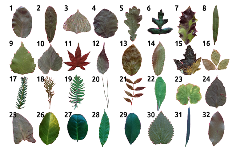
The first data set I am going to use contains the classification of 10 different types of leaf based on their physical characteristics. In this case t-SNE takes as input 14 numeric variables. These include the elongation and aspect ratio of the leaves. The following chart shows the 2-dimensional output. The species of the plant determines the labels (and colors) of the points.
The data points for the species Acer palmatum form a cluster of orange points in the lower left. This indicates that those leaves are quite distinct from the leaves of the other species. The categories in this example are generally well grouped. Points from the same species (same color) tend to be grouped close to one another. However, in the middle points from Castanea sativa and Celtis sp. overlap, implying that they are similar.
The nearest neighbor accuracy gives the probability that a random point has the same species as its closest neighbor. This would be close to 100% if the points were perfectly grouped according to their species. A high nearest neighbor accuracy implies that the data can be cleanly separated into groups.
Perplexity
Next, I perform a similar analysis with cola brand data. In this example, the data corresponds to whether or not people in a survey associated 30 or so attributes with the different cola brands. To demonstrate the impact of perplexity, I start by setting it to a low value of 2. The mapping of each point considers only its very closest neighbors. We tend to see many small groups of a few points.
Now I’ll rerun the t-SNE with a high perplexity of 100. Below we see the points are more evenly spread out, as though they are less-strongly attracted to each other.
In either case, the cola data is less separable than the leaves. Although there are regions where one brand is more concentrated, there are no clear boundaries.
Note that there is no “correct” value for perplexity, although numbers in the range from 5 to 50 often produce the most appealing output. Within this range of perplexity, t-SNE is known for being relatively robust.
Insights into prediction
Measuring the distances or angles between points in these charts do not allow us to deduce anything specific and quantitative about the data. So is there more to this than pretty visualizations? Absolutely yes.
Discovering patterns at an early stage helps to guide the next steps of data science. If categories are well-separated by t-SNE, machine learning is likely to be able to find a mapping from an unseen new data point to its category. Given the right prediction algorithm, we can then expect to achieve high accuracy.
In the Acer palmatum example above one category is isolated. This can mean that if all we want to do is distinguish this category from the remainder, a simple model will suffice.
In contrast, if the categories are overlapping, machine learning may not be so successful. At the very least you can expect to have to work harder and be more creative to make decent predictions. This is the case below, which is the same as the previous plot except that now we are grouping by the strength of preference for a brand (on a scale from 1 to 5). The fact that the categories are more diffuse suggests that strength of preference will be harder to predict than cola brand. The nearest neighbor accuracy is also lower.
Comparison to PCA
It’s natural to ask how t-SNE compares to other dimension reduction techniques. The most popular of these is principal components analysis (PCA). PCA finds new dimensions that explain most of the variance in the data. It is best at positioning those points that are far apart from each other because they are the drivers of the variance.
The chart below plots the first 2 dimensions of PCA for the leaf data. We see that Acer palmatum is also isolated but the other categories are more diffuse. This is because PCA cares relatively little about local neighbors. It is also a linear method, meaning that if the relationship between the variables is nonlinear it performs poorly. Such an example is where the data are on the surface of a sphere in 3 dimensions. All is not lost, however, as PCA is more useful than t-SNE for compressing data to create a smaller number of features for input to predictive algorithms.
Summary
t-SNE is a user-friendly method for visualizing high dimensional space. It often produces more insightful charts than the alternatives. Next time you have new data to analyze, try t-SNE first and see where it leads you!
Worked example
I created the analyses in this post with R in Displayr. You can review the underlying data and code or run your own t-SNE analyses here (just sign into Displayr first). I used the flipDimensionReduction package (available on GitHub), which itself uses the Rtsne package.