A small multiple is a data visualization that consists of multiple charts arranged in a grid. This makes it easy to compare the entirety of the data. They are also known as trellis, lattice, grid, and panel charts.
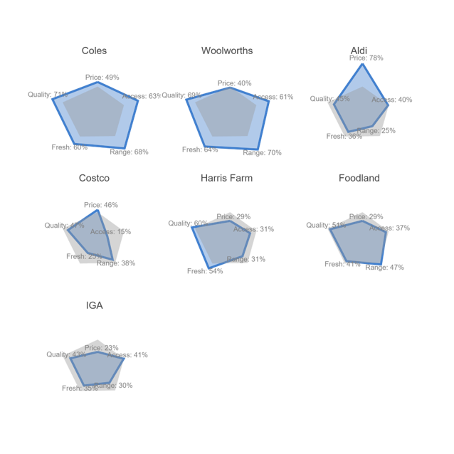
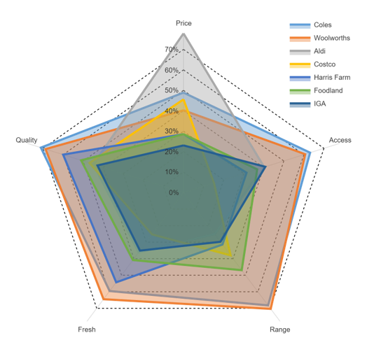
Here is an example of small multiples of radar charts. As you can see, showing a series of charts in a table format makes it easy to compare the different brands.
Required data for a small multiple
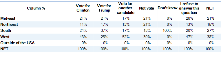
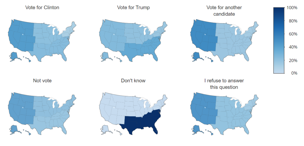
The required data for a small multiple is typically a table, where the rows or columns contain the data for each of the separate series to be plotted. For example, in the table below, each column is represented as a separate map (choropleth) in the small multiple shown below. Sometimes software can require that the data is in a more exotic format, such as an R data.frame.
Strengths of small multiples
Small multiples are particularly effective when:
- The data exhibits overplotting. This makes it hard to compare and contrast the data, as has occurred with the more traditional radar chart shown below.
- The goal is to facilitate comparison between the entirety of the data. By contrast, if we are only interested in comparing one variable, small multiples may not be the best visualization. For example, if our only interest was in comparing the supermarkets based on price, the more traditional radar chart shown below is preferable to using a small multiple.
Tips on making a good small multiple
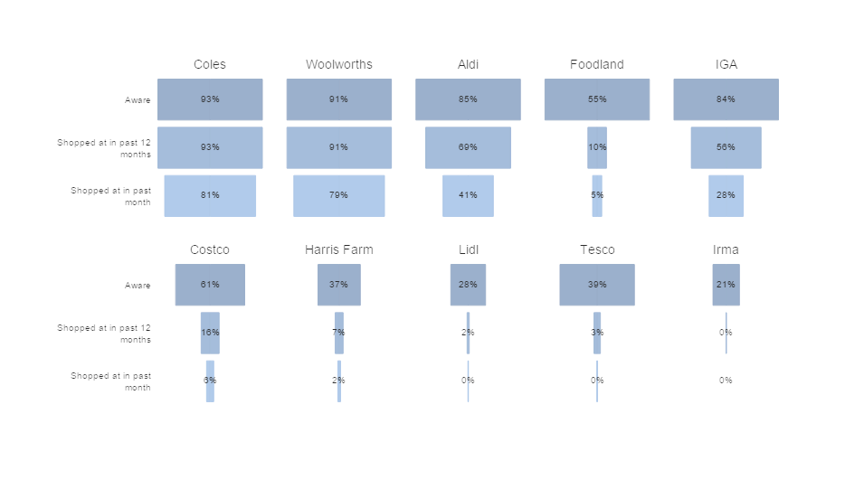
- Order the categories. For example, in the small multiple of spindles (funnels), shown below, they have been ordered based on the first value (Aware), which facilitates comparison.
- Use a common scale. For example, in the visualization below, each of the numbers is on a common scale. There are exceptions to this rule, such as with density plots and histograms, where it is often useful to instead scale the visualizations to have an equal height.
- Use a relatively simple chart type, which can be viewed as a single image. For example, maps, area charts, line charts, scatterplots and radar charts all work well as small multiples. By contrast, chart types which require a more analytic processing to interpret, such as bar charts, pie charts, and treemaps, can work poorly.
- Avoid the temptation to make each chart a separate color. While it will look pretty, these colors add no information, and so only serve to distract the viewer.
Software for creating bar charts
There are lots of great open source tools for creating small multiples, such as ggplot and plotly. The visualizations that I have created in this post use plotly, but were all created by selecting options from the menus in Q (please get in touch if you want a demo!). And, you can also create them using a free Displayr account!
Want to create your own small multiples? Sign up for a trial of Displayr!