Definitions: crosstab vs contingency table
Before we dive into all things crosstabs, it’s worth getting our definitions right. A crosstab (short for cross-tabulation) is a table used in statistics to display the relationship between two or more categorical variables. It allows you to examine how different categories or groups of variables intersect and how they are distributed within a dataset. In short, a crosstab summarizes categorical data, providing a quick and easy way to see patterns or associations between variables.
One of the defining features of a crosstab is that it can show two or more variables. So when a crosstab only shows the relationship between two categorical variables – where the row categories are mutually exclusive, and the column categories are also mutually exclusive – it can also be called a contingency table.
Example of a crosstab of two variables
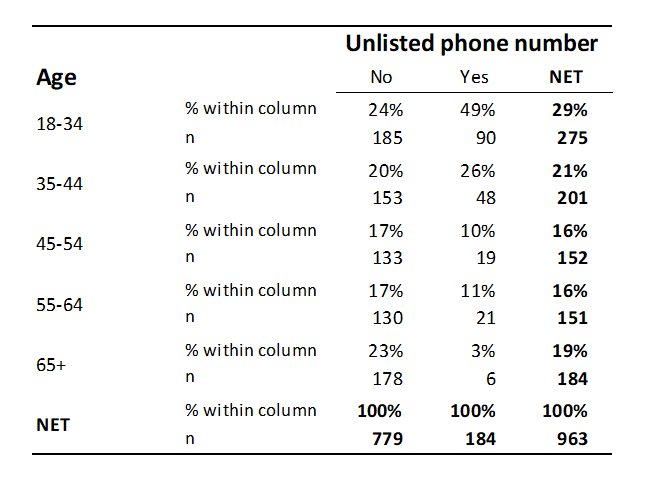
The table below is a crosstab that shows by age whether somebody has an unlisted phone number. This table shows the number of observations with each combination of possible values of the two variables in each cell of the table. We can see, for example, that 185 people are aged 18 to 34 and do not have an unlisted phone number. Column percentages are also shown (these are percentages within the columns, so that each column’s percentages add up to 100%); for example, 24% of all people without an unlisted phone number are aged 18 to 34 in the sample.
The age distribution for people without unlisted numbers is different from that for people with unlisted numbers. In other words, the crosstab reveals a relationship between the two: people with unlisted phone numbers are more likely to be younger. Thus, we can also say that the variables used to create this table are correlated. If there were no relationship between these two categorical variables, we would say that they were not correlated.
In this example, the two variables can both be viewed as being ordered. Consequently, we can potentially describe the patterns as being positive or negative correlations (negative in the table shown). However, where both variables are not ordered, we can simply refer to the strength of the correlation without discussing its direction (i.e., whether it is positive or negative).
Want to build your own crosstabs?
Start a free trial of Displayr.
Crosstabs with more than two variables
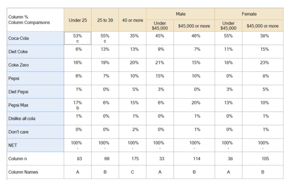
It is common for crosstabs to contain more than two variables. For example, the table below shows four variables. The rows represent one categorical variable, which records brand preference, and the columns represent age and income-within-gender.
Crosstabs are routinely created with many more variables. For example, each row and each column may represent a different variable.
When working with crosstabs that involve more than two variables, you can explore more complex relationships and interactions within your data. For example, you might create a multivariable crosstab to examine how age, income, and gender influence brand preference, revealing deeper insights into consumer behavior. These multivariable crosstabs allow you to uncover intricate patterns and make more informed decisions by showing how multiple factors work together to influence outcomes.
Key decisions when creating a crosstab
In addition to selecting which variables to include in a crosstab, it is also necessary to work out which statistics to show. In this example, column % and the sample size for each column is shown.
A second key decision is how to show statistical significance. The example above uses lettering, which indicates whether a column is significant to another specific column. Alternatively, tests can be used which show whether a cell is different from its complement. Some crosstab software solutions can automate this process.
Handling missing data in crosstabs
Any researcher knows that missing data is part of the game. When creating crosstabs, it’s important to decide how to handle these missing data points. You might choose to exclude missing data from the crosstab analysis, use imputation techniques to make an educated guess based on the other values, or categorize them as a separate category to observe any patterns.
It is usually considered best practice to implement multiple imputations – whereby you create multiple possible values for each missing data point, thereby accounting for the uncertainty about what the true value might have been. Proper handling of missing data ensures that your crosstab remains accurate and avoids skewing results, especially when analyzing sensitive or incomplete datasets.
Terminology
In commercial research, the rows of a crosstab are historically referred to as stubs and the columns as banners.
Want to learn more? Our Crosstab Builder helps you learn how to build crosstabs step-by-step.


