


If you’ve ever wondered which country drinks the most wine, some familiar suspects might have flashed across your mind. Maybe you thought of the famously snobbish wine drinkers, the French? Maybe those Italians and Greeks, whose idea of a healthy diet includes a glass a day? Or perhaps those notorious beer drinkers, the Germans, might also like their wine? Could it be the United States, always so proficient in the consumption stakes? Let’s have a look at our contenders.
Decanting the Data
Countries by wine consumption in mhl
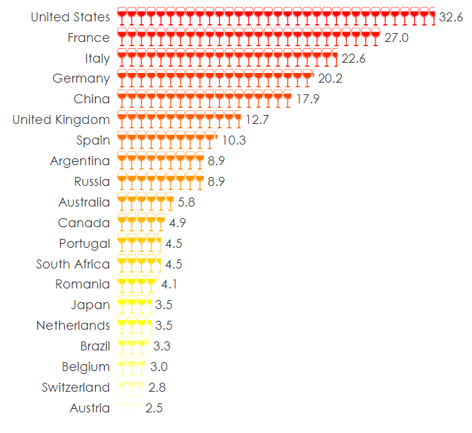 If you picked the United States, raise a toast! Americans consume the most wine out of every nation on the planet, clocking in at a whopping 32.6 million hectoliters. That’s right, hectoliters, as in a hundred liters. The next four countries are our usual suspects, with France, Italy and Germany representing Europe as wine central.
China rounds out the top five. But if the rest of our nations want to hold onto their spots, they better hit the bars. China is climbing fast both in terms of national wine production and consumption. Mirroring the meteoric rise of the United States from sixth in the world in the early 1990s to claiming the top spot for consumption in 2016, China has seen a similar rise. China also now only trails Spain in total area of wine cultivation and is expected to overtake Spain within the next few years. With wine becoming increasingly popular in China and a population of over 1.4 billion, the potential boom for the Chinese market is sky-high.
But if you think you know who the booziest country in the world is now, think again. Just looking at the data for total consumption doesn’t tell us the whole story. Looking at our visualization for wine consumed per capita for the same countries, we’re thrown for quite the plot twist.
Countries by wine consumed per capita in liters
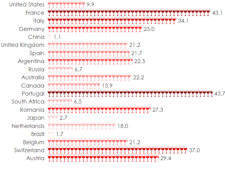
The United States doesn’t even make the top three! Instead, that honor goes to the Portuguese, followed by the French. In fact, the U.S. even falls short of their great rivals to the North, the Canadians. Ooh, la la indeed! Perhaps surprisingly, the Swiss round out our top three. Our data visualization has a custom color palette from dark reds to light pinks, representing the variation in amounts.
Interestingly, China actually falls bottom of this metaphorical wine glass with only 1.1 liters consumed per capita – highlighting just how massive the gap in their market is and how monumental their potential for growth is. Does anyone want to partner up and open a bar in Shanghai?
But wait…there’s more!
Top destinations for wine consumed per capita
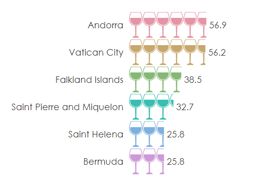
Andorra and the Vatican City come out of absolutely nowhere to trounce the rest of our top countries for wine consumed per capita. This visualization shows some of the most concentrated areas of wine drinkers. Tiny Vatican City, with an area of 44 hectares and just 1000 citizens, manages to pack away a stunning 56.9 liters per capita. It must be all those clergymen running about!
So who really is the booziest country in the world?! Well, technically, it’s Andorra!
Interactive Geographical Map
Of course, a pictograph bar chart like we’ve done above isn’t the only way to show this data. A cool visualization you might want to use to show your own data is the interactive geographical (choropleth) map. Hover over each country and the map will tell you how many liters of wine each country consumes per capita. Like the pictographs, this map is also color-coded to represent which countries consume more or less wine. You can also zoom in and out of this visualization as you please.
Were you surprised that the answer is Andorra? We sure were! If you want to recreate these visualizations, you can access and play with the original Displayr document here. Even better, you can read the step-by-step tutorial for how we created them here, and do the same thing with your own data!
Learn how we made these vizualisations, or check out more fascinating data stories!