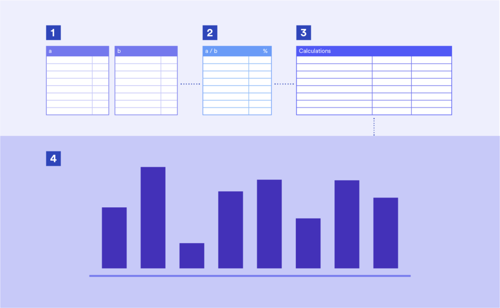
A typical workflow using “interim” calculations
The creative market researcher always seeks to go beyond the limitations of the source data and add value. One way of doing this is to create new variables or data points from existing ones.
Consider a scenario where there is a desire to plot:
- market penetration, an existing variable (“Ever”) …
- against adoption rate, a new dimension created by dividing the result for “Monthly” by the result for “Ever”.
A typical workflow might be …
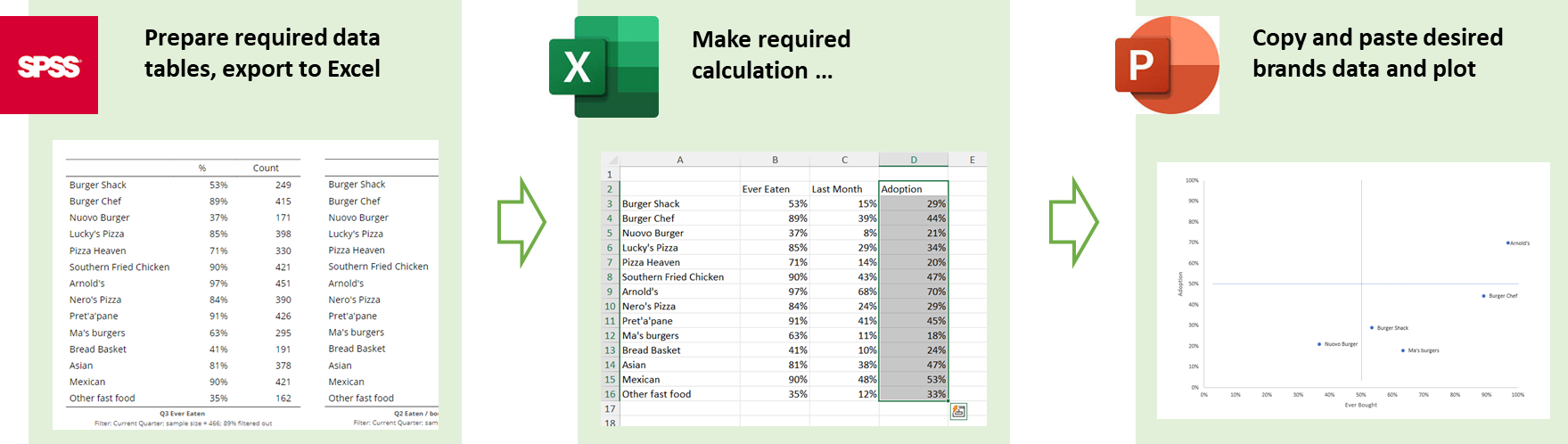
There are however potential problems with this approach:
- If the output needs to be updated, for example when there is new data added, many if not all the steps need to be repeated.
- If the output needs to be replicated for say different filters or scenarios, this too can involve repetition.
- If the updates or replications are to be done by someone other than the original author, the need to find the right Excel Workbook and the right location within it can take up valuable time.
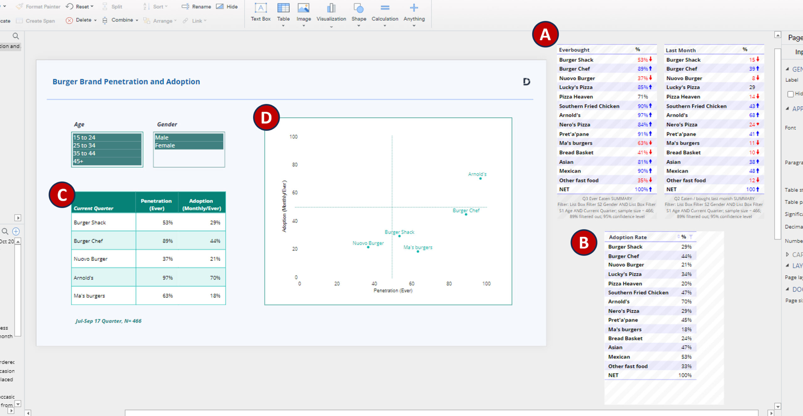
The Power of Having Everything Connected
These problems are instantly resolved by having your data, outputs, and workings housed and connected in one document, as you can do in Displayr. Zooming out in this example we can see the following set up.
- A) Hidden tables for the two source questions, “Ever” and “Last Month”.
- B) A hidden calculation, dividing the results for “Last Month” by “Ever”, our adoption ratio.
- C) A Calculation Grid, extracting brands from A and B and linking data via cell references.
- D) A scatter-plot visualization linked to C.
There are also some filter controls top left and a dynamic date filter applied to all inputs so the analysis will always show the most recent quarter as the data is updated.
Hidden items (indicated by grey cross-hatch shading) means that the document editor can see the output but it will not be shown when published to a dashboard or exported to PowerPoint.
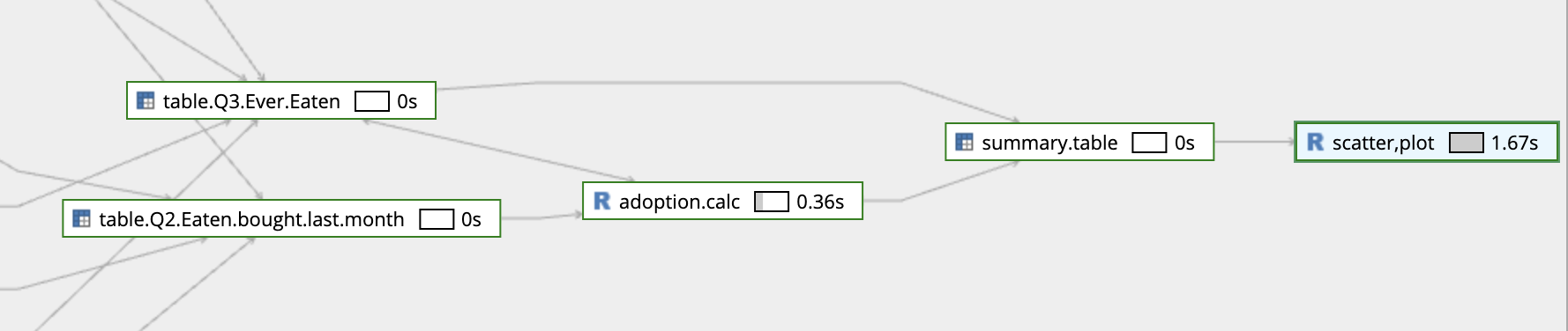
If someone comes to edit the document later the relationships are easily identified via Displayr’s dependency graph (right click on an item to find it). The scatter plot is created from the summary table, the summary table is a combination of Q3 and the adoption calculation, and so on. This addresses problem 3 noted earlier (difficulty in tracing workings when they are in a different place).
But the real benefits kick in when it comes to updating or replicating this output (problems 1 and 2). It should be self-evident but watch in this video how seamless it is to create new versions of the framework via filtering and updating it with new data … even the footer descripting the sample date and size changes.
If you want to take a closer look and study the workings in detail, you can get a copy of this document here: Embedded Workings