

Ok, ok, this blog’s title would be a bit more accurate if the word “often” appeared in the title. In my defense, all the anti-pie chart trolling provoked me! Troll HQ, Wikipedia, writes “Statisticians generally regard pie charts as a poor method of displaying information”. Ouch! And a curious error of logic hides here. Let me give you a hint: who hires statisticians to design visualizations?
Before I jump into the detail of my thesis, let me jump straight to some examples, as many people that hate pie charts really just hate ugly pie charts. Below I show both an ugly and an amazing pie chart. I am sure we can all agree that one of these deserves contempt. But, are they both so bad?
The redoubtable Michael Friendly has written a 14 page treatise, Save the pies for dessert, denigrating the pie chart, in which he says:
I have read every research study that I could find that tested the effectiveness of pie charts versus other means of displaying quantitative data … and have found only one advantage that can confidently be attributed to pie charts. Unfortunately, this one strength is rarely if ever useful.
Despite this denigration, businesses use them all the time. Why? Is it that business people are dumb, and that they are all making the same mistake? No. It is not. The problem is that the implications of the research studies used to criticize pie charts are greatly over-stated. And some are junk science.
Compare the column chart of the same data. Yes, it is better than the ugly pie chart. It is, however, markedly inferior to a pretty pie chart.
A simple visual experiment demonstrates the power of the pie chart.
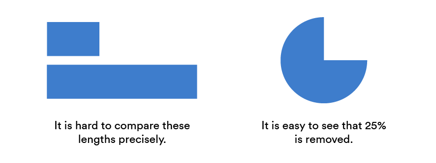
Look at the two bars. How long are they? There is no way you can tell without labels. You cannot even tell their relativity without a ruler. If I were to tell you that the bar above was one-quarter the length of the one below, you may well believe me. Short of using a ruler, you will never know for sure. Now look at the pie chart on the right. It is clear that the missing slice is 25%. Not 27% and not 23%. Sure you cannot tell if it is 24.5%, or perhaps 25.3%, but you can readily see that it is very close to being precisely 25%.
Pie charts tap into our instinctive ability to assess proportions when we look at things. As a result, we should consider the pie chart whenever we need to communicate proportions. There are lots of situations where proportionality is key. For example, as we can all recognize a straight line, a pie chart showing voting preferences is the safest way to communicate whether a political party has a majority or not.
Our instinctive love of pies
Our ability to interpret proportions is hard-baked into our brains. Surviving on the savanna frequently required us to look at objects and assess proportionality. How much of the apple have we eaten? How much water do we have left in the gourd? How much of the cake is left? Evolution has given us the skill to assess proportions instinctively.
We continue to train this skill teaching fractions using pie charts. This is why in the example above you get to exactly 25%, as your brain reaches back to junior high fractions and geometry. Watches and clocks require the same skill, which is why some people use watches without numbers and ticks. Most importantly, we regularly practice these skills when dividing up a pizza.
So, the first great strength of the pie is that we are really good at reading them. Of course, it is lot easier to make a bad pie chart than a bad pizza. Consequently pie charts often get a bad rap. The biggest problem with normal pie charts is the labels. You will see in the example below, that with a bit of love (from my colleague Michael Wang), this is a solvable problem. Nevertheless, the pie chart is still far from perfect, but this one makes it easy to see that there are many browsers out there, with Chrome 48.0 dominating the market.
If you want to play around with these examples, or plot your own data so that it looks like the examples in this blog, click here.
Sorting helps
If we sort, we end with something a whole lot better. Our brain can easily work out from this chart that two browser versions, Chrome 48 and IE11, make up more than half of the market in our data. Again, we can do this instinctively, as we can see that their combined shares are bigger than a semi-circle. The only way to get that from the comparable bar chart would be to add up all the numbers. The point of a visualization is to let the viewer see the patterns, not to provide numbers that they can then add up. Thus, the pie chart wins hands down for data like this.
Even the brands that are too small to plot are taken care of. We end up with a beautiful visual effect as they fade into obscurity on the left-side. However, you can hover over them with your mouse to see the tooltips, thus losing no information. In a bar chart, these would likely have been merged into an unhelpful “others” category.
Donuts are even better when you have lots of categories
We can also scoop out the middle of the pie to create a donut, and use the new-found space to add more labels, if we have the need.
As shown at the beginning, we can add even more clarity by nesting a pie chart within the donut. This final visualization allows us to quickly see that Chrome is more than half the market, and that the lion’s share of this is achieved by Chrome 48.
This analysis was done in Displayr. To see Displayr in action, grab a demo.
Acknowledgements
Both the style of the pie charts shown here, and the donuts, draw heavily on examples by Highcharts.
