
It is hard to believe that PowerPoint has been around since 1987. This makes it one of the most enduring software applications in market.
However, it is also much maligned – a quick Google search on the often-heard phrase “Death by PowerPoint” yields 109 million (!) hits. Most of the criticism in the returned articles is directed at slide content and design. From our experience, there are some very good PowerPoint slide designers out there (so lesson number one is to find and secure the services of such a person). One of the main barriers in telling a clear story (the content) is finding the time to hone and craft that story into as succinct a form as possible.
When it comes to working with the unique challenges of survey data these time-related problems can be compounded.
- Working up a set of analyses which will form the report can take longer than expected. This compresses the time designers have to work their magic between then and when the report is to be delivered
- In working from analyses to report build, data is often exported in “rough” form to PowerPoint or Excel, but still must be cut, pasted, (into a charting tool, for example) and edited by someone. This can be a tedious and error-prone process. Additionally, if the research analyst is distracted by slide and chart design during this process it probably is not the most effective use of their time (and why this part of the process can take longer than expected!)
- When a data update for a periodic tracking or syndicated report is in, having to organize a team to cut and paste data into the existing report – again tedious, resource-hungry and error-prone
- A data problem is discovered late in the process, (e.g. incorrect filter or weighting), even when the report is near-ready, and some or all of the charts needs to be updated. This can result in late, stressful nights, cutting, pasting, and hand editing. Still tedious, still error prone, and therefore risking further mistakes
- A standardized report needs to be produced for multiple events – different products, different geographic markets, different customer departments. Once again, a task that would be typically done via cutting, pasting, and editing, and therefore time and resource hungry.
Do any of these scenarios sound familiar? Thankfully software tools are evolving to deliver new PowerPoint exporting features that make it easier to link data to charts and open up a whole world of automated reporting.
Decide up front if you will be making final edits in Displayr or PowerPoint
This is a key step towards ultimate efficiency
- Final Edits in Displayr: using this approach you would produce a new document each time you publish. By doing everything in Displayr you have the highest level possible of automation and quality control
- Final Edits in PowerPoint: u sing this approach Displayr updates the numbers in an existing document. You have more control of the look and feel using PowerPoint. Your Displayr document need not be pretty, as PowerPoint is where the design steps are being done. This might be more suited to team based work-flows, where different people are doing the analysis and design (see below)
These alternatives are explained in more depth here: Report Automation
Working more efficiently in teams
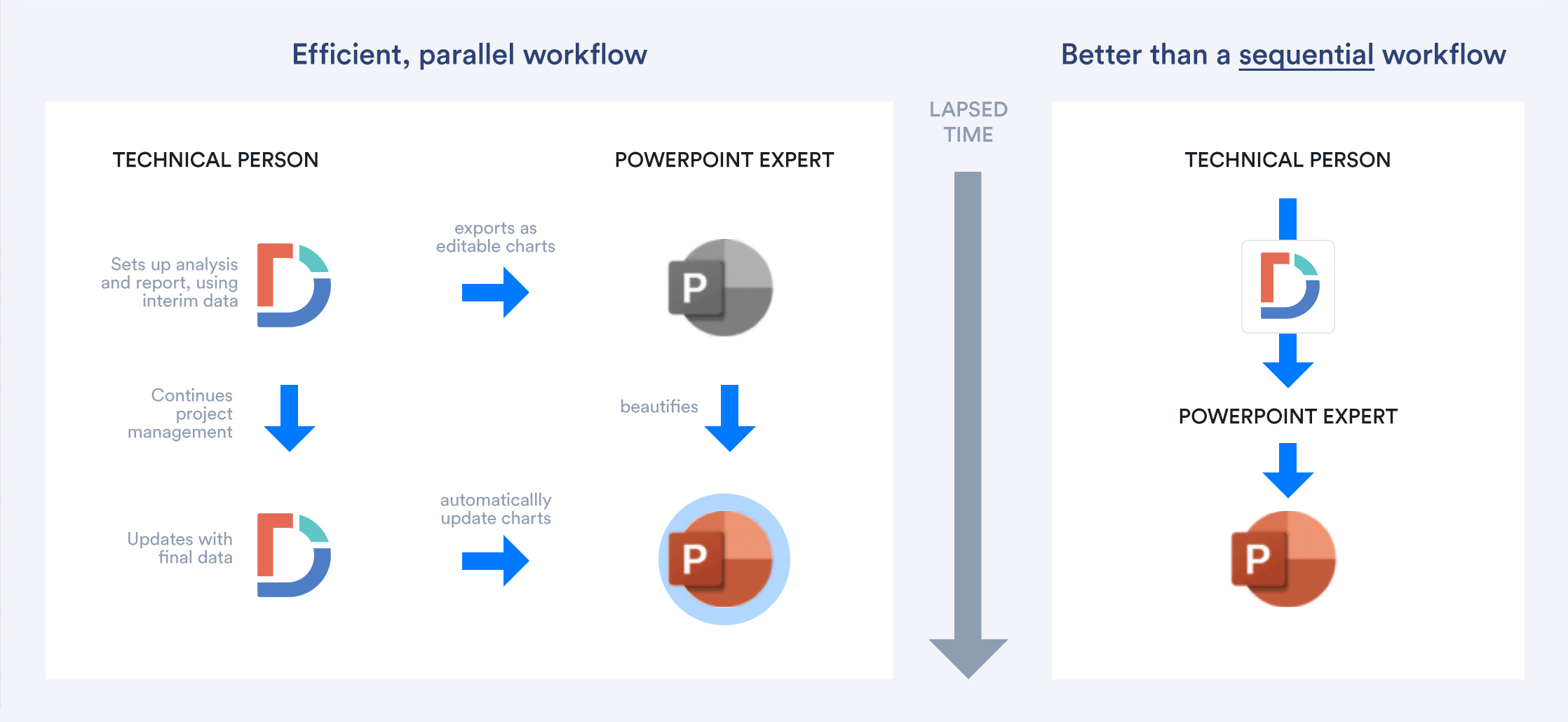
In many research companies the tasks of analysis and making PowerPoint charts beautiful are conducted by different people. A typical approach is for the analyst(s) to complete their data story first and hand it on in some form to the PowerPoint expert – essentially a sequential approach.
Displayr now allows the researcher to “rough in” their analysis, create a new document when exporting to PowerPoint, and have all the elements in that new document directly linked back to the data. Displayr does this by creating a Globally Unique Identifier code (GUID) for each element.
The PowerPoint can be edited and beautified by a designer. If and when the data changes the report can be automatically updated from Displayr (via the GUID).
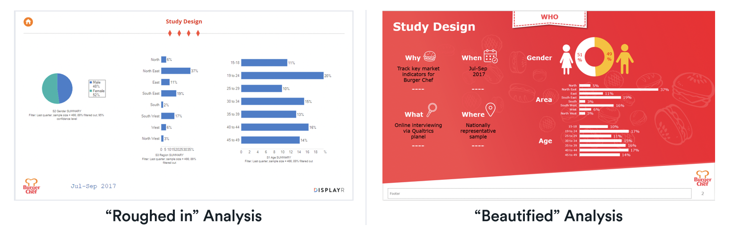
So, an organized research analyst can take advantage of this feature by working with the PowerPoint expert in parallel. The report can be “roughed in” with interim or incomplete data and the PowerPoint expert start working earlier. This can lead to better looking reports and faster project turnaround times. The researcher needs not be distracted by PowerPoint chart editing and slide layouts as they work, which is a productivity gain for them.
You can see an example of this in action here:
Fixing last minute data problems or other data updates
The creating and updating of editable PowerPoint charts is particularly useful for continuous survey work, where the data is regularly updated (as with the example above).
It also has broader applications. Any survey-based project – whether being run by a team or a more self-contained researcher – can benefit from being set up in a way that allows for charts to be edited in PowerPoint and automatic updating to occur if and when required.
Consider the following scenarios:
- Well into the process a problem with the data is found… it could be an inappropriate filter has been used for many tables or charts; some external data has been found that suggests the data needs to be re-weighted; or even worse – a problem with the questionnaire script has been picked up and some new data has had to be collected to cover the gap (it happens). All of these situations would normally involve cutting and pasting data into PowerPoint, effectively a do-over (which can be heartbreaking). In these specific cases, this work is often done at the last minute, perhaps late at night, and under a lot of stress (providing scope for further error). Imagine the joy of being able to update the report to reflect these changes, in a few clicks.
- During the delivery of the report, perhaps a few edits to the PowerPoint were made on-the-run. The client likes what they saw and would actually like to top up the sample to improve the reliability of some of the numbers. This, historically, would be tedious work. It is comforting to know this task could be performed with ease with these modern software tools, in a way that both retains any edits to the PowerPoint and changes to the data
- Similarly, a client was so happy with a project run last year they want to do it again, as an update (this also happens). Imagine being able to change just a few items, update the report with this year’s data, adjust the commentary, and be ready to present.
Long term or “legacy” trackers
A good tracking study or syndicated report will have been in service for a long time. We have come across cases recently where the companies involved hire casual labor at key times in the reporting calendar to work at night to update such reports with new data, essentially exporting data to Excel and having it cut and pasted into the report.
To address this situation, you can link the Displayr data to a pre-existing chart in PowerPoint, using the GUID code mentioned earlier, in a few simple steps.
- You select the object in Displayr
- In the “Properties” tab (in the Object Inspector on the right-hand-side of the screen), the GUID information is available. Drag the cursor across it, right-click, and select “Copy”
- Then find the corresponding object in PowerPoint (be it table, chart, text box, or other object); select it, right-click on the outer edge of the frame, and select “Edit Alt-Text”, and Ctrl-V to paste the GUID into the box
The PowerPoint object is now linked to the source data and can be updated if and when that data ever changes.
You can see an example of this in action here:
While this itself is a set of manual steps, once this linking back is done the PowerPoint report can be automatically at any time from that point forward. A small effort now results in a long-term productivity gain.
Producing multiple versions of the same report
We have seen some wonderful examples of one page “dashboards” – for example to summarize the outcomes of a multiple product test, via one page per product.
This same “one page” approach can be used to convey segment snapshots in segmentation research. Even multi-country or multi subscriber syndicated research can feature template-based reporting.
To perform these tasks, an analyst would typically need to create data filters for each reportable event. A report template can be set up in Displayr and when exporting to PowerPoint (or PDF), using the “update” function you can automatically create reports for each filter selected.
You can see an example of this in action here:
Long live PowerPoint!
The new breed of PowerPoint exporting tools addresses some long-standing issues in survey research. Creating or linking PowerPoint elements that can be automatically updated from such tools not only saves a lot of time and cuts down the risk of errors (by eliminating the practice of tedious cutting, pasting and re-editing), it can also promote new and better ways of working in teams.
All of this gives you much more control of your PowerPoint use and frees up time to work on other things. Learn more PowerPoint automation in Displayr.