
Infographics, dashboards, and reports often need to highlight or visualize a single number. But how do you highlight a single number so that it has an impact and looks good? It can be a big challenge to make a lonely, single number look great. In this post, I show 12 different ways of representing a single number. Most of these visualizations have been created automatically using R.
When to create a visualization to represent a single number
There are a number of situations in which it can be advantageous to create a visualization to represent a single number:
- To communicate with less numerate viewers/readers;
- Infographics and dashboards commonly use one important number;
- To attract the attention of distracted or busy viewers/readers;
- To add some humanity or "color", to create an emotional connection;
- Or to increase the redundancy of the presentation (see Improve the Quality of Data Visualizations Using Redundancy).
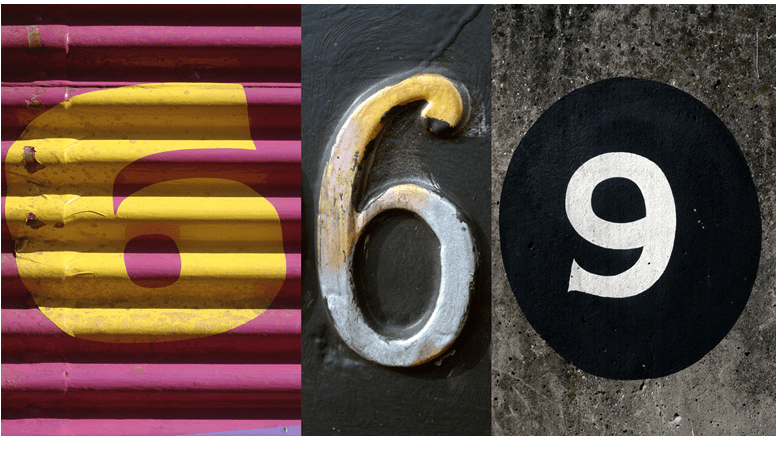
Option 1: Standard text formatting: font, size, style
Sometimes the plain text is the best option. Make fonts big and simple so they stand out.
669 people died
Option 2: Informative formatting
Colors, bolding, emphasis, and other formatting options can be used to draw attention to figures and to communicate additional information. For example, the red font could draw attention to low results. Example: Sales declined by 23%.
You can do this in a sentence or in a visualization, such as in the bar chart below, where color is used to encode statistical testing results.
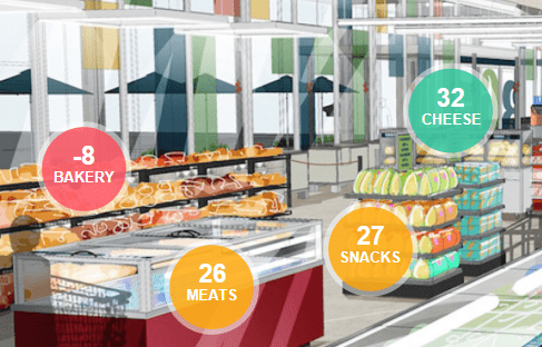
And you could also use informative formatting via a colored background for numbers, as in the visual confection below. In this instance, traffic-light coloring indicates the relative levels of performance of different departments in a supermarket.
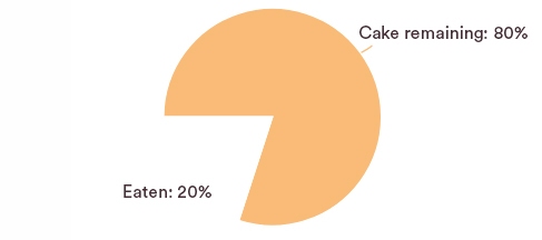
Option 3: Pie charts
Proportions are often illustrated using pie charts with varying degrees of success. They can be particularly elegant for displaying single numbers that are proportions.
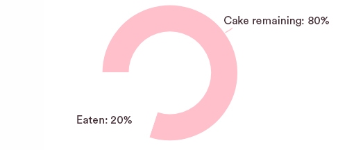
Option 4: Donut charts
Similarly with donut charts. It's just a matter of taste.
Option 5: Portion of an image
The two-category pie chart and donut chart are special cases of a more general strategy, which is to show a portion of an image.
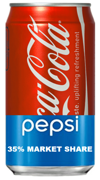
Option 6: Overlaid images
A twist on showing a portion of an image is to proportionally color an image.


A common, but misleading, criticism of overlaid image visualizations and all the pictograph type of visualizations is that they are imprecise at best, and innumerate at worst. The three visualizations above have all been created to illustrate this point. The one on the left is not too bad. The President Trump approval visualization can readily be criticized in that the actual area shaded in blue is less than 37%. This is due to the greater amount of whitespace over the shoulders. Particularly problematic is the age visualization. This implicitly compares a number, 37, against some unknown and silly benchmark implied by the top of the image.
While such criticisms are technically correct, they are misleading. Consider the "worst" of the visualizations, which shows the average age. The purpose of the visualization is simply to communicate to the viewer that the average age figure is in some way low. How low? This is communicated by the number at the base. If the actual correct number is shown, there is little prospect of the viewer being misled. However, showing a number without the visualization runs the risk that the viewer fails to notice the point at all. This leads to a much higher error.
Furthermore, there are many contexts in which precision is not even important. How often is half a glass of wine actually precisely half a glass?
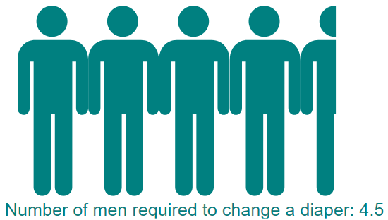
Option 7: Countable pictographs
While all pictographs have a bad reputation, in the case of the countable pictograph, it is quite undeserved. Countable pictographs achieve redundancy and thus likely improve the accuracy with which the underlying data is understood by the viewer.
Option 8: Uncountable pictographs
The goal of the uncountable pictograph is to suggest, in a graphical way, "big". It is often most useful when next to a comparable countable pictograph.
Option 9: Dials, gauges, and thermometers
This data is from a study by the Pew Research Center. Go to the original report for a better visualization, which uses a thermometer.
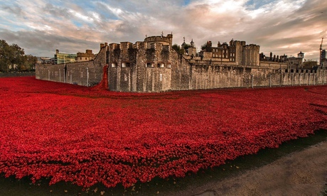
Option 10: Physical representations
This photo, from The Guardian, shows 888,246 ceramic red poppies installed around the Tower of London. Each poppy represents a British or Colonial serviceman killed in World War I. It is the same basic idea as the uncountable pictograph but on a much grander scale.
Option 11: Artwork/graphic design
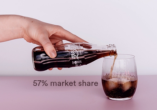
Option 12: Evocative collages
And finally the most common of all approaches in marketing reporting is to find an image or images that in some way represent, or evoke, something relevant to the number.
Software
You can only create the visualizations in option 2 easily in Displayr. The visualizations in options 3 through 8 were all created using the open-source GitHub R packages /rhtmlPictographs and /flipPictographs, which were created by my colleagues Kyle and Carmen.
Create your own visualizations
Everyone can access the Displayr document used to create these visualizations here. To modify the visualizations with your own data, click on each visualization and either change the Inputs or modify the underlying R code (Properties > R CODE).
Acknowledgments
Google's gauge inspired the gauge in this post. I haven't been able to find any copyright information for the beautiful Coca-cola photo. So, if you know where it is from, please tell me!