Choosing Color Palettes in Displayr
The choice of colors in data visualization is crucial in allowing important features to be clearly seen and compared. Displayr has a collection of palettes that can be used with categorical, ordinal and numerical data.
Qualitative color palettes
When showing categorical data that is ordered arbitrarily, you will generally want to use one of the qualitative color palettes. These colors are chosen so that the categories can be readily distinguished without emphasizing any particular category.
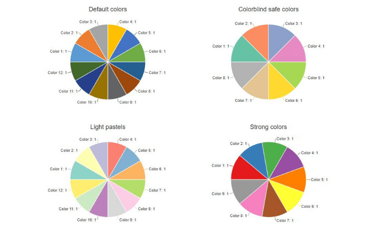
Displayr offers four qualitative palettes:
Default colors: based on the Microsoft Office palette (12 colors)
Colorblind safe colors: also known as Colorbrewer’s Set2 (8 colors)
Light pastels: Colorbrewer’s Set3 (12 colors)
Strong colors: Colorbrewer’s Set1 (9 colors)
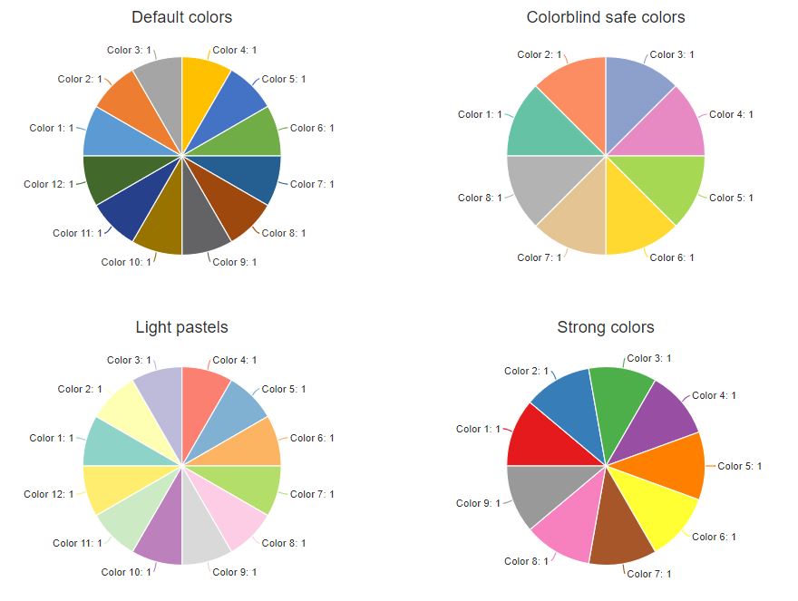
If the number of categories is larger than the number of colors in the palette, Default colors will recycle through the same colors. For the other 3 palettes, the colors will be slightly modified. This ensures that the categories will still be shown in unique colors, but some of the categories may not be easily distinguishable.
Divergent color palettes
For numerical or ordered data, divergent or sequential color palettes can be used. Divergent color palettes are typically used when we want to show both the high and low extremes compared to a central reference value. Displayr offers two divergent palettes: Rainbow and Spectral. (More combinations can be created with Custom palette, demonstrated later in the article).
Rainbow colors
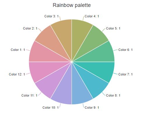 The rainbow palette offered in Displayr is a modified version of the standard red-green-blue (RGB) rainbow palette (from the colorspace package). The palette varies the hue while holding the saturation and luminance constant. This reduces artificial banding perceived using the standard RGB palette. (This also means that if you photocopy the chart in black and white the whole palette will be the same shade of grey). The colorspace correction also does not avoid the problem that the color spectrum is circular. As such it does not create an intuitively understandable gradient.
Spectral colors
Those wanting to use a quantitative palette varying from red to yellow to blue may want to try Colorbrewer’s spectral palette instead. In the following chart, we use the spectral palette to show the corruption perception index globally in 2017. The different colors in the palette make spatial groupings of countries with different levels of corruption immediately obvious.
Sequential color palettes
In contrast to the divergent palettes, sequential color palettes focus on the contrast between high and low values (i.e. the central values are not emphasised). A single-hue palette often allows easier comparison of quantitative differences. They also have the advantage of being colorblind safe.
Theoretically, the palettes consisting of Reds, Blues, Greens or Greys are interchangeable. But there are some objects that are automatically associated with particular colors. For example, imagine if the color palettes for the following charts were interchanged.
We have also included two multi-hue palettes that are used in the physical sciences: Heat and Terrain. Both of these palettes come from the colorspace package. Unlike the base R palettes, they have been corrected so they do not have artificial banding. They also vary in lightness and saturation at the same time as varying in hue. This redundancy means they are colorblind and photocopy safe.
We use both color palettes to visualize the same bivariate density. As you can see, finer graduations can be seen at low values of the heat palette; terrain colors show more detail in the higher values.
Custom gradient
For more flexibility, you can create gradients between any two colors, by selecting Custom gradient. For better contrast, choose colors that differ in saturation and lightness as well as hue.
Custom palette
To specify more than two colors, there is also the option of Custom palette. As this is the most flexible option in the colors menu, the input format is slightly more complicated. You will need to input the colors as a comma separated list of hex codes (six digit HTML codes that refer to specific hues). Any number of colors can be provided. This format allows custom or brand colors to be easily copied to multiple visualizations.
The treatment of the colors depends on the type of chart selected. If categorical data is expected (e.g. pie charts or stacked bar charts), then the colors specified in the custom palette will be taken as is. However, if continuous data is expected (e.g. heat maps, geographic maps and scatter plots with colors shown as a numeric scale), interpolation will automatically be applied to the colors supplied. Below, we create a divergent gradient by specifying three colors. For these type of gradients, the middle color is typically a neutral (white, grey or black). The geographic map below shows voting results by state. Because of the colorscale has a clear mid-point (white), we can immediately identify borderline states.
The examples in this articles are available here. You can play with the settings and try different color palettes or add your own data.
Ready to start using your favorite color palette? Get started with Displayr!