
In this post I explain the difference between the two techniques, and their relative strengths and weaknesses. I assume that you already are familiar with correspondence analysis, but if not, then consider first reading How correspondence analysis works (a simple explanation).
The core difference between correspondence analysis and multiple correspondence analysis
The name, rather obviously, suggests that multiple correspondence analysis should be better than correspondence analysis. Multiple = more = better. And this gets to the root of the problem: the word “multiple” is misleading, except in an exotic technical case, which I will return to below.
For most purposes the way to think about the two techniques is this:
- Multiple correspondence analysis is a technique for analyzing categorical variables. It is essentially a form of factor analysis for categorical data. You should use it when you want a general understanding of how categorical variables are related.
- Correspondence analysis is a technique for summarizing relativities in tables. As tables are ubiquitous in data analysis, it is a technique that can be used widely.
Both techniques give the same answer when you have two variables. You can also use both of them for more than two variables, but they give different answers. I illustrate this below.
The reason for the word “multiple” is that multiple correspondence can be applied to a table that has more than two dimensions (e.g., a cube), whereas correspondence analysis requires as an input a table with only two dimensions. So, the word “multiple” refers to the number of dimensions of the input table. Below I show you a five dimensional table so you can get a better idea of what this means.
This analysis was done in Displayr. To see Displayr in action, grab a demo here.
Book a demoAn example of multiple correspondence analysis
The scatterplot below shows a multiple correspondence analysis of five variables: voting in the 2008 and 2012 US elections, approval of President Trump, age, and gender. The key conclusions from it are that:
- People aged 18 to 24 were less likely to vote and more likely to have no opinion about Trump.
- Approval and disapproval is correlated with candidate-party choice for 2012 and 2008.
The problems with multiple correspondence analysis
Difficulty in checking the input data table
The above plot seems pretty useful. And, multiple correspondence analysis can be useful. Nevertheless, it has some serious limitations. The first limitation is that it is extremely difficult to check conclusions by looking at the raw data. Check out the table below. Note the scroll bars: it is a really big table. It is a five-dimensional table. It shows counts, as it is difficult to even think about how to compute percentages on a five-dimensional table.
Inability to confidently evaluate associations
The next limitation relates to the interpretation of the relationships between the variables. As discussed in How to interpret correspondence analysis plots (it probably isn’t the way you think), if we have the appropriate normalization, when we use correspondence analysis we can understand the association between labels from different variables by drawing a line from each label to the origin, and taking into account the lengths of these lines and the angle where they intersect with the origin. Unfortunately, with multiple correspondence analysis, there is no normalization that permits all such comparisons. Consequently, we always need to check the raw data. But, as just discussed, that is not so easy. Hence, with multiple correspondence analysis we have an increased risk of misinterpretation.
Further complicating the problem with looking at associations is that multiple correspondence analysis tends not to explain all the variance. In the map shown above, 16% of the variance is not explained. As we cannot inspect the data, this is a problem.
Messiness
The next problem relates to messiness. With more than five or six variables, the resulting maps are really hard to use. As an example, take a look at the one below. What makes it so hard is that it plots every level of every categorical variable. Often this means that redundant information is plotted (e.g., the “yes” of a two-category, and, at the opposite side of the map, the “no” for the same variable). As I will show you soon, we can get a good visualization of this data using correspondence analysis.
Unfocused
Last, multiple correspondence analysis produces unfocused analyses. What do I mean by this? In the analysis above, we are looking at the relationship between 17 variables relating to traits that people want in a US president, and age. The analysis treats all of the variables as being equally important. It will show the strongest relationships. That means that we will end up with a plot that explains how preference for the traits relates to age if and only if there is a very strong relationship between preferences for these characteristics and age.
This analysis was done in Displayr. To see Displayr in action, grab a demo here.
Book a demoCorrespondence analysis with multiple variables
The messy plot above represents a multi-dimensional table, that has 17 different dimensions. Sixteen of the dimensions have two levels each (i.e. if a person mentioned a trait or or not). The final dimension, age, has six levels. Thus, the input table has 2^16* 6 = 393,216 cells! Much too many to read. The table below uses the same 17 variables, but only has 96 cells. This is because rather than each of the trait variables being an extra dimension with two levels, we are just showing one of the levels and “stacking” them on top of each other as rows in the table. For example, 69% of people aged 18 to 24 said they wished for an American President that was Decent/Ethical, and 33% of people in this age band want The President to be Plain-speaking.
The multiple correspondence analysis shown in the previous section was based on the same data. However, it was based on the underlying variables. With correspondence analysis we first need to create a table. This is really what makes correspondence analysis so useful. We get to create a table in such a way that we focus on what we want to know. As this table compares age by the 16 variables, it will produce a plot that highlights the key relationships between age and the importance of these characteristics.
The resulting plot (shown below) is a lot less messy. It tells us some things that are on face-value surprising. For example, that the 25 to 34 year olds are not so interested in a Christian president. As the analysis is based on a table, we can confirm this conclusion.
Summary
Although multiple correspondence analysis sounds better than correspondence analysis, the truth is the other way around. Multiple correspondence analysis is an obscure technique that can be useful in special circumstances. Correspondence analysis is applicable to the analysis of many different types of tables. As most data appears in a table at one time or another, correspondence analysis is a technique that can be widely applied.
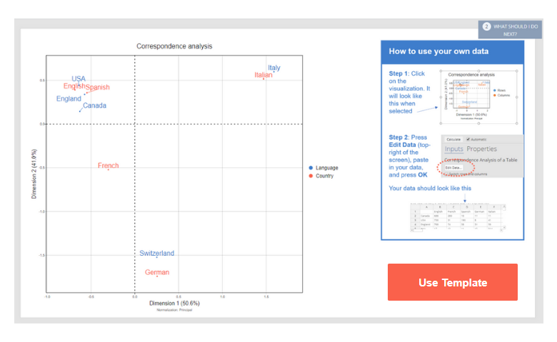
The examples used in this post have all be created in Displayr. You can create your own correspondence analysis in Displayr for free by using the template below!
This analysis was done in Displayr. To see Displayr in action, grab a demo here.
Book a demo