


This post provides examples of different types of Dashboards created in Displayr. For each dashboard you can both view the dashboard in View mode (the mode seen by the end-users), and edit the dashboard in Edit mode, to see how it works.
Microsoft KPI
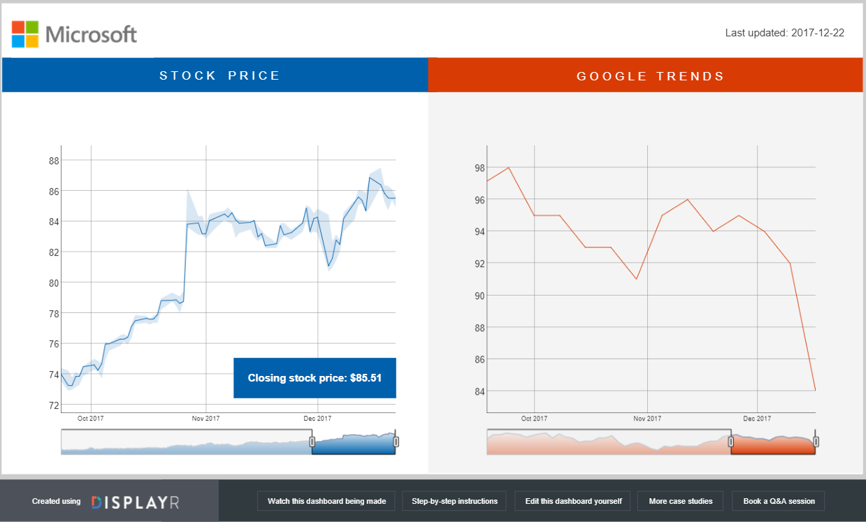
Overview: A one-page dashboard showing stock price and Google Trends data for Microsoft.
Interesting features: Automatically updated every 24 hours, pulling in data from Yahoo Finance and Google Trends.
View mode: Click here to see the dashboard.
Edit mode: Click here to see the underlying document.
Europe and Immigration
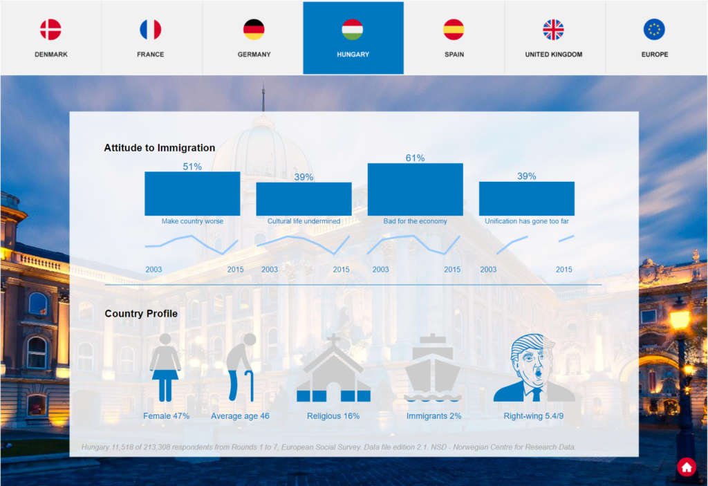
Overview: Attitudes of Europeans to Immigration
Interesting features: Based on 213,308 survey responses collected over 13 years. Custom navigation via images and hyperlinks.
View mode: Click here to see the dashboard.
Edit mode: Click here to see the underlying document.
Supermarket Brand Health
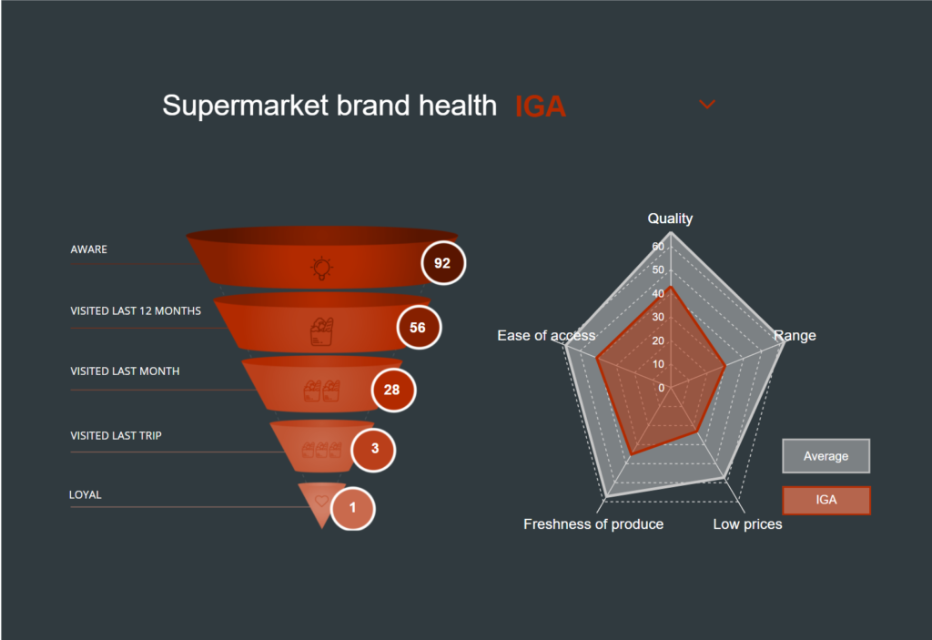
Overview: Usage and attitudes towards supermarkets
Interesting features: Uses a control (combo box) to update the calculations for the chosen supermarket brand.
View mode: Click here to see the dashboard.
Edit mode: Click here to see the underlying document.
Grocery Store NPS
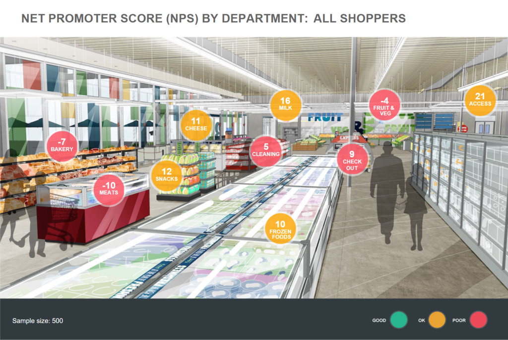
Overview: Performance by department of grocery stores.
Interesting features: Color-coding of circles based on underlying data (they change when the data is filtered using the Filters menu in the top right). Custom navigation, whereby the user clicks on the circle for a department and gets more information about that department.
View mode: Click here to see the dashboard.
Edit mode: Click here to see the underlying document.
Blood Glucose Confection
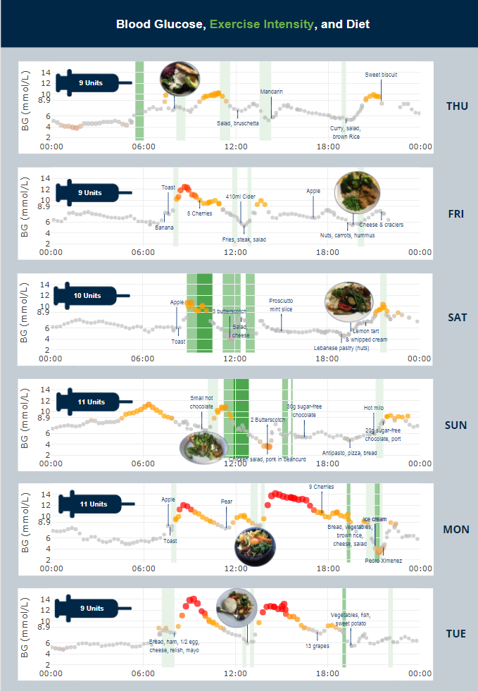
Overview: Blood glucose measurements and food diary.
Interesting features: The underlying charts are fully automated, integrating data from a wearable blood glucose implant (internet of things) and a food diary. See Layered Data Visualizations Using R, Plotly, and Displayr for more about this dashboard.
View mode: Click here to see the dashboard.
Edit mode: Click here to see the underlying document.
Interactive infographic
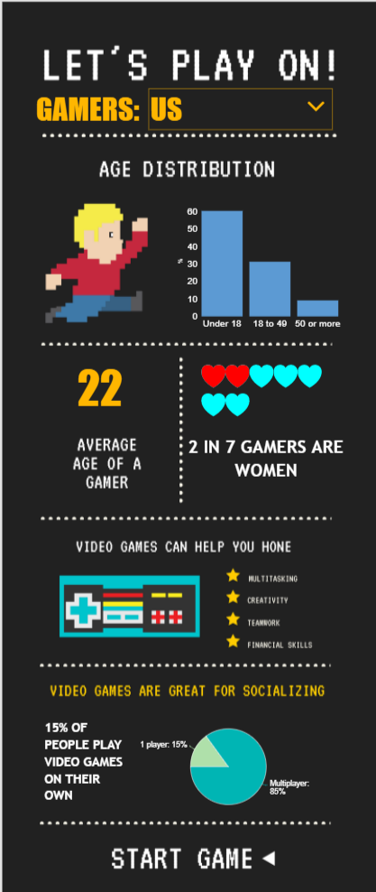
Overview: An infographic that updates based on the viewer’s selection of country.
Interesting features: Based on an infographic created in Canva. The data is pasted in from a spreadsheet (i.e., no hookup to a database).
View mode: Click here to see the dashboard.
Edit mode: Click here to see the underlying document.
Presidential MaxDiff
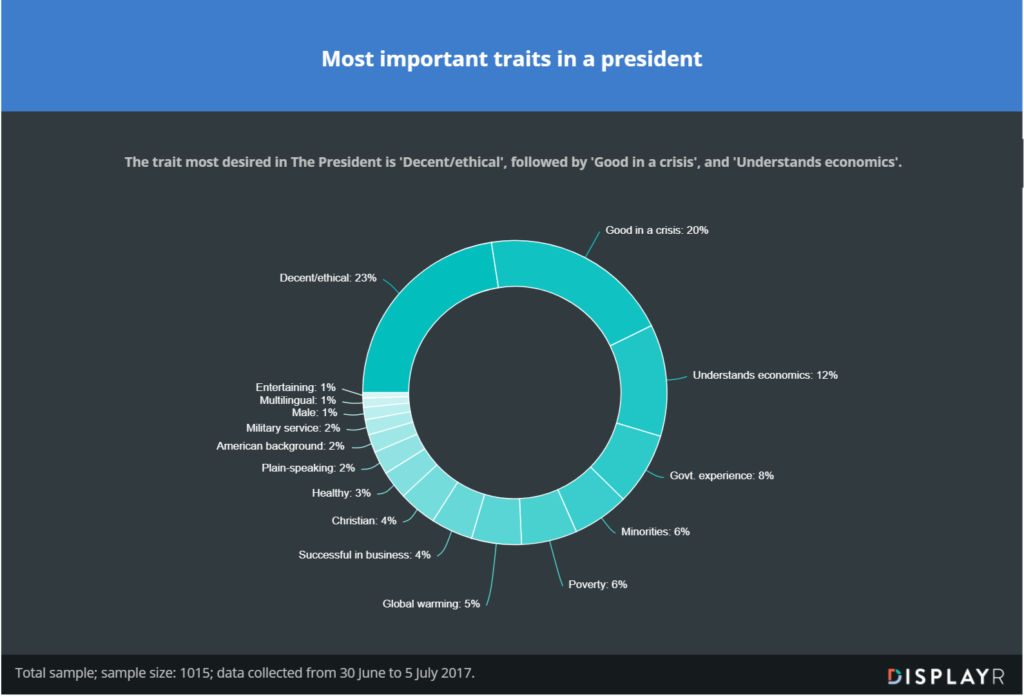
Overview: A story-style dashboard showing an analysis of what Americans desire in their Commander-in-Chief.
Interesting features: The visualizations, text, and the underlying analysis (a MaxDiff model) all automatically update when a revised data file is imported (i.e., it is an automated report).
View mode: Click here to see the dashboard.
Edit mode: Click here to see the underlying document.
Choice Simulator
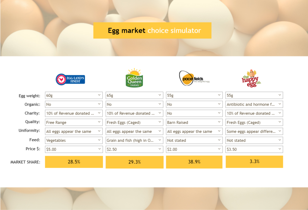
Overview: A decision-support system
Interesting features: The simulator is hooked up directly to an underlying latent class model. See How to Create an Online Choice Simulator for more about this dashboard.
View mode: Click here to see the underlying document.
Edit mode: Click here to see the dashboard.
Military Aircraft
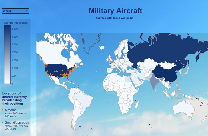
Overview: A map showing the number of military aircraft by country and the real-time position of some military aircraft.
Interesting features: The dashboard regularly scrapes the relevant information from the web. See How to Build a Geographic Dashboard with Real-Time Data for more about this dashboard.
View mode: Click here to see the underlying document.
Edit mode: Click here to see the dashboard.
