When building a predictive model, it is often practical to improve predictive performance by modifying the numeric variables in some way. In statistics, this is usually referred to as variable transformation. In this post I discuss some of the more common transformations of a single numeric variable: ranks, normalizing/standardizing, logs, trimming, capping, winsorizing, polynomials, splines, categorization (aka bucketing, binning), interactions, and nonlinear models.
The goal of feature engineering for a numeric variable is to find a better way of representing the numeric variable in the model, where “better” connotes greater validity, better predictive power, and improved interpretation. In this post I am going to use two numeric variables, Tenure and Monthly Cost, from a logistic regression predicting churn for a telecommunications company (see How to Interpret Logistic Regression Outputs for more detail about this example). The basic ideas in this post are applicable to all predictive models, although some of these transformations have little effect on decision tree models (such as CART or CHAID), as these models only use orders, rather than the values, of numeric the predictor variables.
Ranks
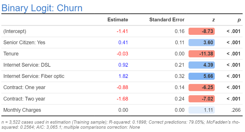
The simplest way of transforming a numeric variable is to replace its input variables with their ranks (e.g., replacing 1.32, 1.34, 1.22 with 2, 3, 1). The rationale for doing this is to limit the effect of outliers in the analysis. If using R, Q, or Displayr, the code for transformation is rank(x), where x is the name of the original variable. The output below shows a revised model where Tenure has been replaced by Rank Tenure. If we look at the AIC for the new model it is 3,027.4, which is lower (which means better) than for the original model, telling us that the rank variable is a better variable. However, we have a practical problem which is that the estimated coefficient is 0.00. This is a rounding problem, so one solution is to look at more decimal places. However, a better solution is to transform the predictor so that it does not provide such a small estimate (this is desirable because computers can make rounding errors when working with numbers very close to 0, as can humans when looking at such numbers).
![]()
Standardizing/Normalizing
Standardizing – which is usually (but not always) the same thing as normalizing – means transforming a variable so that it has a mean of 0 and standard deviation of 1. This is done by subtracting the mean from each value of a variable and then dividing by its standard deviation. For example, 0, 2, 4 is replaced by -1, 0, and 1. In R, we can use scale(x) as a shortcut. The output below replaces Rank Tenure with its standardized form. There are three important things to note about the effect of standardizing. First, the estimate for (Intercept) changes. This is not important. Second, the estimate for the variable changes. In our case, it is now clearly distinct from 0. Third, the other predictors are not changed, unless they too are modified.
If all the variables are standardized it makes it easier to compare their relative effects, but harder to interpret the true meaning of the coefficients, as it requires you to always remember the details of the transformation (what the standard deviation was prior to the transformation).
Logs
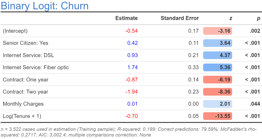
In economics, physics, and biology, it is common to transform variables by taking their natural logarithm (in R: log(x)). For example, the values of 1, 3, and 4, are replaced by 0, 1.098612289, and 1.386294361.
The rationale for using the logarithm is that we expect a specific type of non-linear relationship. For example, economic theory tells us that we should expect that all else being equal, the higher the monthly charge, the more likely somebody will churn, but that this will have a diminishing effect (i.e., the difference between $100 and $101 should be smaller than the difference between $1 and $2). Using the the natural logarithm is consistent with such an assumption. Similarly, we would expect that the difference between a tenure of 1 versus 2 months is likely to be much bigger than the difference between 71 and 72 months.
The output below takes the logarithm of tenure. When compared to the previous models based on the AIC it is the best of the models. However, a closer examination reveals that something is amiss. The previous model has a sample size of 3,522, whereas the new model has a slightly smaller sample size. As sample size determines AIC, we have a problem: the AIC may be lower because the model is better or because of our missing data.
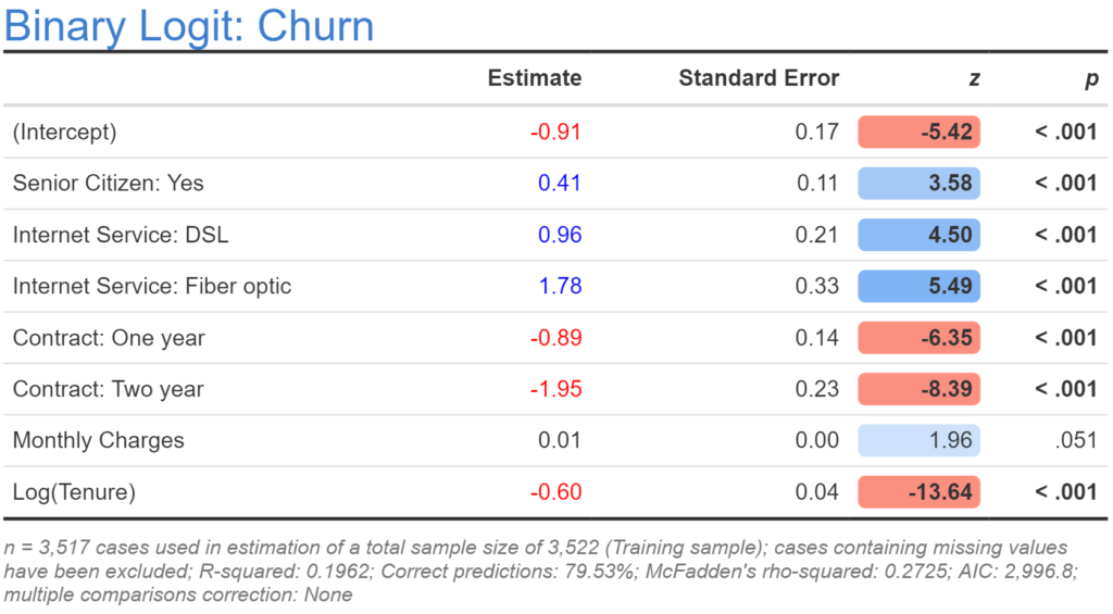
The problem with taking logarithmic transformations is that they do not work with values of less than or equal to 0, and in our example five people have a tenure of 0. The fix for this is simple: we add 1 to all the numbers prior to taking the natural logarithm. Below the output shows the results for this modified model. This latest model has our best AIC yet at 3,002.40, which is consistent with a very general conclusion about feature engineering: using common sense and theory is often the best way to determine the appropriate transformations.
Trimming
Trimming is where you replace the highest and lowest values of a predictor with missing values (e.g., the top 5% and the bottom 5%). At first blush this feels like a smart idea, as it removes the outliers from the analysis. However, after spending more than 20 years toying with this approach, my general experience is that it is never useful. This is because when you replace the actual values with missing values, you end up needing to find a way of adequately dealing with the missing values in the model. This is a substantially harder problem than finding a good transformation, as all of the standard approaches to dealing with missing values are inapplicable when data is trimmed (to use the jargon, data that is trimmed is nonignorable).
Winsorizing
Winsorizing, also known as clipping, involves replacing values below some threshold (e.g., the 5th percentile) with that percentile, and replacing values above some other threshold (e.g., the 95th percentile) with that value. With the tenure data, the 5th percentile is 1, and the 95th percentile is 72, so winsorizing involves recoding the values less than 1 as 1 and more than 72 as 72. In this example, 72 is also the maximum, so the only effect of winsorizing is to change the lowest values of 0 to 1. With the example being used in this post the winsorization had little effect, so the output is not shown. While in theory you can try different percentiles (e.g., 10th and 90th), this is a bit dangerous as there is no theory to guide such a decision, although using a histogram or density plot to identify extreme values can be useful. An alternative and often better approach is to use polynomials or splines (discussed later in this post). The following R code below winsorizes tenure.
x = tenure
quantiles = quantile(x, probs = c(0.05, 0.95))
x[x <= quantiles[1]] = quantiles[1]
x[x <= quantiles[2]] = quantiles[2]
x
Capping
Capping is the same basic idea as winsorizing, except that you only apply the recoding to the higher values. This can be particularly useful with data where the very highest values are likely to be extreme (e.g., as with income and house price data). The following code caps the tenure data at 30:
x = tenure
x[x > 30] = 30
x
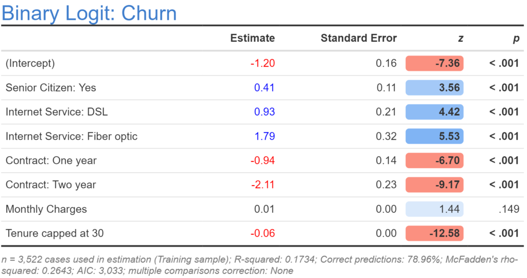
The output from the model with tenure capped at 30 is shown above. The model is better than our initial model, but not as good as any of the more recent models. The reason why it performs better than the original model can be understood by looking at its coefficient of -0.06, which is twice the coefficient of the first model (-0.03), which tells us that the effect of tenure is comparatively greater for the lower values of tenure (as hypothesized in the discussion of logarithms).
Polynomials
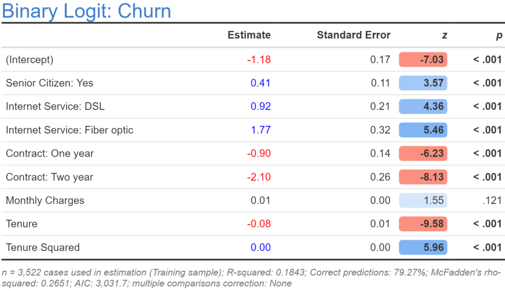
When we take the logarithm we are asserting a specific non-linear relationship. In economics, where sample sizes are often very small, this is often a good thing to do. However, in our data set we have a much larger sample, so it makes sense to use a more general non-linear specification and try and extract the nature of the nonlinearity from the data. The simplest way to do this is to fit a quadratic model, which is done by both including the original numeric variable and a new variable that contains its square (in R: x^2). The resulting model for tenure is shown below. This one is actually worse than our previous model. It is possible to also use cubics and higher order polynomials, but it is usually better practice to fit splines, discussed in the next section.
If you do wish to use polynomials, rather than manually computing them, it is usually better to use R’s in-built poly function. For example, in R, poly(x, 5) will create the first five polynomials. The cool thing about how this works is that it creates these polynomials so that they are orthogonal, which avoids many of the fitting problems that can occur with higher order polynomial calculated in the traditional way (e.g., x^5) due to multicollinearity. If adding polynomials to a data set in Displayr, you will need to add them one by one (e.g., the fourth variable would be poly(x, 5)[, 4]. Use orthogonal polynomials with care when making predictions, as the poly function will give a different encoding for different samples.
Splines
Where there is a numeric predictor and we wish to understand its nonlinear relationship to the outcome variable, best practice is usually to use a regression spline, which simultaneously fits the model and estimates the nature of the nonlinear relationship. This is a bit more complicated than any of the models used so far, and is usually done by writing code. Below I show the code and the main numerical output from fitting a generalized additive logistic regression:
library(mgcv)
churn.gam = gam(Churn_cat ~ SeniorCitizen + InternetService_cat + Contract_cat + MonthlyCharges + s(Tenure),
                subset = training == 1,
                family = binomial(logit))
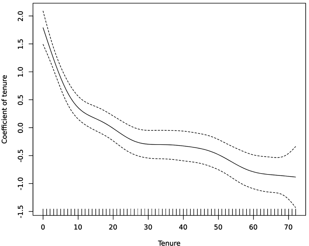
The key output for our analysis is a plot showing the the estimated nonlinear relationship, which is shown below.
plot(churn.gam, ylab = "Coefficient of tenure"))
The way that we read this is that the tenures are shown on the x-axis, and we can look up the coefficient (effect) for each of these. We can see, for example, that the coefficient is about 1.75 for a tenure of 0 months, but this drops quickly to around 0.4 after 10 months, after which the drop-off rate declines, and declines again at around 24 months. Although the spline is very cool and can detect things that have not been detected by any of the other models, the model’s resulting AIC is 3,012, which is not as good as the logarithmic model, suggesting that the various wiggles in the plot reflect over-fitting rather than insight.
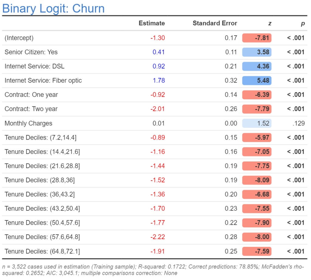
Bucketing/binning/categorization
The last approach is to convert the numeric variable into a categorical variable. This can be done judgmentally or via percentiles. In the output below I show the results where I have split the data into deciles (cut(tenure, breaks = 10)) and set the variable as a categorical variable when estimating the model. The first decile is people with tenures from 0 to 7, and is defined as having an estimate of 0 (see How to Interpret Logistic Regression Coefficients for more info about how to interpret coefficients). We can see that the second decile, which is for tenures of 8 to 14, has a much lower coefficient, and then the next one is a lower again, but the overall trajectory is very similar to what we saw with the spline.
The bucketing is worse than the spline, and this is pretty much always the case. However, the great advantage of bucketing is that it is really simple to do and understand, making it practical to implement this with any predictive model. By contrast, splines are only practical if using advanced statistical models, and these can be tricky things to get working well if you haven’t spent years in grad school.
Interactions
An interaction is a new variable that is created by multiplying together two or more other variables. For example, we can interact tenure and monthly charges by creating a new numeric variable with the code Tenure * `Monthly Charges`. Note that in this example, backticks (which on an international keyboard is the key above the Tab key) surround monthly charges, which is the way to refer to variables in Displayr by their label rather than their name.
If specifying a lot of interactions it can be a bit painful to manually create a variable for each of them. An alternative is to edit the regression formula by going to the R code (Object Inspector > Properties > R CODE), and adding a * to the formula, as can be seen in the screenshot below. Note that when we do this, the regression will automatically estimate three coefficients: one for Monthly Charges, one for LogTenurePlus1, and one for their interaction. If we only wanted to create the interaction we would instead write MonthlyCharges:LogTenurePlus1.

Nonlinear models
Splines are really a nonlinear model rather than a form of feature engineering, and this highlights that sometimes we can avoid the need for feature engineering by using explicit statistical and machine learning models that are designed to detect and adjust for nonlinearity, such as decision trees, splines, random forests, and deep learning. Although such methods can be highly useful, my experience is that even when using such methods it usually pays off to try the various types of transformations described in this post.
Explore the original dashboard
If you want to look at the various analyses discussed in this post in more detail, click here to get a copy of the Displayr document that contains all the work. If you want to reproduce these analyses yourself, either with this data or some other data, please check out:
- How to do Logistic Regression in Displayr
- Feature Engineering in Displayr
- Feature Engineering for Categorical Variables
Ready to get started? Click the button above to view and edit these models!