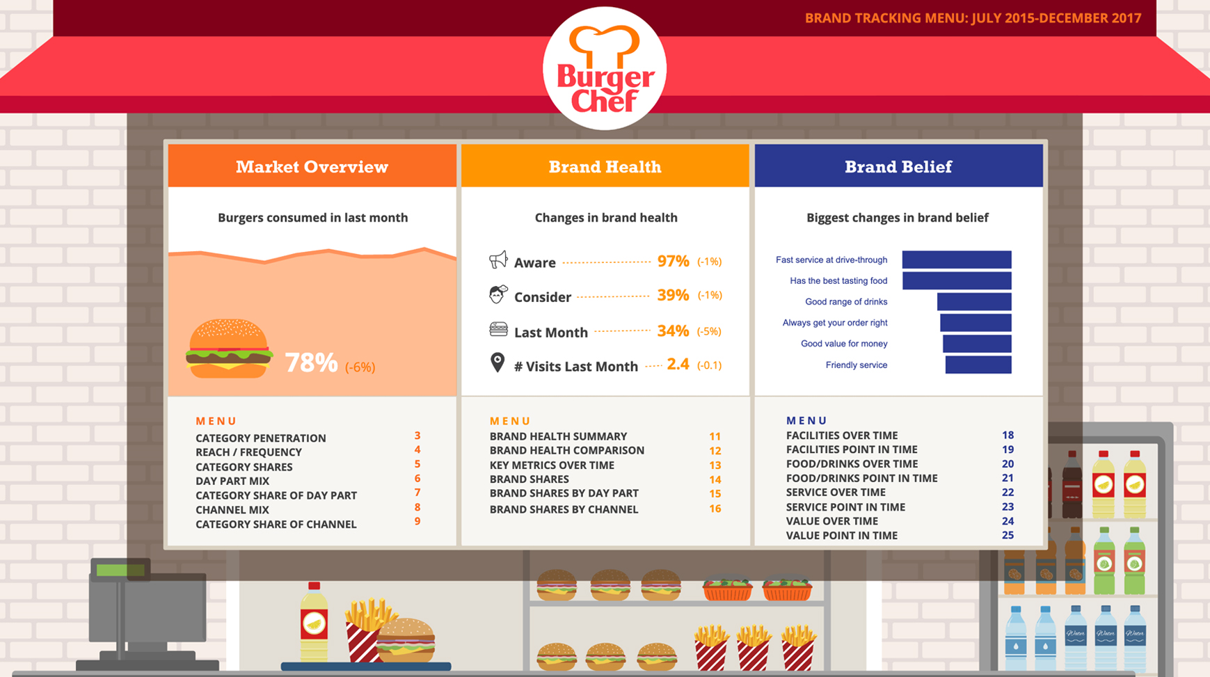
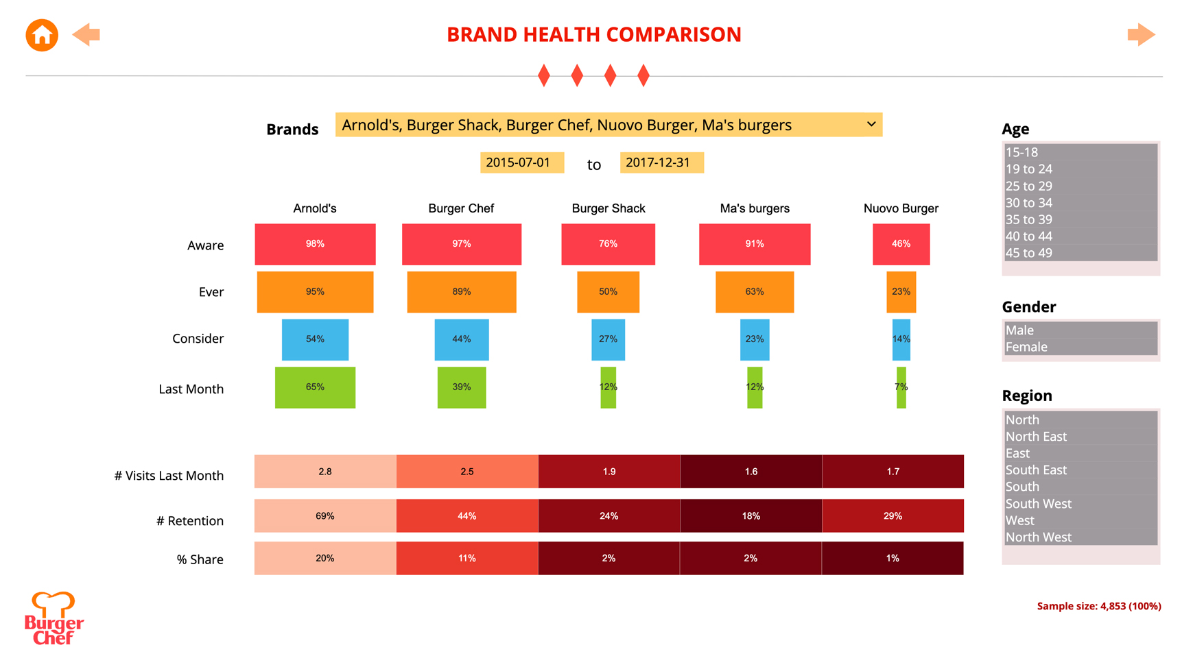
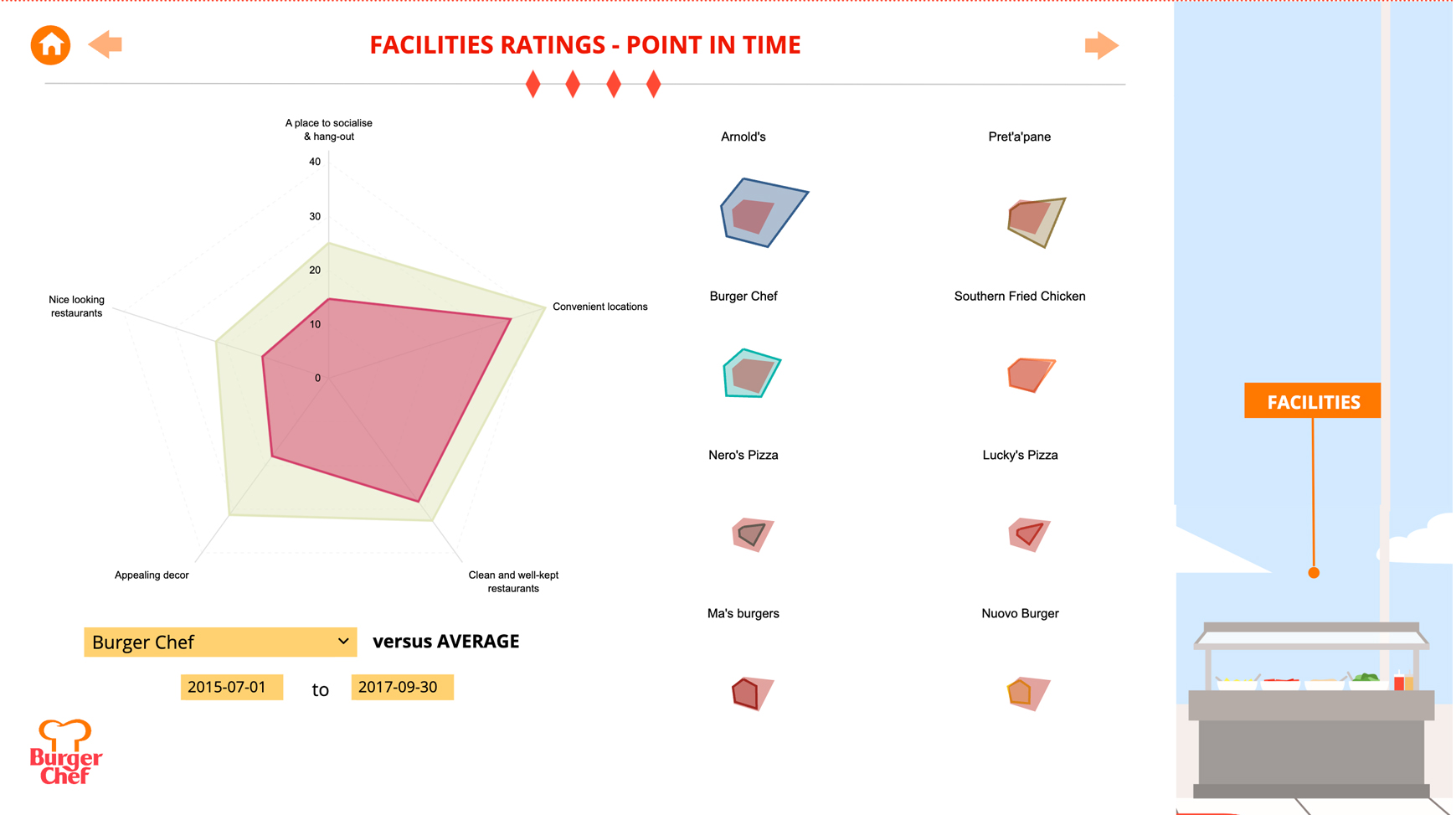
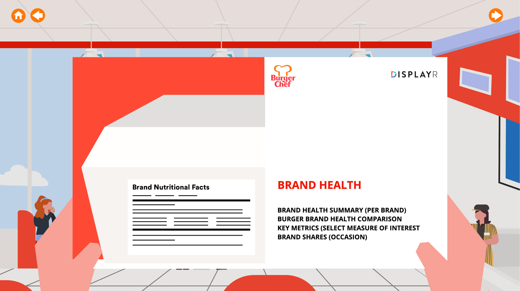
This is a live brand tracking dashboard, a working example you can click around, not a screenshot. It compares competing burger brands over time: pick a brand, a time period, or a demographic and every trend chart updates to match.
Explore the dashboard below – everything filters, drills, and updates.
What does a good brand tracking dashboard look like?
It shows movement, not snapshots. Three things separate a good brand tracking dashboard from a chart collection: wave-on-wave trends with statistical significance flagged (so a wobble isn’t mistaken for a story), filters for market and demographic, and the newest wave loaded automatically. This example does all three – the arrows on the trend charts mark statistically significant movement since the previous wave.
Visualize brand tracking data over time
The heart of any tracker is the time series: awareness and usage trending across waves, brand by brand. This dashboard visualizes brand tracking data the way brand teams read it, competing brands overlaid on one chart, with the periods and brands selectable, so “are we gaining on the leader?” takes one glance.
Wave on wave, updated automatically
When the next wave of tracking data lands, this dashboard updates itself – every trend extends, every significance test re-runs, and the latest period appears in the filters. Set it up once for wave one, and wave twenty is already built. The same document can also export as an auto-updating PowerPoint report for stakeholders who want slides.
Use this dashboard as your template
Everything here – the trend charts, the significance arrows, the filters – is a working Displayr document, and it’s fully customizable: your brands, your waves, your styling. Start free, connect your own tracking data, and this layout rebuilds itself around your study.
Frequently Asked Questions
What’s the difference between a brand tracking dashboard and a brand health dashboard?
A brand tracking dashboard emphasizes movement over time – trends, waves, and significant changes between periods. A brand health dashboard emphasizes the state of the brand, the funnel from awareness to usage, and KPIs at a point in time. Most tracking programs use both views; see our live brand health dashboard example for the funnel-led version.
How do brand monitoring dashboards compare across tools?
The differences that matter: whether trends carry statistical significance testing (most tools chart movement but can’t tell you if it’s real), whether the dashboard updates itself when new waves arrive, and whether stakeholders can view it without their own license. Generic BI dashboards typically fail the first test on survey data.
Trusted by 2,900+ research teams worldwide






VP Data & Analytics, Cygnal
More examples
Multi-Page | PowerPoint Automation
Multi-Page | PowerPoint Automation
Infographic | Interactive
Interactive