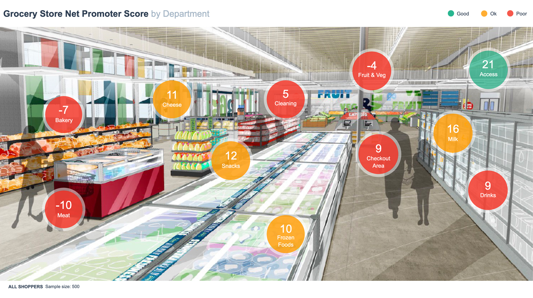
This dashboard measures the Net Promoter Score® of a grocery store by department. It uses color-coding of circles based on underlying data (they change when the data is filtered using the Filters menu in the top right). They use a traffic light system with green to indicate high numbers and red to indicate low numbers.
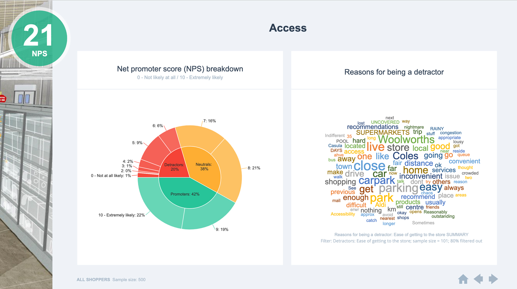
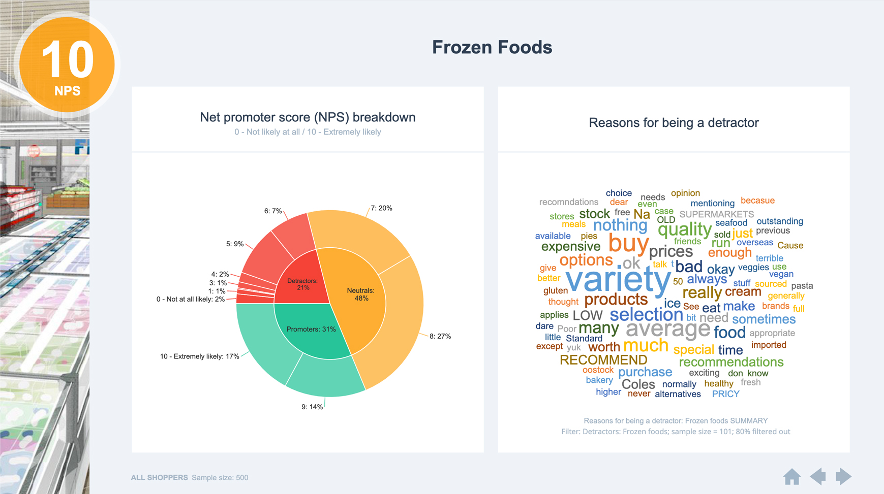
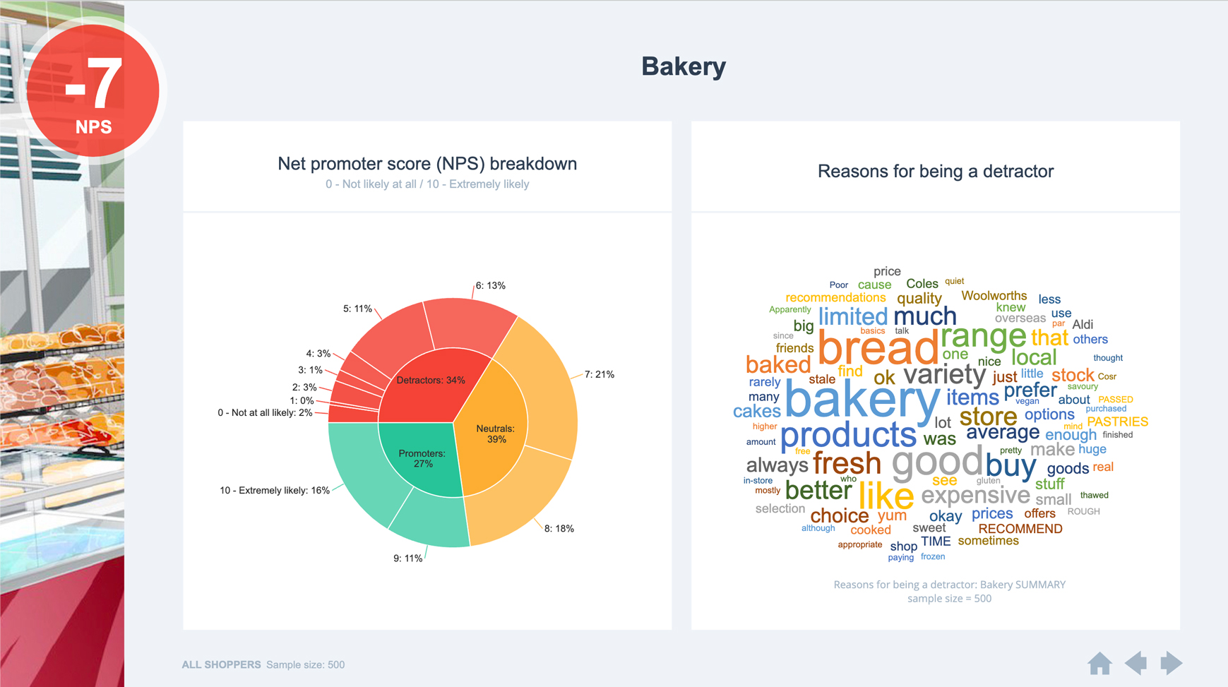
This dashboard also uses hyperlinked drill-down menus, whereby the user clicks on the circle for a department and is taken to another page that shows more information about that department.
TRUSTED BY THOUSANDS OF CUSTOMERS

Displayr is at least 50% faster than just creating a PowerPoint presentation. In some cases, I think it’s even higher than 50%.

Matt Hubbard
VP Data & Analytics, Cygnal
More examples
Exploring US Diet Trends
Interactive | Multi-Page
Dashboard with Hyperlinked Menu
Interactive | Multi-Page
What does America want in a Commander-in-Chief?
Interactive | Multi-Page
Decision Support Dashboard
Interactive | Multi-Page


