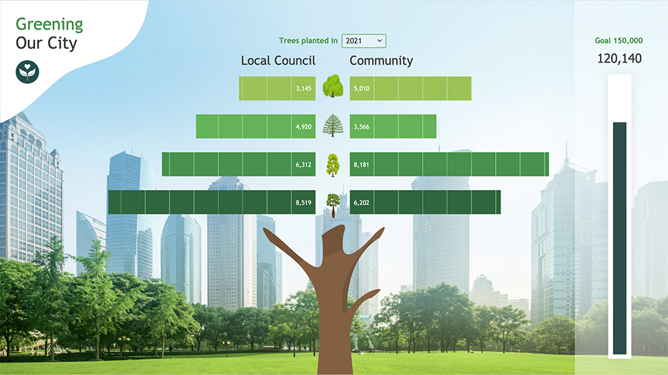
Get ready to see data in a whole new way with our interactive pictograph! It’s not just pretty to look at, it also updates automatically with new information so you always have the most up-to-date data.
Pictograph bar charts are a fun and creative way to share lots of information in an easy-to-understand format. And unlike traditional bar charts, pictograph bars can be right-aligned, which makes it simple to compare different groups side by side.
Want to create your own pictograph bar chart in Displayr? It’s easy! Just head to Visualization > Pictograph > Pictograph Bar > Square icon > Fill from left. Then, duplicate the chart and fill from right. Voila! You’re all set to start creating your own unique and eye-catching charts.
And we didn’t stop there. To add a little extra flair, we sourced a background image from a stock website to really make our chart pop. So go ahead, explore the data and have some fun with our pictograph!