Basketball or Baseball Dashboard

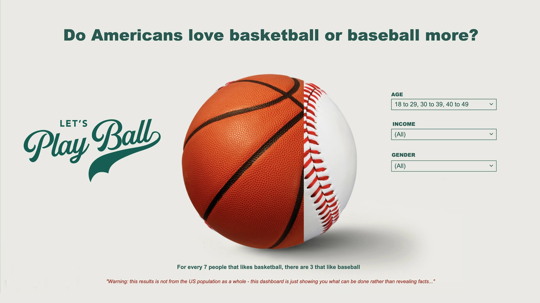
This dashboard is a great tool for comparing the popularity of basketball and baseball among different groups in America, like age, income, and gender. And the best part? You can easily control which groups you see on the main pictograph with the filter drop-down on the right.

To make things even more fun, we used custom images of basketball and baseballs in a single pictograph. If you want to try it out for yourself, select a single icon pictograph visualization and use the "custom icon" option to add your contrasting images.

Make sure you use high-quality images from trustworthy stock sites like Shutterstock. And if you want to use our dashboard as a template, just click "Make a copy" and swap out the images with ones that fit your brand. Happy exploring!

Take a look at this dashboard in action

Basketball or Baseball Dashboard
Matt Hubbard

“Displayr is at least 50% faster than just creating a PowerPoint presentation. In some cases, I think it’s even higher than 50%.”

Matt Hubbard VP Data & Analytics, Cygnal
Cookies help us provide, protect and improve our products and services. By using our website, you agree to our use of cookies (privacy policy).
close-image

Register now
close-link

Ready to chat?
Book a time to learn more about how Displayr will cut your analysis and reporting time in half.

Book your time here
close-link