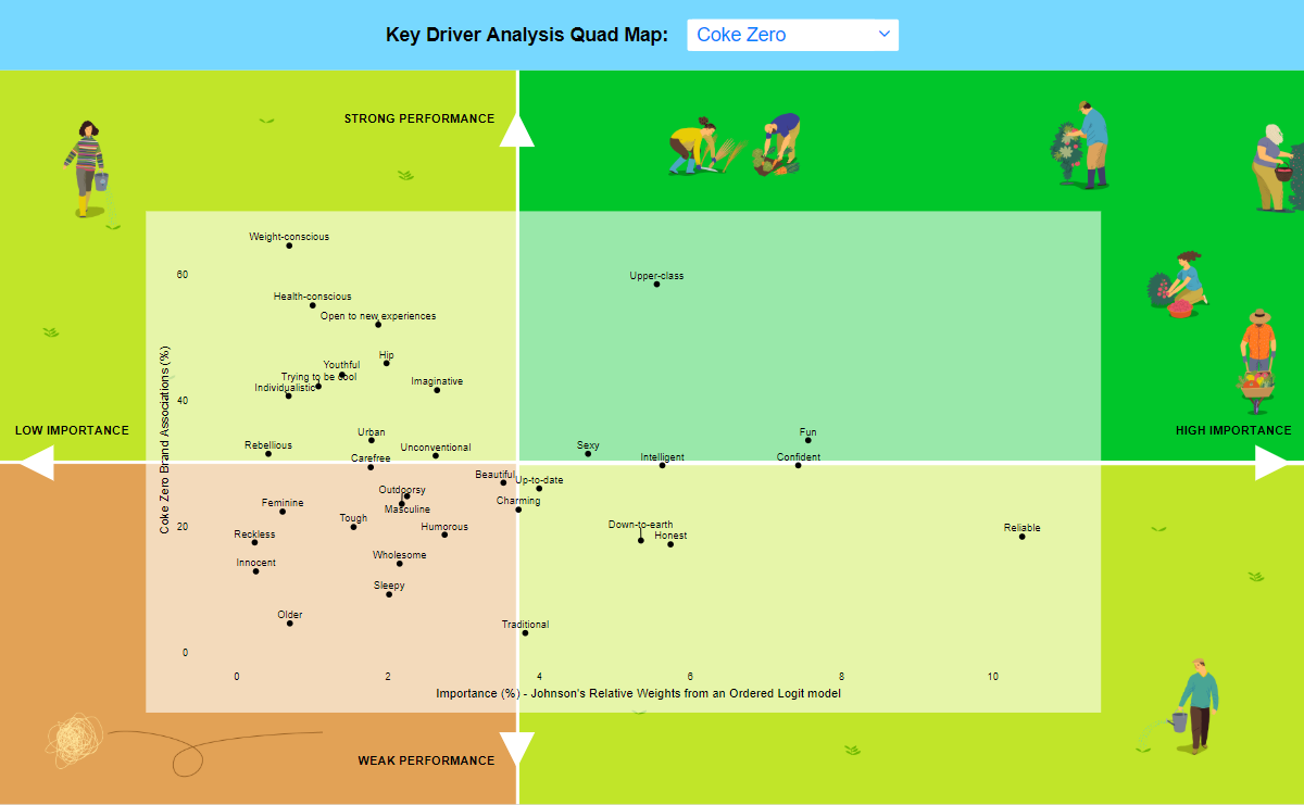
Looking for a fun and easy way to understand brand preferences? Check out our Key Driver Analysis Quad Map Dashboard. This pretty quad map shows important drivers of brand preference for six different cola brands, and it’s super easy to understand.
The Key Driver Analysis, also known as Relative Importance Analysis, shows the relative importance of different attributes and how each brand is performing for these attributes. By focusing on attributes that are highly important but performing less strongly on, marketing and other teams can improve brand performance.
And the best part? Dashboards like these are easy to create, update and explore. Simply replace the data file with new data, and everything will be instantly updated, including analysis, visualizations, filters, weights, text summaries, and more. Plus, our interactive visualizations, drop-down menus, and pictographs make it easy to explore and discover new insights.
So why wait? Try create a duplicate of this Key Driver Analysis Quad Map Dashboard today and see how it can help you improve your brand performance.