Dashboards for tracking studies often take the form of multipage reports, with many, many charts and tables – and that’s important for the right audience. But you can also use tracking data to tell a story, which our own data indicates is a very engaging approach.
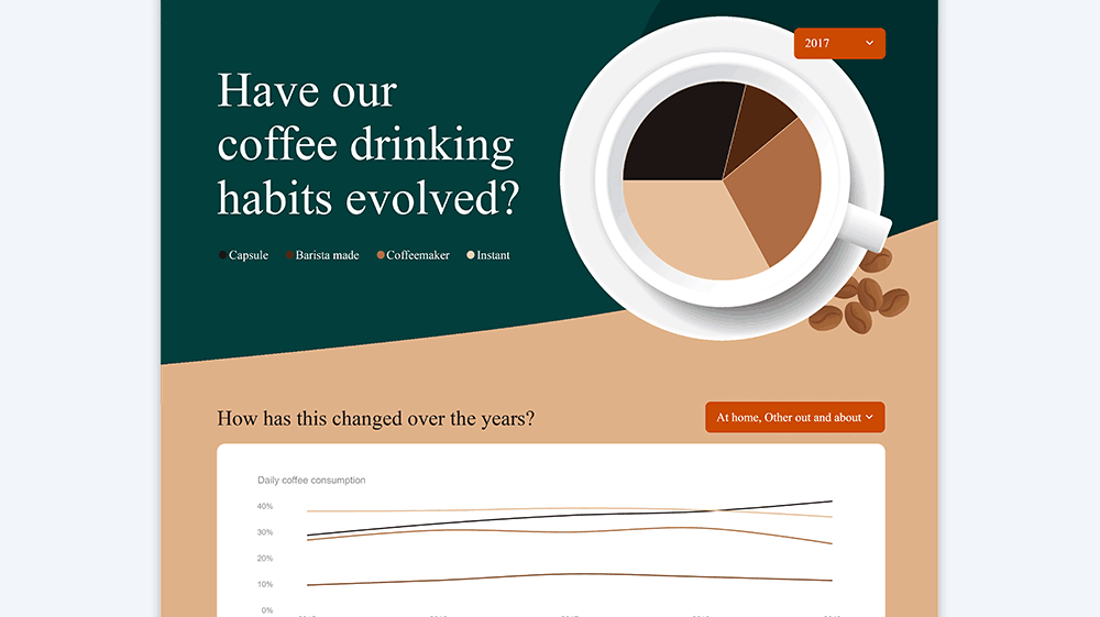
This dashboard tells a great story about coffee market trends, the rise of capsules, and how one brand is driving this change. And one of the best parts? It’s dynamic – you can change the focus year or where coffee is consumed and visualizations and even text labels all update.
Our main aim here is demonstrate the importance of visual design when it comes to story telling. But this dashboard also takes advantage of some very cool Displayr features, like Dynamic Text Boxes, Custom Calculations, Filter Controls, and the visualization gallery. To take a peek inside to see how it all works, just click “Use Template”.