There are three different ways of creating heatmaps in Displayr. You can create a heatmap visualization. You can create a segment comparison table (Insert > Group/Segment > Segment Comparison Table). And, you can add heatmap shading to any table or chart. This post describes how to add the shading to any table or chart.
Example
Step 1: Choose the shading that you want
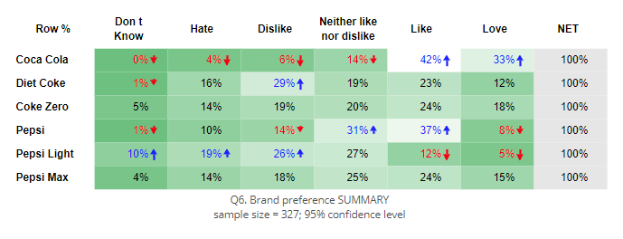
Click on this link and it will open up a Displayr document showing the 12 heatmap shading designs. Select on the one you like and click Home > Copy. Then, go back to the tab that contains your Displayr document and press Home > Paste. When you do this a box will appear, with a red border.
Step 2: Hook up your data
Select the data you wish to use from the Data Sets tree, and drag it over the box, releasing it in the Rows slot. The table you create will now be shaded as per the design you chose. You can still format the table just like any other table (e.g., choosing different styles for the table, stat testing appearance, merging categories, etc.).
Step 3: (Optional) Turn it into a chart
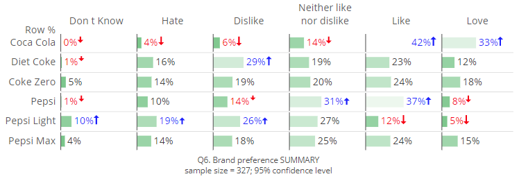
Click on the table, and select Inputs > OUTPUT > Chart and your preferred type of chart. The chart will also be shaded using the same color scheme.
Further customization via Q
This link gives you a choice of 12 designs. Displayr’s sister product, Q, allows you to create bespoke color palettes using 2 or 3 colors and also set target values for the different colors. If none of the 12 designs fit what you are looking for, please contact [email protected] to inquire about getting a copy of a table that suits your need.