

Quick Steps
- Insert or select a table containing numeric values.
- Go to Insert → Visualization → Heatmap.
- In the Inputs panel, select the appropriate table as the data source.
- Adjust the colour palette and formatting options.
- Sort rows or columns if required to highlight patterns.
Heatmaps are a great way to pick up patterns in tables of data. The heatmap represents the table by shading the cells according to the values in the table. Rather than squinting your way through a huge series of numbers trying to pick out which ones are higher or lower the dimension of color makes it easy to see these kinds of answers at a glance. In this post I show you how to create a heatmap in Displayr from your data.
Don’t forget that you can easily use Displayr’s heatmap maker to create your free heatmap!
Create your own Heatmap
Method 1 – Pasting in data
Most of the visualization options in Displayr work with data that you can paste in from a spreadsheet (or type in manually if you don’t have a spreadsheet). This means that if you already have some results that you want to visualize, you can make a heatmap quickly by pasting them in.
Your data just needs to be a table of numbers, ideally with row labels and column labels, like this:
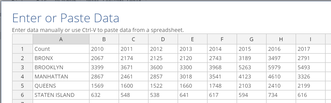
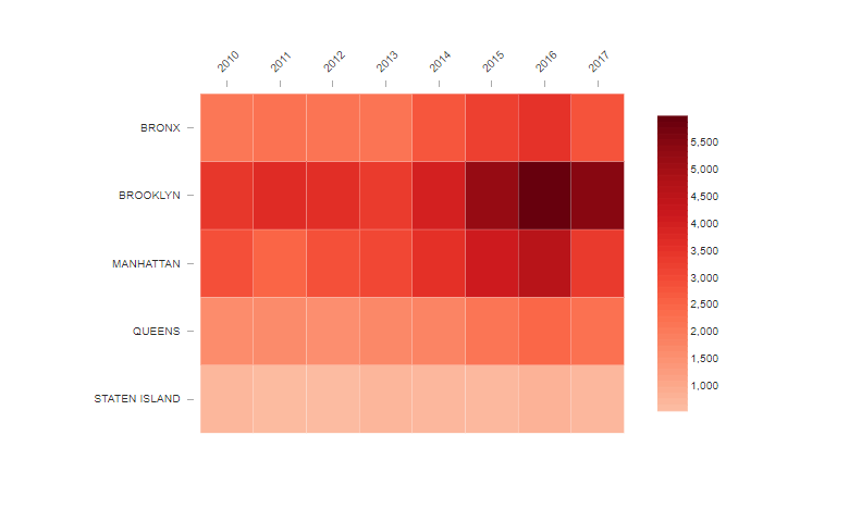
This table contains the number of rats sighted in each borough of New York, from 2010 to 2017. It’s not too difficult to find the biggest concentration of rats was in Brooklyn in 2016, but the heatmap makes it easy.
To add a heatmap for this data:
- Select Insert > Visualization > Heatmap.
- Click on the Paste or type data button in the Inputs > DATA SOURCE section of the Object Inspector over on the right-hand side of the screen.
- Paste in your data into the spreadsheet interface (it should look like my screenshot above), and click OK.
- Change any formatting options from the Chart section on the right-hand-side.
My heatmap looks like the one just below. It’s easy to work out that Brooklyn hit “peak rat” in 2016,
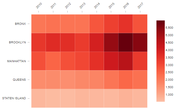
You can choose your colors from a collection of premade palettes, like my red scale above. You can also use Chart > DATA SERIES > Color Palette > Custom Gradient to define your own preferred colors. For tips on choosing colors for heatmap, check out “2 Rules for Coloring Heatmaps so That Nobody Gets Burnt”.
Method 2 – Create your table in Displayr
You can use Displayr’s built-in statistical engine to calculate summary tables and crosstabs from raw data. If you’re a coder, you can take it further by using R to compute new tables or modify existing ones. In this part of the post I show you how you can take some raw data, calculate tables of results with Displayr, and then display them as a heatmap.
To start, you’ll need to add a data set to your Displayr document. There are a variety of methods you can use, including importing a data file, connecting to an SQL database, or importing from a URL. All of these options are available to you when you select Home > New Data Set. Check out our other post, Getting Your Data into Displayr, for a discussion of the options that are available. Once you add your data, the variables from the data becomes available under the Data Sets section in the bottom left.
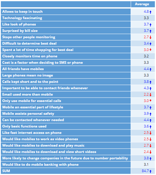
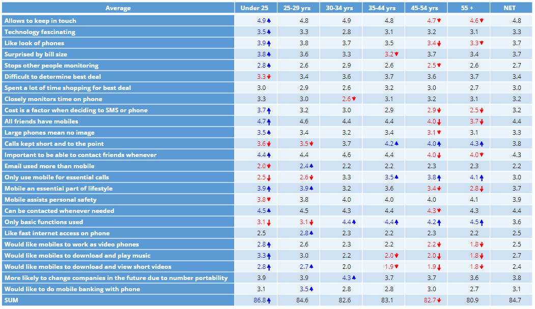
For example, I have added a data file from an old survey which asked people about their attitudes to mobile phone features and plans. I want to get a picture of the patterns of these attitudes, and how they vary with the age of the respondent. To do so, I start by creating my table. I drag the ‘Mobile phone attitudes’ variable set from under Data Sets on to my page. This creates a SUMMARY table. As the data is numeric, the table shows me the average score (on a 5-point scale) for each of the different attitudes.
Next, I create a crosstab by dragging a variable for age groups from the Data Sets section in to the Columns box on the existing table. You can also change what data is shown in the table by using the Rows and Columns options. These appear in the Object Inspector on the right-hand side of the screen when you select the table. The break-down of average attitude scores by age comes out as follows.
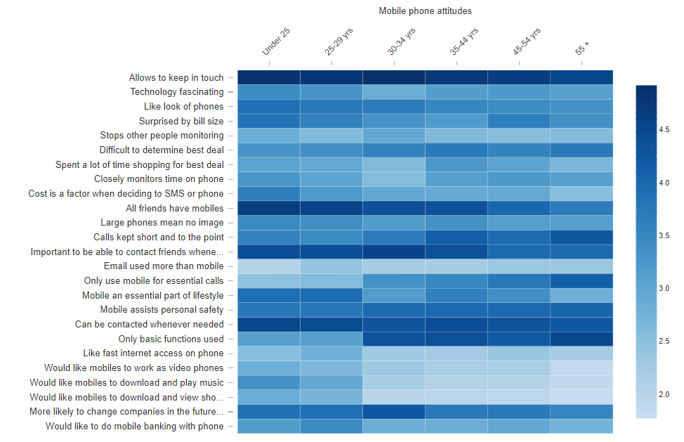
To visualize this as a heatmap:
- Select Insert > Visualization > Heatmap.
- Click into the Output in ‘Pages’ box on the right (which lists all available tabular outputs), and select the table.
The heatmap will update if you change the table, for example by deleting or merging rows and columns, changing statistics, or modifying the underlying data. This is a key advantage to loading up a data set into your Displayr document and using Displayr to calculate your tables for you – all analyses stay up to date.
The heatmap for my mobile shows a strong signal across all age groups that mobile phones are important for keeping in touch. Technical applications are less important. Keep in mind that this survey was done before the rise of the smart phone! We would ask vastly different questions, and likely get a vastly different picture, if we repeated the survey today.
Sorting
You can make the patterns in a heatmap easier to identify by sorting the rows or columns (or both). Sorting options are found in Chart > APPEARANCE in the Object Inspector on the right.
There are basically two types of sorting. Firstly you can sort the rows or columns according to the average score in each. Doing so allows you to create a ranking of sorts. If I sort the rows according to the row averages, I get the highest-ranking options at the top. All the top options have to do with using phones for social purposes.

The other method of sorting is to use a dendrogram. The dendrogram option uses an algorithm to group rows according to similarities in the patterns.
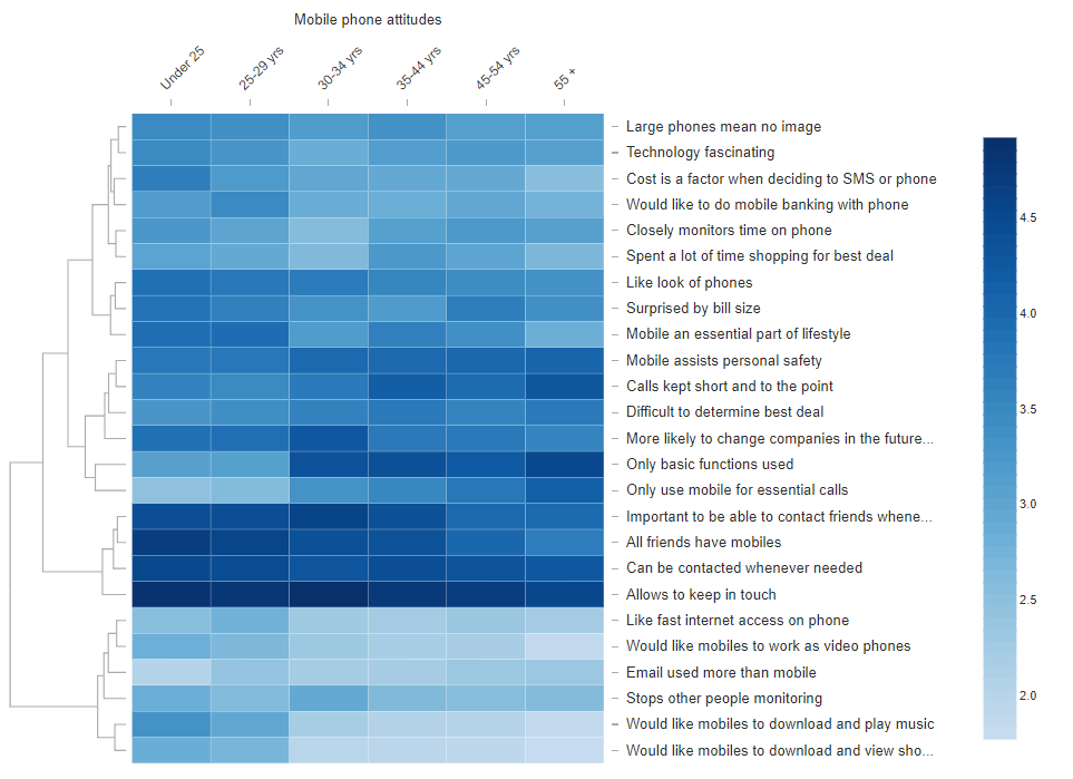
The term dendrogram refers to the tree diagram that is shown on the left side of the heatmap. The tree is used to illustrate the groupings that have been found. In this example, the rows grouped together in the bottom six correspond to attitudes which have a low score overall. They all relate to technological applications of mobile phones. The next four rows up correspond to the social applications of phones which we saw earlier, which tended to be high across all ages. The next two rows up correspond to attitudes of people who view phones as being a tool for basic functions and making essential calls. These tended to have a higher score in the older groups. Patterns in the rest of the table are less obvious in this particular example.
Frequently Asked Questions
What data can be used in a heatmap in Displayr?
Heatmaps in Displayr require numeric data arranged in a table. This data can be pasted directly from a spreadsheet or generated using Displayr’s built-in analysis tools, such as summary tables or crosstabs. Each cell in the table must contain a numeric value so that Displayr can apply colour intensity to represent relative magnitude.
How do I paste data into Displayr to create a heatmap?
To paste data, select Insert → Visualization → Heatmap, then in the Inputs → Data Source section choose Paste or type data. Enter your numeric table into the spreadsheet interface, ensuring it includes row and column labels, and click OK. Displayr will generate a heatmap based on the pasted values.
Can I customise the colour palette in a heatmap?
Yes. In the Object Inspector under the Chart settings, you can choose from predefined colour palettes or define a custom gradient. Custom gradients allow you to specify exact colours for low, medium, and high values, helping you control how patterns and contrasts appear in the heatmap.
Does the heatmap update automatically if the table changes?
Yes. When the heatmap is based on a table generated from a dataset, it updates automatically whenever the underlying table changes. For example, modifying variables, merging rows, or updating the dataset will immediately refresh the visualisation to reflect the new values.
What is the benefit of sorting rows or columns in a heatmap?
Sorting rows or columns helps reveal patterns and group similar observations together. Displayr provides options such as sorting by averages or using a dendrogram, which clusters rows based on similarity. These sorting methods make trends and group structures easier to interpret visually.
Create your own heatmap for free in Displayr! Plus, now that you’re an expert on heatmaps,find out what other cool data visualizations you can create.
