In Displayr, pie charts can be created by using the Charts menu or the Visualization menu. The Charts menu is useful for quickly charting data whereas the Visualization menu provides many more options for customizing the formatting of your chart outputs.
Pie charts have gotten a bad reputation, but we love them – and they remain a classic visualization. You can create pie charts for free using Displayr’s pie chart maker! In this post, we’ll look at examples of each of these two methods for creating a pie chart in Displayr.
Charts menu
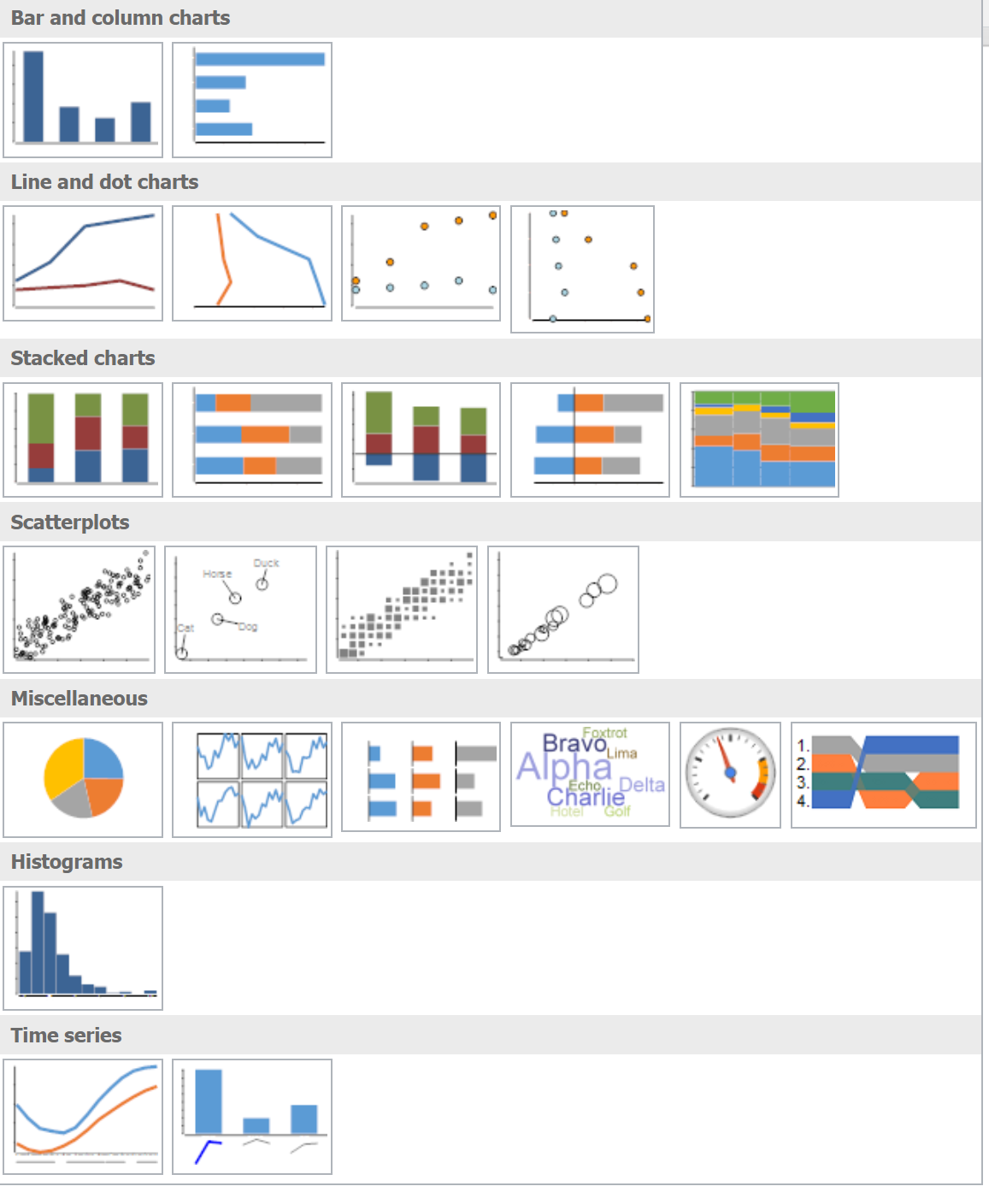
The charts menu can be used to create many different types of charts. To create a pie chart using the charts menu in Displayr, select Home > Charts and select the pie chart icon from the charts menu (the first chart on the Miscellaneous row):
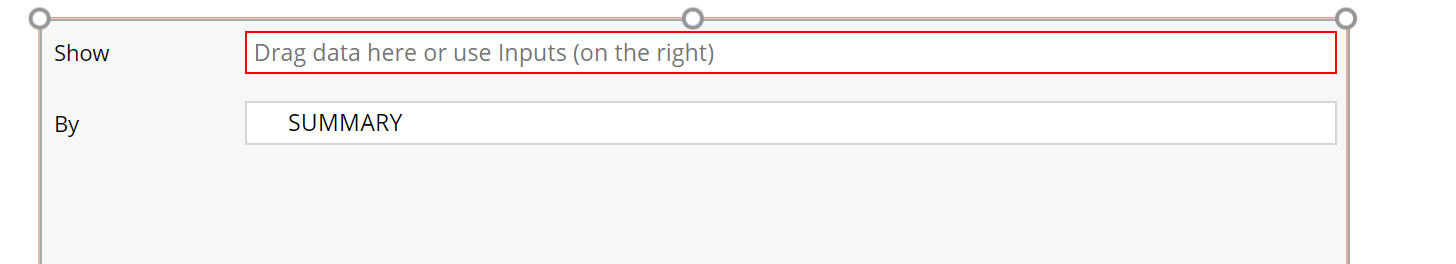
A chart object will be created on the page. Next, provide input data to the pie chart object by selecting a variable from the Show drop-down box. Alternatively, you can also select data from the Show drop-down box in the Object Inspector in the right pane under Inputs > DATA or by dragging and dropping a variable from the Data Sets tree onto chart object.
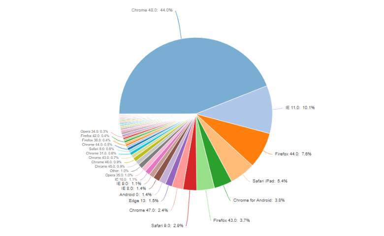
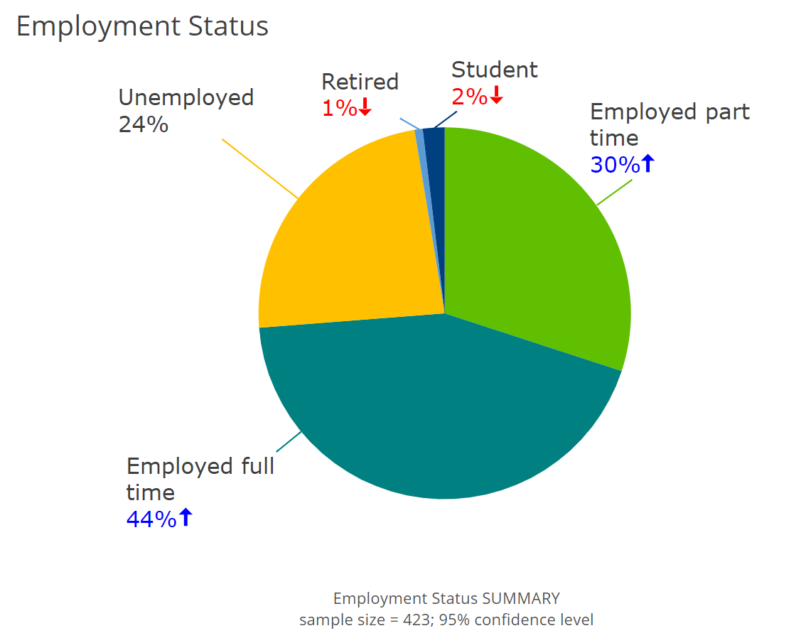
I’ve selected the Employment Status variable from my data set to create the pie chart below. Here, I’ve modified several of the default chart properties such as title, chart colors, and fonts. Note that red/blue highlights indicating significant differences is being shown here as well (significance is not displayed on charts created from the Visualization menu).
You can modify the pie chart properties in the Chart section of the Object Inspector. Here you will find various options to customize the chart data labels, colors, font sizes, chart and axis titles and more.
Visualization menu
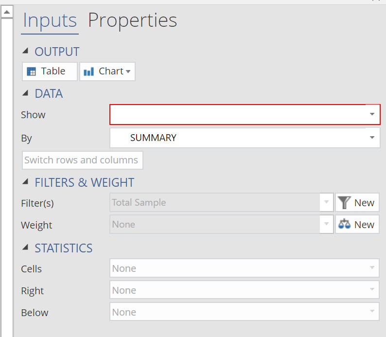
The second method for creating a pie chart in Displayr is by selecting Insert > Visualization > Pie Chart. Similar to the built-in chart options, this also creates a chart object on the page. In the Object Inspector, we have 3 different ways in which we can provide input data to our pie chart in the DATA SOURCE section.
- Output in ‘Pages’ – select a table output.
- Variables in ‘Data’ – select an individual variable from the Data Sets tree. Once an item is selected a second drop-down called Groups will appear. Here you can select a second cross-tab variable.
- Paste or Type data button – copy and paste data from Excel or some other source directly into a spreadsheet object in Displayr.
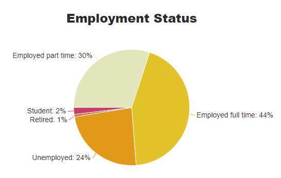
As an example, I’ve selected the Employment Status variable from the Variables in ‘Data’ drop-down list to create the same pie chart as above. You can modify all of the pie chart properties in the Chart section of the Object Inspector.
Done with your pie chart? Find out why they’re actually better than bar charts!