Pyramid charts, sometimes referred to as funnel charts or “wedding cakes”, are a popular option for visualizing results from funnels (like different types of brand or website conversion funnels). They are like a bar chart, except that the bars are symmetrical about the center of the chart. Data for such charts usually has a natural order. As a result, the increasing or decreasing bars present the appearance of a pyramid or funnel, respectively. In this post I show you how to build a pyramid chart in Displayr.
Data setup
The data that you want to visualize in the pyramid must be set up as a table before drawing the pyramid. There are many types of data that you could choose to use in a pyramid or funnel, and some examples include:
- In market research, the proportion of people aware of a brand, considering purchasing from that brand, and who actually purchase products from that brand. Each of these statistics is necessarily smaller than the previous one.
- Measuring the success of a blog, by considering the number of visitors who land on a blog, the number of visitors who stick around and read the blog, and the number of visitors who subscribe to the blog.
The way that these metrics are constructed will depend very much on the type and structure of your data. One example of building a brand funnel in Displayr is outlined in How to Build a Brand Funnel in Displayr using R.
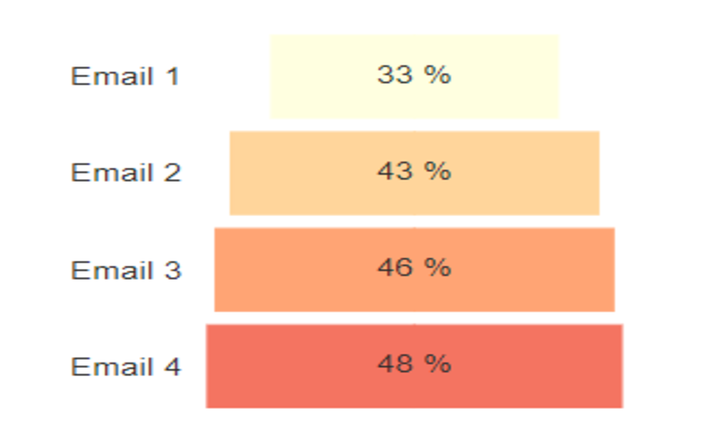
It is possible to draw a single pyramid, but it is also possible to create a sequence of pyramids together in a single chart. This second approach allows you to more easily compare pyramids (or funnels). I will show you an example of each of these two approaches. In my first example I will draw a funnel for the cumulative percentage of people who opened one of the four emails that I sent to them:
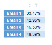
The first row shows the percentage of people who opened Email 1, the second shows the proportion of people who opened Email 2 OR Email 1, and so on.
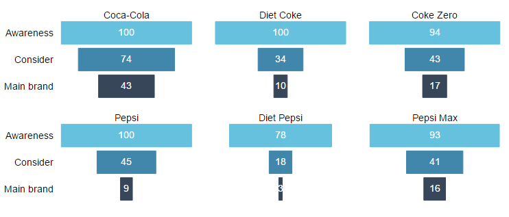
The table for my second example is the brand conversion funnel, which comes from the blog post that I linked above:
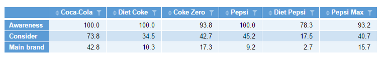
The first row of the table shows the percentage of people who said they were aware of each cola when asked in a survey. The second row shows the percentage of people who said they would consider buying that brand of cola, and the final row shows the percentage of people who actually purchased that brand.
For more on tables in Displayr, see Introduction to Displayr 3: Creating Tables, Charts, and Other Visualizations.
Creating the pyramid chart
To create the pyramid for my emails:
- Select Insert > Visualization > Pyramid Chart.
- Click into Inputs > DATA SOURCE > Output in the Object Inspector on the right, and choose the table of numbers that you want to visualize, OR select Inputs > DATA SOURCE > Paste or type data , and paste in your table.
- Tick the Automatic box at the top right. This ensures that whenever you change the source data or the options. The pyramid will redraw itself to show the latest version.
- Change the options in the Chart section of the Object Inspector to your liking.
With the single-column input, I get a pyramid like this:

Small multiples
When you have a funnel for many brands or websites you can use what is called a small multiples chart. This shows the funnel or pyramid in separate panels within the same chart. This has the advantage of allowing you to keep the sizing, scaling, and formatting of your funnels consistent using only a single set of options. To learn more, see What are Small Multiples? Many of the charts in Displayr’s Insert > Visualization menu have a small multiples option available.
To create pyramids for all cola brands at once, use the same options as above, but this time choose the table which contains all the data, and then click Inputs > OUTPUT > Show as small multiples (panel chart). The result is the chart below: