


Radar charts are a great way to visualize two-dimensional data and show the differences between sub-groups. Think of them as a line chart that’s been wrapped around a central point, where the y-axis of the line chart starts from the central point and extends upwards. The lines will also wrap around the central point and meet up again where the “end” of the line chart meets the “beginning”. I’ll show you a super-easy way to make them in Excel.
Though, don’t forget you can easily create a radar chart using Displayr’s free online radar chart maker!
We’ll need some data…
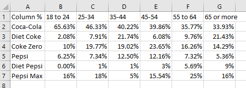
First thing’s first – we can’t create a chart without some data. I’ve got some aggregated data in a table already that shows what people’s preferred cola is by age categories. Here’s what it looks like:
Some differences are noticeable already in the table (Diet Pepsi doesn’t seem to be doing too well!), but other differences are not so easy to spot.
…to make our radar chart
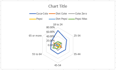
To turn this into a radar chart, all I need to do is select the data on the work-sheet (i.e. from A1 to G7), and in the ribbon, click the radar chart drop-down in the Insert > Charts part of the menu. This will create a basic radar chart in the spreadsheet for you.
Customizing your radar chart…
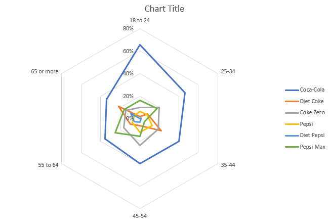
This chart isn’t particularly pretty, and there’s a few things we can do to improve its appearance. First, let’s make it a little bigger, and move the legend to the side. To increase the size, simply select the whole chart, and click-and-drag one of the circular nodes along the outer edge of the chart itself. Next, go to Chart Tools > Design > Add Chart Element > Legend > Right. This will move the legend to the right of the chart, so that the good stuff takes up the maximum amount of space inside the overall chart container.
…and making it pretty
We can make it even easier to read: let’s reduce the decimal points down to none. Select the same data that you selected before we created the radar chart again. Then, in the ribbon, go to Home > Number and click the button with the blue arrow pointing towards a 0 on the right-hand side. This reduces the number of decimals that show in your input data, which updates the chart directly.
The middle of the chart is still a little messy though, and the scale points (percentages) overlap with a lot of my data series. Let’s simplify these even further by double-clicking the column of percentage points in the chart. The Format Axis pane will open on the right, and I can specify the number of units I would like to use here. Under Axis Options > Units > Major I’ll use 0.2 instead of 0.1. The chart will update with the percentage points set at intervals of 20. After these steps, here’s what I have:
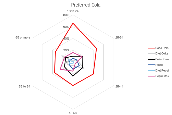
I can do one more thing to make the chart easier to understand. Let’s tie in the series in the chart with the brand colors. Most likely your chart will have data about something completely different, but do consider common color associations. Off-set color choice with ease of reading the chart. You don’t want too many colors that look similar to one another to avoid confusion.
To change the color of one of the series in my chart, click the line itself to select it, then over on the right, under Format Data Series select the fill bucket icon, then Line > Color. In the Colors dialogue select the color you want to use or type its RGB values. I ran into trouble here, because the color palettes of Coca Cola and Pepsi are quiet similar, so some inspiration was gathered from the cherry-flavored variety of Pepsi. Here’s the final product:
Filled radar charts
There are more options in Excel to experiment with. For example, we can turn our radar chart into a filled radar chart. This will only work if you have a few series of data, and your colors are set to have a high level of transparency. Because of overlapping series, it quickly becomes difficult to read. Here’s the same chart again, including all the same series from before, but presented as a filled radar chart with a color transparency of 85%:
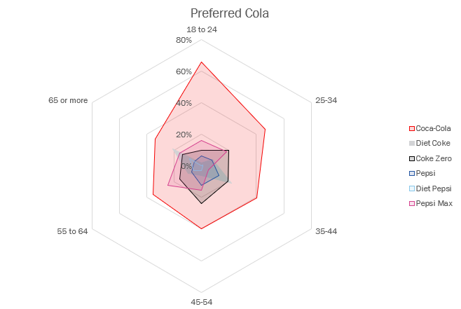
As you can see, it becomes difficult to distinguish the smaller central series from the others, and so the more series you have, the less useful this sort of chart becomes. Best to stick to three or fewer series to make this easily read.
Ready to move beyond Excel? There are other ways to create visualizations that offer more advanced options and flexibility. Check out more visualization ideas!