


Venn diagrams are a fun way to visualize the overlap between variables in your data. The simplest Venn diagram, between two groups, will show a circle for each group, and the area of overlap between those groups. As you add more groupings you gradually create a cluster of overlapping circles. In this post I show you how to get your data set up and create a Venn diagram in Displayr.
You can easily create a Venn diagram for free in Displayr using Displayr’s Venn diagram maker!
Let’s add data
The Venn diagram is not just a chart to show a bunch of numbers. It does a calculation in the background to work out the degree to which the groups in your data overlap. To be able to work this out, you need to supply some raw data for the groups. The are two basic options for getting this set up:
- Add a data set to your document and compute the Venn diagram directly from the raw data of the variables that you want to analyze.
- Create a table which describes the raw data that you want to analyze.
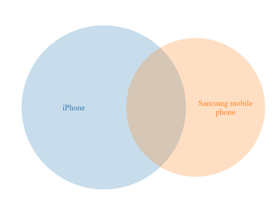
I’ll start by showing you how each option works. In this example I create a Venn diagram from product-ownership data from a survey. The data tells us which devices (iPhone, Samsung phone, etc) are owned by each person who answered the survey. This Venn diagram lets us visualize the overlaps between these product categories.
Option A – Add a data set
You can add a data set to your document by selecting +Add a new data set in the Data Sets section, and then choosing from one of the many sources available. For more information on the range of data sets you can add, see Introduction to Displayr 2: Getting Your Data into Displayr. Once you have added a data set, the variables will become available in the Data Sets section in the bottom left.
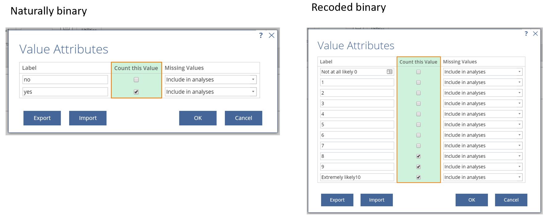
Variables for the Venn diagram must be binary, with values 0 and 1, or TRUE and FALSE. To ensure your variables are binary in Displayr, you need to check the Structure and the Values.
To ensure your variables are binary:
- Select the variables under Data Sets in the bottom left.
- Go over to the Object Inspector on the right side of the screen and select Structure and change it to Multiple Categories (Binary – Multi).
- Click the Select categories button in the Object Inspector on the right.
- Tick the boxes in the Count this value box that correspond to the categories you are interested in counting in the Venn diagram. There are two basic flavors of this shown in the screenshot below. In the easy case you have naturally binary data, in which case there is a single obvious category to choose (e.g. ‘1’, ‘Yes’, ‘TRUE’, ‘Selected’). Alternatively, less commonly, you have non-binary data that you want to turn into recoded binary data. In this second case you may choose several categories to be counted in the Venn diagram. In the example below, I have counted all people who have a score of 8, 9, and 10 on the scale for these variables.
- Click OK.
Once your variables are set up, you can proceed to “Creating your Venn diagram” below.
Option B – Create a table of raw data
If you don’t have a data set like the one above then you can still generate a Venn diagram from a table which shows raw data. The easiest way to do this is to paste the data in. You can paste the data directly to the Venn diagram, or you can add the table to your document for use in other analyses. In both cases you will find a button called Paste or type data, which will allow you to paste in your data.
To add a table of data to your document:
- Select Table > Paste or Enter Table.

- Click the Paste or type data button.
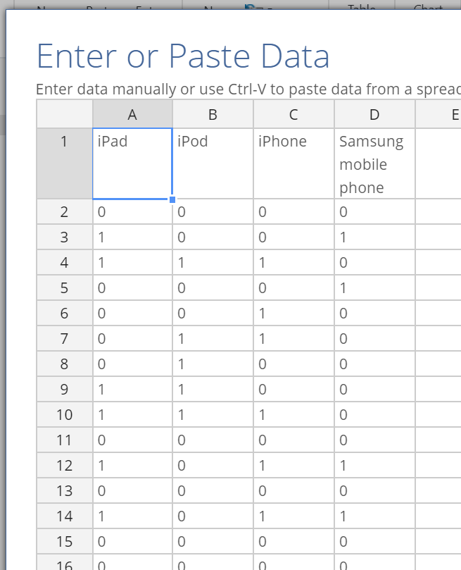
- Paste your data into the spreadsheet interface. You should have labels in the first row, and values of 0 and 1 (binary data) in the columns below the first row. It should look like the screenshot to the right.
- Click OK.
This will add a table containing the pasted data to your page.
Creating your Venn diagram
With the data in place, setting up the Venn diagram is easy.
- Select Visualization > Exotic > Venn.
- Choose a DATA SOURCE in the Inputs section of the Object Inspector on the right. If you have added a data set as in Option A above, then choose the Variables in ‘Data’ option and select the variables you want to include. If you have pasted a table as in Option B, then select Output in ‘Pages’ and select the table that contains your data. You can also paste your data in directly by clicking the Paste or type data button.
The Venn diagram will look like this:
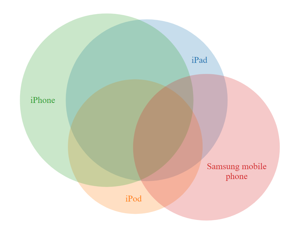
Information about the sample can be seen when you hover your mouse over the different segments.
Discover more fun visualization ideas in Displayr!