

Sankey diagrams are perfect for displaying decision trees (e.g., CHART, CHAID). I used to think that Sankey diagrams were just one of those cool visualizations that look amazing at first, but then don’t turn out to be useful for any real-world problems. I am happy to report I have this wrong and when it comes to visualizing decision trees, you should definitely try the Sankey diagram (sometimes known as a Sankey chart).
Don’t forget you can make a Sankey diagram easily for free using Displayr’s Sankey diagram maker.
Create your own Sankey Diagram
What is a Sankey diagram or Sankey chart?
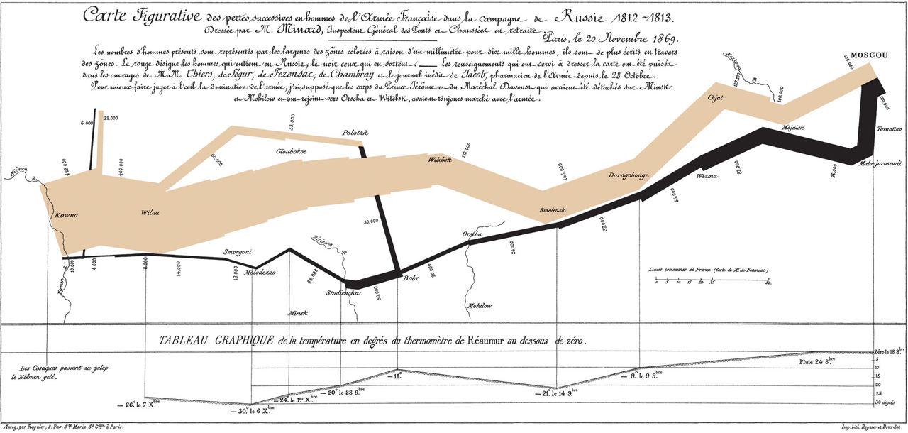
Perhaps you have not come across Sankey diagrams or Sankey charts before? The most famous of them all, created by Charles Joseph Miniard in 1861, shows the ill-fated march of Napoleon to Moscow and back. The tree-branch-like image that goes across the visualization is proportional to the size of Napoleon’s army. Brown represents the advance of Napoleon, with the army shrinking the closer he gets to Moscow. Black shows the retreat from his Pyrrhic victory. Immediately, we can see why Sankey diagrams may naturally be a good choice for visualizing decision trees.
A more typical Sankey diagram example
A more typical example is the load energy flow Sankey diagram or Sankey chart below, which shows UK energy sources and applications.
Cool? Yes. However, I tried to apply these to a whole host of problems, and I kept getting results completely devoid of insight. Then, in an epiphany, which no doubt means that I have stolen the idea from somebody else (perhaps Kent Russell?), it occurred to me that Sankey diagrams are the perfect solution to an age-old visualization problem: how best to represent data from a classification tree.
You can inspect the code, and play with the examples used in this post by clicking here.
Create your own Sankey Diagram
The standard, difficult-to-read, tree output
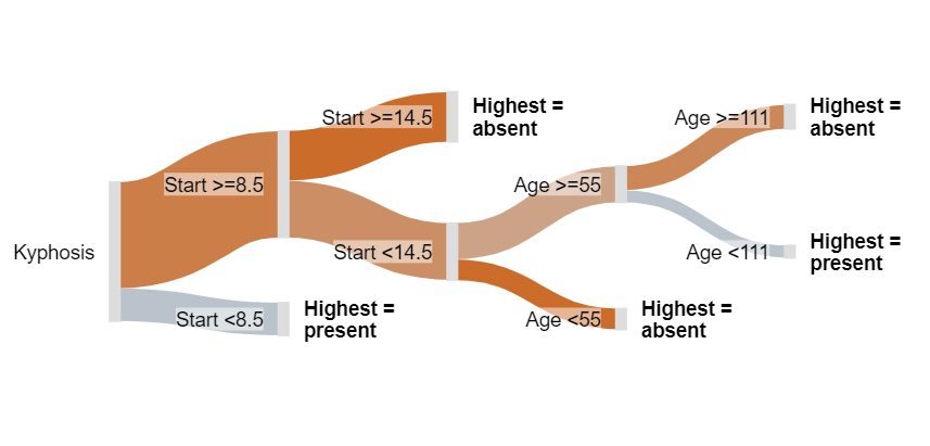
The tree below is the standard output R decision tree visualization from the R tree package. This example shows the predictors of whether or not children’s spines were deformed after surgery. The tree predicts the Presence of Absence of deformation based on three predictors:
- Start: The number of the topmost vertebra operated upon.
- Age: The age in months of the patient.
- Number: The number of vertebrae operated upon.
With a bit of effort you can discern from the tree above that it has identified three segments of children for whom the probability is 50% or more:
- Start < 8.5 and Age ≥ 93
- Start < 8.5 and Age < 93 and Numbers ≥ 4.5
- Start ≥ 8.5 and Start < 14.5 and Age ≥ 55 and Age < 98
However, this R decision tree visualization isn’t great. Compare the meagerness of these findings with what we obtain from the Sankey tree visualization below.
Create your own Sankey Diagram
A Sankey tree
The branches are color-coded, on a continuum of blue to red via grey. Blue means 100% chance of a deformity, grey 50% chance, and red means 0% chance. Thus, we can readily conclude the following things which could not be known from the traditional tree. For example:
- As most of the visualization is red, most children do not experience a deformity after surgery.
- The best indicator of deformity is Start. If Start is 9 or more, the chance of a deformity is comparatively low, except for the small segment for whom Start is between vertebrate 9 and 14 (inclusive), and age is from 55 to 111 months. If you hover your mouse pointer over this node (the second from the top, on the far-right), you will see that only 7 children fit this category, and of these 4 (57%) had a deformity.
TRY IT OUT
You can inspect the code, and play with this example for free using Displayr.
Acknowledgements
The data used in the Sankey tree is kyphosis from the rpart package. The Sankey tree code was a collaborative effort involving Kent Russell, Michael Wang, Justin Yap, and myself, based on a fork of networkD3, which is itself an HTMLwidget version of Mike Bostock’s D3 Sankey diagram code, which is inspired by Tom Counsell’s Sankey library. The load energy flow example is from networkD3, which is a reworking of a Sankey library example, using data from the UK’s Department of Energy & Climate Change.
