
Comprehensive Guide To Market Research Dashboards
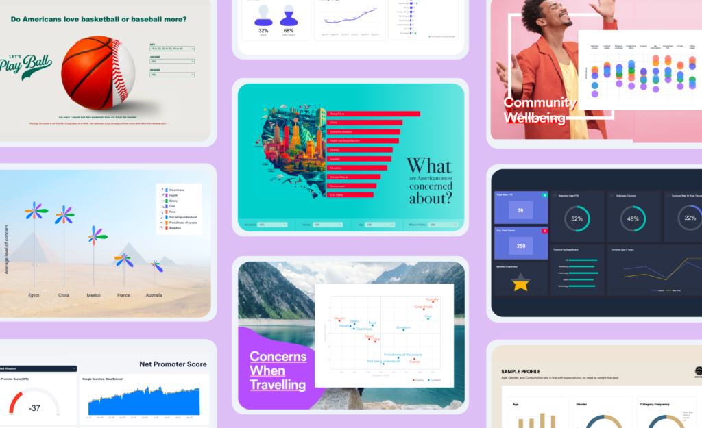
Table of Contents What Are Research Dashboards? Key Features of Effective Market Research Dashboards Common Challenges With Market Research Dashboards Types of Market Research Dashboards Other Market Intelligence Dashboards Why Choose Displayr for Your Market Research Dashboards? What Are Research Dashboards? Market research dashboards allow researchers and consultants to present the data in a way […]
Text Data Visualization: What It Is and How To Use It

Text data visualization is your not-so-secret weapon when it comes to telling impactful market research stories. In theory, it’s a simple process. Just collect your data, analyze it for key insights,and then transform these insights into memorable visualizations. But anyone who has ever attemted to wrangle survey verbatims into a bar chart knows it is […]
5 Ways to Visualize Relative Importance Scores from Key Driver Analysis

Key driver analysis techniques, such as Shapley Value, Kruskal Analysis, and Relative Weights, are useful for working out the most important predictor variables for some outcome of interest (e.g., the drivers of satisfaction or NPS). But, what is the best way to report them? In this post, I illustrate 5 ways of presenting the results […]
Smoothing Time Series Data
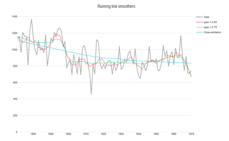
These include both global methods, which involve fitting a regression over the whole time series; and more flexible local methods, where we relax the constraint by a single parametric function. Further details about how to construct estimated smooths in R can be found here. 1. Global trends over time i. Linear One of the simplest methods […]
Dashboard Design: Working with a Graphic Designer
How do you work with a graphic designer so they can help make your online dashboard beautiful? Building a great dashboard requires lots of different skills: data skills, engineering skills, and quantitative visualization skills to work out the best way of visualizing each piece of data. And importantly, design and UX skills to work out […]
How to Create an Interactive Infographic
An interactive infographic can be used to communicate a lot of information in an engaging way. With the right tools, they are also relatively straightforward to create. In this post, I show step-by-step how to create this interactive infographic, using Canva, Displayr and R code. The interactive example is designed so that the user can change […]