Table of Contents
What Are Research Dashboards?
Market research dashboards allow researchers and consultants to present the data in a way that is both informative and visually engaging. A great market research dashboard tells a clear data story by using the right types of visualizations and understanding the intended audience. Unlike static PowerPoint slides, market research dashboards can be interactive and live, so the viewer can now actively participate in their own data story.
Dashboards should be one of the biggest and most important parts of a market researcher’s toolkit. However, they are sometimes considered to be time-consuming and resource-intensive to create and maintain. But with recent advances in data analysis and reporting technologies, producing client-ready dashboards is easier than ever.
Key Features of Effective Market Research Dashboards
If the aim of a market research dashboard is to present relevant data to stakeholders in an engaging and digestible way, then the layout and choice of data visualization need to have the same goal. Some of the key features of effective market research dashboards include;
- Choosing the right visualization to show each specific metric: For example, pie charts are a great way to show proportions, while bar charts are effective when it comes to comparing values across categories. Understanding these nuances is what helps take a dashboard from good to great.
- Design for natural eye flow: Structure your dashboard so that information follows the way people naturally read – typically from left to right and top to bottom. Placing the most important insights in the top-left or center ensures they’re seen first, while supporting details can be positioned further down or to the right.
- Logically group related metrics: Cluster similar KPIs and metrics together to create a coherent and organized visual experience. For example, group all customer satisfaction indicators in one section and sales performance metrics in another.
- Use size and placement to signal importance: Highlight critical information by making it more prominent – use larger fonts, bigger charts, or central placement for your most important metrics. Secondary data can be shown in smaller widgets or positioned in less prominent areas.
- Tell a story: Go beyond presenting numbers – add context to your data by using descriptive labels, concise explanations, and relevant comparisons.
For more tips on creating awesome market research dashboards, check out this dashboarding best practices guide.
Common Challenges With Market Research Dashboards
Some of the most common challenges market researchers face when it comes to dashboards include;
- Information overload: Dashboards can quickly become cluttered when too much data is presented at once, making it difficult for users to focus on the most important metrics. Prioritizing key performance indicators and grouping related data are essential to maintain clarity and usability.
- Inconsistent data updates: If dashboards are not updated regularly and reliably, users may lose trust in the accuracy of the insights provided. Automated reporting tools ensure the data can be refreshed as needed, ensuring the dashboard’s relevance.
- Lack of customization and personalization: A one-size-fits-all dashboard may not address the unique needs of different users or departments. Allowing users to tailor their dashboard view, filter data, and focus on what matters most to them increases engagement and value.
- Insufficient context: Presenting numbers without explanation or benchmarks can leave users guessing about their significance. Adding context through annotations, targets, or industry benchmarks helps users interpret the data correctly and take meaningful action.
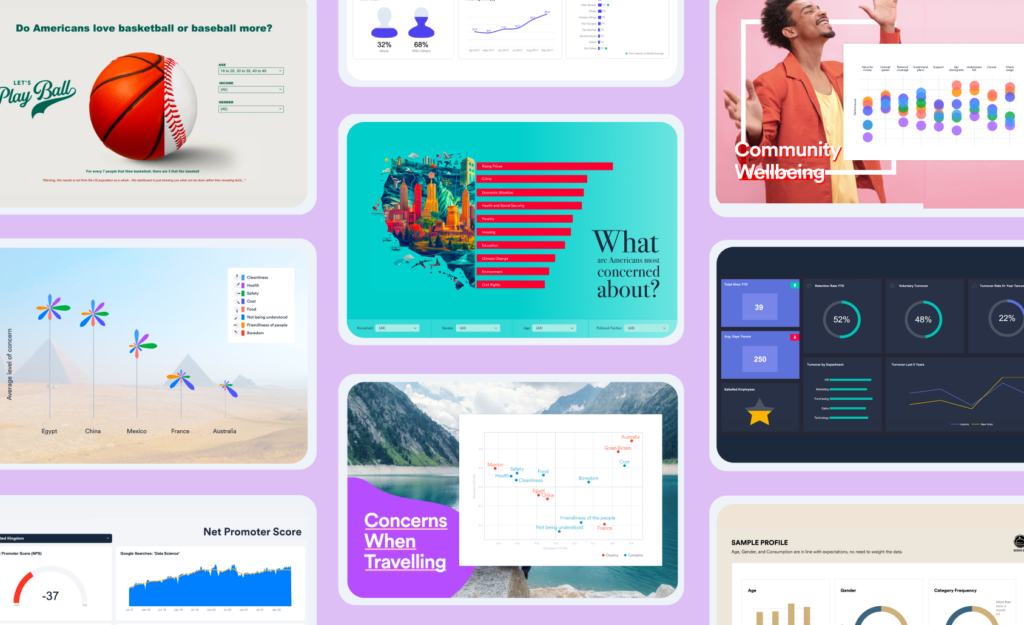
Types of Market Research Dashboards
- Brand analysis (awareness, health, etc.): The most classic way of visualizing a brand analysis on a market research dashboard is with a brand funnel. Brand funnels usually measure the awareness, familiarity, consideration, purchase, repeat purchase, and loyalty of customers for that brand.
- KPI tracking: A Key Performance Indicator (KPI) is one of the most important measurable values that shows how effectively a company or organization is achieving its business objectives. Companies use KPIs to evaluate their success at reaching targets over time.
- Conversion rate and optimization: A conversion rate is the percentage of people or companies that move from one stage to the next stage in a process. The main goals of tracking a conversion rate are to identify weak spots in a company’s customer acquisition process or to compare the performance of different marketing initiatives.
- Product innovation: Product innovation is a great market research dashboard for insight into future product development, pricing decisions, and potential future markets. It normally measures three metrics: usage intention, purchase intention, and willingness to pay.
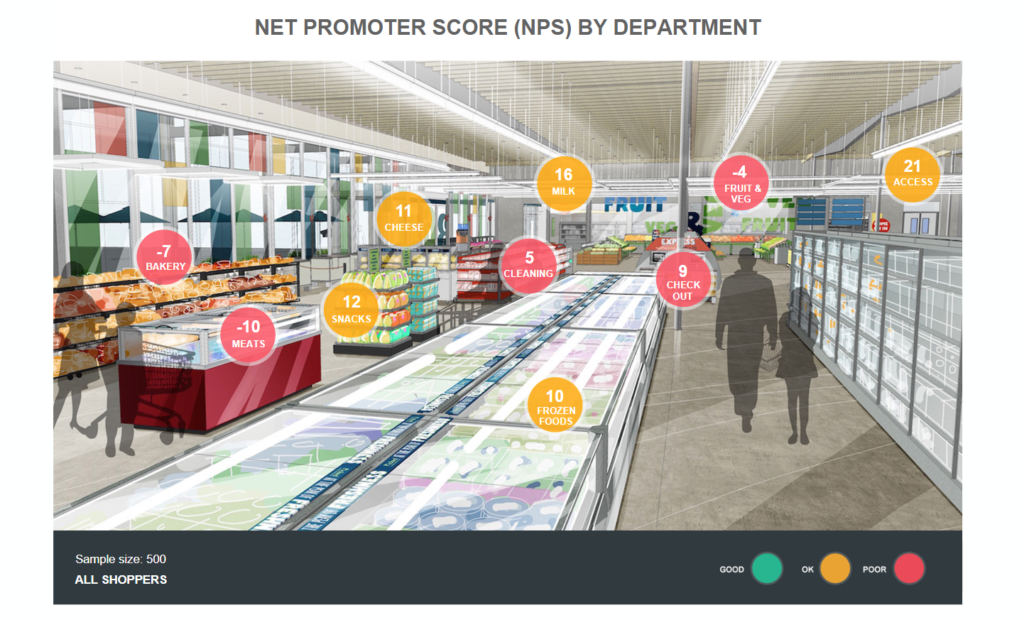
- Customer satisfaction and Net Promoter Score: This market research dashboard surveys existing customers and asks them about their experiences with a particular brand. One of the most important metrics here is the Net Promoter Score (NPS), which evaluates customer loyalty by asking how likely a customer would be to recommend the product or service to someone else on a scale of 0-10. Market researchers often compare Net Promoter Scores across their industry. Another metric that customer satisfaction measures is the Customer Effort Score (CES), which asks customers to evaluate how difficult it was to get support. Ultimately, customer satisfaction measures: the perceived quality of a product, the pricing, the design, and the customer service.
Want to create your own market research dashboards? Check out Displayr’s gallery of interactive dashboards and templates.
Market Insights Dashboard vs. Market Intelligence Dashboard
While often used interchangeably, market insights dashboards and market intelligence dashboards serve different yet complementary purposes in research and decision-making.
- Market insights dashboards: focus on internal or survey-based data. These dashboards are built from primary research sources – like customer surveys, brand trackers, or satisfaction studies – and are designed to uncover what your audience thinks, feels, and does. Their primary role is to distill survey data into actionable insights that help guide marketing, product, or customer experience strategies.
- Market intelligence dashboards: on the other hand, focus on external data sources. These dashboards aggregate and visualize secondary data – such as economic indicators, competitor activity, or industry trends – to help businesses understand broader market conditions and anticipate change.
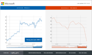
Other Market Intelligence Dashboards
While market research dashboards serve as an effective tool for visualizing and communicating survey data, many researchers will also understand the need to report on secondary sources to better inform decision-making. This is where market intelligence dashboards come in. These focus on external factors that impact a business and provide the insight needed to anticipate and respond to changing market dynamics.
Some examples of a market intelligence dashboard include:
- A dashboard tracking global commodity prices – Helps businesses monitor fluctuations in raw material costs and adjust pricing strategies accordingly.
- An economic indicators dashboard – Monitors key metrics like GDP growth, inflation rates, and unemployment to assess the overall economic environment.
- A supply chain risk dashboard – Tracks disruptions in global supply chains, such as shipping delays, geopolitical risks, and raw material shortages.
- A retail sales trends dashboard – Analyzes sales data across different industries to identify shifts in consumer demand and market opportunities.
Why Choose Displayr for Your Market Research Dashboards?
We know how important it is to you to have engaging, informative, and interactive dashboards to present to your clients. Displayr is the only complete tool for creating market research dashboards yourself for free. Here are a couple of reasons why:
- Ease of use: Displayr can be used by everyone from the most advanced of researchers to non-technical people. No more relying on others to create dashboards. Tell your own story of the data.
- Beauty and functionality: Create beautiful and interactive dashboards. Change filters with one click. Really wow your clients by customizing the design to include logos and brand colors.
- Made for you: Displayr’s dashboarding tools are specifically designed for market researchers by market researchers. We know how painful it has been in the past to make dashboards; that’s why we’ve built Displayr to handle market research data.
- But it can do more: Displayr is a complete tool, not only can it handle survey data seamlessly, it can take on all other data types for you.
- Value: Using multiple tools to analyze and present your data? Using add-on dashboarding solutions? By combining all the things you need to do, Displayr will save you from spending. Best of all, you can try Displayr for free!