

A scatterplot is a great way to visualize two variables from a data set. In this post, I describe how to extend a basic scatterplot to show trends. The trends reveal how the data evolve through time.
Don’t forget you can create a scatterplot for free using Displayr’s scatterplot maker!
Showing movement through time
The chart below plots the relationship between two perceived characteristics of colas. It does so at two points in time, Q1 2012 and Q2 2012. It is immediately clear that Coca-Cola is becoming more ‘out and about’ and also more ‘at home’.
The plot was created in Displayr from the toolbar with Visualization > Scatter > Scatter. In the object inspector, for the Data > Data source, I selected two tables, each with the cola brands labelling the rows and the variables stored in the columns.
Then I checked Chart > Appearance > Show lines with arrows. Importantly, trend lines are plotted between points from each table in the order that the tables are given. The arrows show the points in the final table given. Note that trend lines link rows of data across tables. This is different from plotting a line of best fit for all the points.
Highlighting one brand
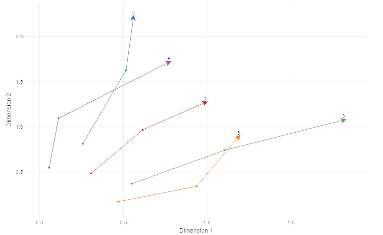
The chart below extends the previous chart in two ways:
- Four tables were supplied instead of two, so I now show the evolution across four quarters. Most of the brands are oscillating around their starting location. Only Coke Zero exhibits a clear trend.
- I have set Chart > Data Series > Color palette > Custom pallette and set the colors of the brands to be “grey, grey, red, grey, grey, grey“. This immediately makes Coke Zero stand out.
Summary
In this post I have shown how you can incorporate a temporal dimension into scatterplots. By using color you can highlight the important trends.
You can see a document including the outputs above or play around with your data and charts in Displayr by following this link.
