
A column chart is a data visualization where each category is represented by a rectangle, with the height of the rectangle being proportional to the values being plotted. Column charts are also known as vertical bar charts.
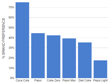
Column chart example
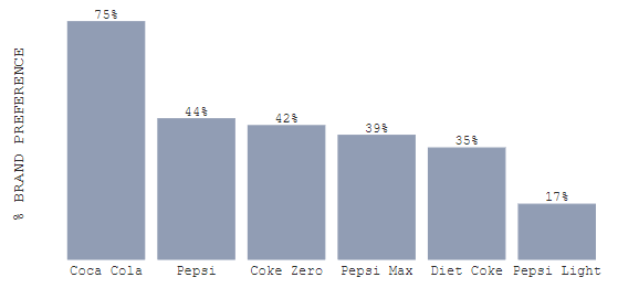
In the example below, the height of each bar is proportional to the percentage of people who listed each type of cola as being their favorite.
Column chart definition
The official definition of a column chart is a graphical representation of data where rectangular bars, or "columns," are used to show values for different categories. Each column's height represents the value of the data point it represents, with categories typically displayed along the horizontal axis. Column charts are commonly used to compare discrete categories or track changes over time, making them a useful tool for visualizing trends or differences between groups.
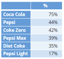
Required data
This visualization typically displays categories along the horizontal axis and values along the vertical axis. The chart above plots the data that is shown in the table below.
Main variants
There are many variations of the column chart. The main ones are:
- Variants designed for dealing with multiple values for each category, including:
- Clustered column chart
- Stacked column charts
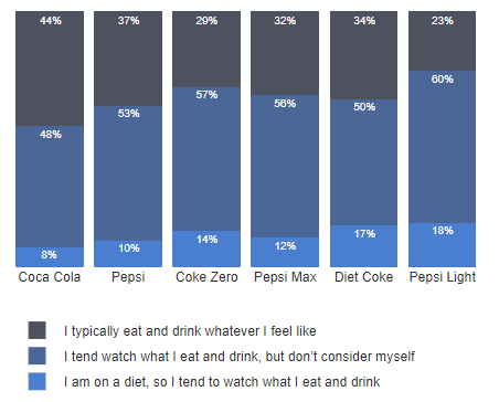
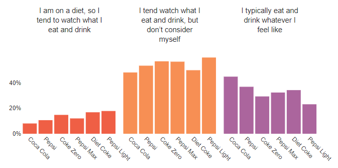
- Small multiples
- Clustered column chart
- Bar charts, which are essentially the same, except that the whole chart is rotated by 90 degrees, with the data communicated by the width of the bars.
- Pictograph column charts, which replace the columns with images, with the goal of making the chart more recognizable and interesting (e.g., a column of height 5 for Coke may be replaced by cola cans).
Advantages of column charts
They are particularly useful when:
- The data has a small number of discrete categories, with a single value for each category. Where there are multiple values per category, the variables such as small multiples, cluster column charts, and stacked column charts, shown above, are superior.
- The goal is to compare the values of each category.
- The intent is to make it simple for the viewer. Column charts are arguably sometimes the best of all visualizations, as they tap into our instinctive ability to understand heights, whereas most other data visualizations require some degree of training for the reader to decode.
Limitations and alternatives
Column charts are a relatively poor choice when:
- There are a very large number of categories. With more than about ten data points, other visualizations such as dot charts or even bubble clouds, donut charts, pie charts, and word clouds, are often better.
- It is interesting to look at the cumulative values of the categories. In such situations pie charts, donut charts, and waterfall charts tend to be superior.
- The values being represented are small counts (numbers less than 10), in which case pictograph column charts and minimal column charts are often clearer and more interesting.
- The intended audience has a low level of interest. In this case, the variants of pictographs can be more visually engaging.
- The values being represented are rates (e.g., deaths per thousand), in which case pictograph area and waffle charts are better.
Tips on making a good column chart
- Sort the categories, so that the highest category is on the left, except where there is a natural order to the data (e.g., age categories).
- The y-axis (vertical) axis should show the 0 value, with the column starting at 0. Otherwise, the height of the bars becomes misleading.
- Use a single color. Multiple colors merely serve to distract.
- If you want the focus to be on the actual numbers, consider removing the axes and placing the values at the ends of the columns, or inside the columns. This is demonstrated in the example below. However, if the focus is intended to be on the trends, it is better to display the axes. When the chart is presented online, the values can then be shown when the user moves their mouse pointer over the columns.
- The width of the columns should be wider than the gaps between, and the gaps need to be big enough that the columns are distinct, as otherwise, the visualization focuses the viewer's eye more on evaluating the shape than on comparing the height of the columns.
Column chart software
There are many software packages in the world that can create column charts. The only trick is that often they do not have their own option, and you need to instead first create a bar chart and then choose an option telling the software to draw it vertically. You can easily create a column chart here in Displayr.
Tackled column charts? Discover all the other visualizations you can create in Displayr!