In this post I show you to create 3D visualizations of correspondence analysis using Displayr. This allows you to view an extra dimension of your data (and looks great too!).
Traditional correspondence analysis
Traditional correspondence analysis plots typically plot the first two dimensions of a correspondence analysis. Sometimes, additional insight can be gained by plotting the first three dimension. Displayr makes it easy to create three-dimensional correspondence analysis plots.
The data
In this post I use a brand association grid which shows perceptions of cola brands.
Creating the correspondence analysis
The first step is to create a correspondence analysis. In Displayr, this is done as follows:
- Create a table of the data to be analyzed (e.g., import a data set and then press Insert > Table (Analysis)).
- Select Insert > Dimension Reduction > Correspondence Analysis of a Table.
- Select the table to be analyzed in the Input table(s) field in the Object Inspector.
- Check Automatic (at the top of the Object Inspector).
This should give you a visualization like the one shown below. You can see that in this example the plot shows 86% of the variance from the correspondence analysis. This leads to the question: is the 14% that is not explained interesting?
Create your own Correspondence Analysis
Creating the interactive three-dimensional visualization
- Insert > R Output
- Paste in the code below
- Replace my.ca with the name of your correspondence analysis. By default it is called correspondence.analysis, but it can have numbers affixed to the end if you have created several correspondence analysis plots. You can find the correct name by clicking on the map and looking for the name in the Object Inspector (Properties > GENERAL).
rc = my.ca$row.coordinates
cc = my.ca$column.coordinates
library(plotly)
p = plot_ly()
p = add_trace(p, x = rc[,1], y = rc[,2], z = rc[,3],
              mode = 'text', text = rownames(rc),
              textfont = list(color = "red"), showlegend = FALSE)
p = add_trace(p, x = cc[,1], y = cc[,2], z = cc[,3],
              mode = "text", text = rownames(cc),
              textfont = list(color = "blue"), showlegend = FALSE)
p <- config(p, displayModeBar = FALSE)
p <- layout(p, scene = list(xaxis = list(title = colnames(rc)[1]),
           yaxis = list(title = colnames(rc)[2]),
           zaxis = list(title = colnames(rc)[3]),
           aspectmode = "data"),
           margin = list(l = 0, r = 0, b = 0, t = 0))
p$sizingPolicy$browser$padding <- 0
my.3d.plot = p
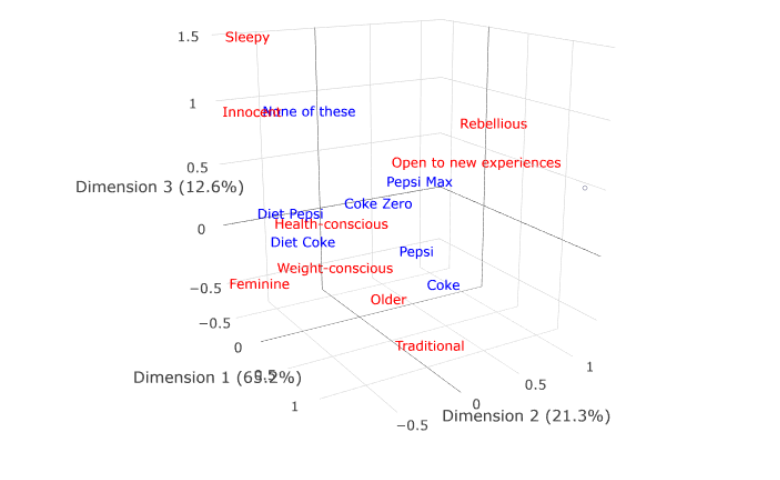
You will now have an interactive visualization like the one below. You can click on it and drag with your mouse to rotate, and use the scroll wheel in your mouse (if you have one) to zoom in and zoom out.
Click the button below to see the original dashboard and modify it however you want!
Sharing the interactive visualization
You can also share the interactive visualization with others, by using one of the following approaches:
- Press Export > Web Page and share the URL of the web page with colleagues. This includes an option to require password access. For more on this, see our Wiki.
- Press Export > Embed, which will give you some code that you can embed in blog posts and other websites, which will make the interactive visualization appear in them.
If you click here you will go into Displayr and into a document containing the code used the create the analyses and visualizations in this chart, which you can then modify to re-use for your own analyses.