Box plots are used to display the median, interquartile range, and outliers for a set of numeric data. They let you focus on the characteristics of the distribution, and compare distributions between different variables or groups in your data. In this post I show you how to create a box plot in Displayr.
Don’t forget, it’s super easy to create a free online box and whisker plot using Displayr’s box and whisker plot maker.
Method 1 – Paste in data
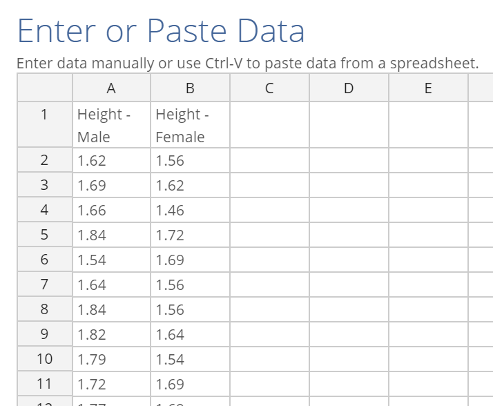
The easiest way to make visualizations in Displayr is often to just paste your data right in. As box plots are designed to show characteristics of a distribution of data, the type of data you need to be pasting in is raw data corresponding to observations on one or more variables. This lets the box plot do its math in the background to work out the median and interquartile range. Your data set up should look like this:
To create a box plot by pasting data:
- Select Insert > Visualization > Box Plot.
- Click Paste or type data under Inputs > DATA SOURCE in the Object Inspector on the right.
- Paste your data into the spreadsheet interface, like the one I have shown above.
- Click OK.
- Tick the Automatic box. Any changes you make to the settings or to the underlying data will be reflected automatically in the plot.
- Change any formatting settings in the Chart section on the right.
My data is in two separate columns. One shows the height of males and the other shows the height of female members of the data set. The box plot comes out looking like this:
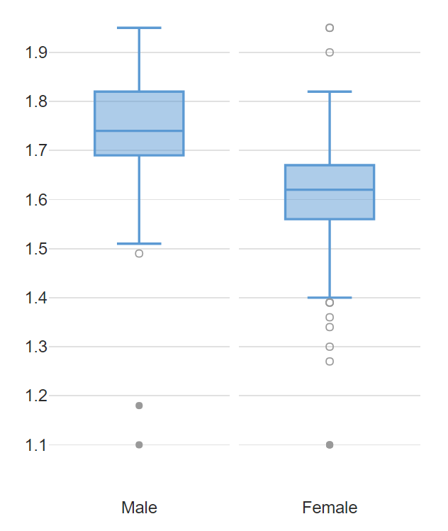
The box itself shows the interquartile range of the data, while the lines within each box show the median. The lines reaching out above and below the box are referred to as the whiskers. These connect the box to the largest and smallest values that are within 1.5 times the interquartile range from the box. The dots shows data points which lie outside the whiskers, typically considered to be outliers.
Method 2 – Use data from a data set
You can add a data set to your document by selecting Home > New Data Set, and then choosing from one of the many sources available. For more information on the range of data sets you can add, see Introduction to Displayr 2: Getting Your Data into Displayr. Once you have added a data set, the variables will become available in the Data Sets section in the bottom left.
To create a boxplot from the variables in your data set:
- Select Insert > Visualization > Box Plot.
- Click into the Variables in ‘Data’ box under Inputs > DATA SOURCE in the Object Inspector and select the variables you want to include in the plot.
- Tick the Automatic box at the top.
Grouping box plots
One key advantage of using a data set is that you can choose variables from your data set to automatically split the box plot, allowing you to compare between groups. For example, I have added a data set from a very old survey which asked people about the number of text messages they send in a week. I can draw a box plot to show the distribution of text messages. Then, to compare between age groups in the data, I can select Inputs > DATA SOURCE > Groups and choose the variable which contains the age groups of the respondents in the survey.
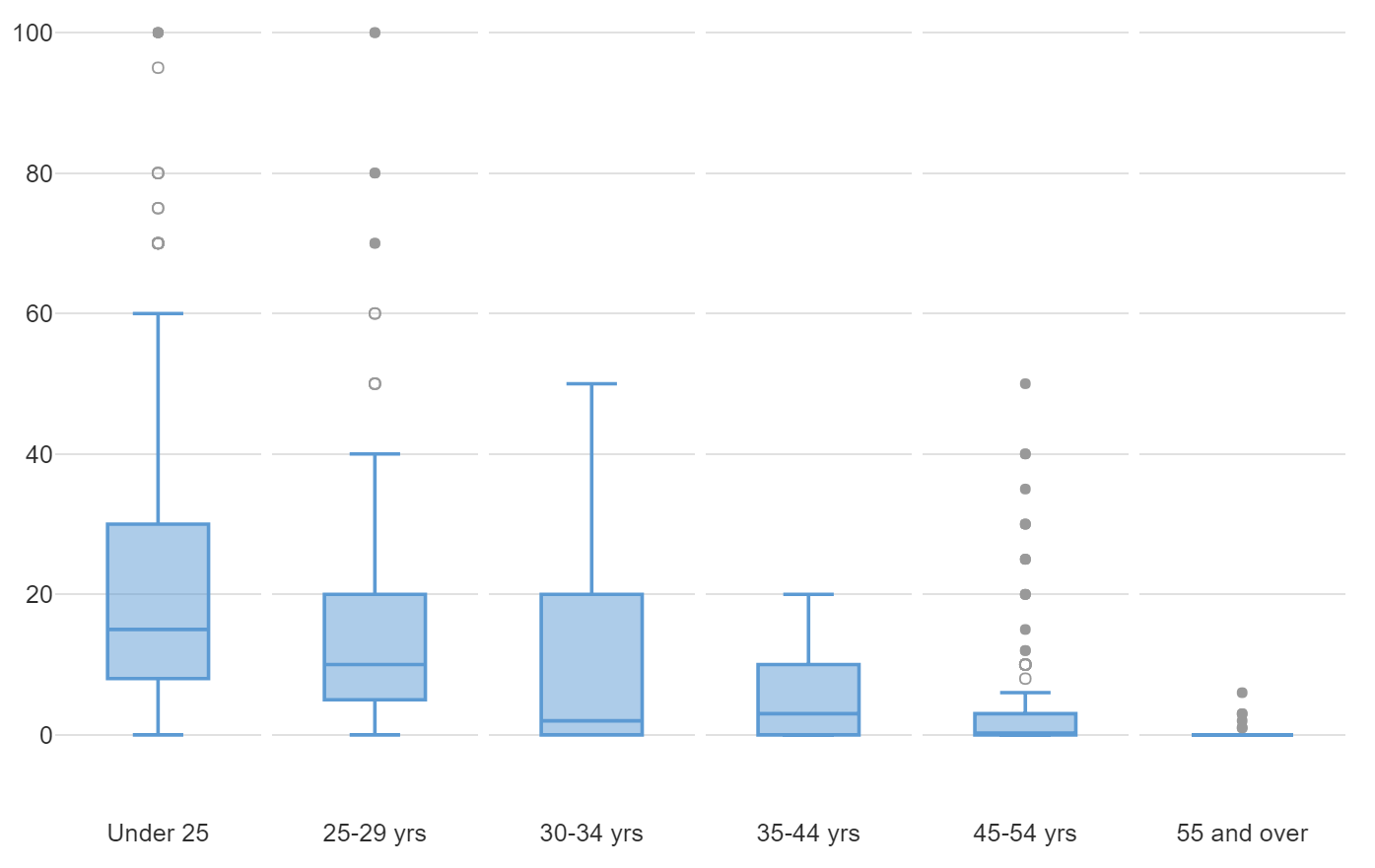
As we may expect, we see a drop off of the median number of weekly texts with age, as well as a general shrinking of the range of the distribution.
You can create box plots in Displayr for free. Feel free to also check out more visualization ideas!