Open-ended survey responses can be difficult to analyze. Algorithms and data models that work well with numeric and multiple-choice data often struggle to make sense of free-form text data. Sentiment analysis is a widely used text analytics technique to help code customer feedback. Learn what it is and how to use it!
An open-ended customer feedback survey question prompts customers to respond in their own words. This often results in detailed but messy data. Sentiment analysis algorithms help you make sense of your feedback responses by coding responses based on the number of positive and negative words used.
Ready to try it out?
Start a free trial of Displayr.
What is sentiment analysis?
Sentiment analysis is the process of using an algorithm to categorize content based on how positive, neutral, or negative it is perceived to be. Note that you can perform a sentiment analysis manually if you have a small dataset, but it’s time-consuming. The algorithms access a dictionary of words with positive or negative sentiments attached to them. The algorithm then looks at each response and assigns a sentiment score. The more positive the comment is perceived to be, the higher its sentiment score.
However, it should be noted that sentiment algorithms will misinterpret idioms and fail to detect sarcasm. It can also be tripped up when a respondent uses positive or negative words but are actually stating a fact. For example, “Microsoft is a very well known brand that is well liked” is given a positive score by the algorithm despite the fact that it actually doesn’t express a positive sentiment felt by the respondent.
A practical example of customer sentiment analysis
Once you have calculated sentiment scores from your feedback survey, there are a few ways to analyze and present your data with Displayr.
Average sentiment
Calculating the average sentiment score is always a great starting point. A high score indicates that the feedback has been generally positive and that words with a positive sentiment are over-represented in your responses. On the other hand, a score below zero indicates that the feedback has been largely negative.
Sentiment histogram
The average sentiment score tells you nothing about the distribution of your sentiment scores. A histogram is a great way to visualize the shape of your data.
From the histogram, we can see that the sentiment scores are clustered around a mean of 0.7. There are very few responses with either abnormally high or abnormally low sentiment scores, which suggests that the majority of respondents did not have an extreme reaction to your customer feedback question. A cluster of sentiment scores on either extreme is something that should be noted and further investigated.
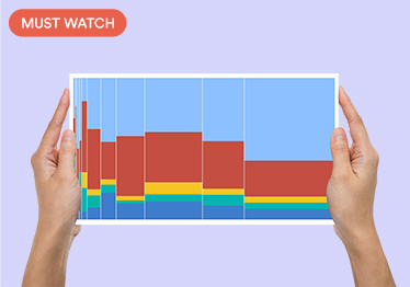
Donut chart and column chart
The donut chart and column chart are two ways to visualize negative, neutral, and positive responses. The donut chart is a great way to illustrate the proportion of each category, while the column chart is a better way to visualize the counts.
From the two charts, we can see that 182 respondents gave feedback with a positive sentiment score, which makes up over half of all respondents (61%). On the other hand, only 31 respondents left feedback that is perceived to be negative, which makes up only 10% of all respondents.
Word cloud
We now know that the majority of customers responded with positive feedback, with an average sentiment score of 0.7. But we don’t know much about the actual responses. A word cloud will help you better understand the themes and topics addressed in your responses.
The words “innovative”, “easy”, “leader”, and “trustworthy” are commonly found in the survey responses. This suggests that the positive sentiments expressed within the responses are due to these attributes. The word cloud provides us with a deeper understanding of the responses and the sentiments expressed within them.
The evolution of sentiment analysis
Modern sentiment analysis leverages advanced techniques in natural language processing (NLP) and machine learning to accurately interpret and categorize text data. Algorithms can now identify not only positive or negative sentiments but also the subtleties of emotion, tone, and context within a response, using vast databases of words, phrases, and linguistic patterns. While sentiment analysis has become more sophisticated, challenges remain in accurately interpreting sarcasm, idiomatic expressions, and ambiguous statements, requiring ongoing refinement of models and approaches.
Try it yourself
Try Displayr’s text analysis tool on your survey data today.