


Data checking is a bore (and a step we skip at our peril!). The laundry-list of data checking tasks can be seemingly endless: identifying bogus respondents, cleaning up the metadata, organizing the results. In larger organizations, data files may go through a special data-processing department before the researcher even sees it. In this scenario, the data checking and cleaning that happens typically takes a lot of time and energy (especially when checking things rigorously). Market researchers and data analysts frequently don’t have the luxury of a separate team to do their dirty laundry. Automating data checking reduces this tedium, and allows you, the researcher, to get on with effective analysis (the fun stuff!).
You have a lot of dirty laundry to do with survey data
Surveys are based on sampling, and sampling is never perfect. Having outliers or “flat-liners” in your sample can skew the results one way or another, throw off your statistical testing, and lead you to make erroneous conclusions. As a result, we typically want to exclude them. Furthermore, the survey collection software or programming can do funky things to your data. Perhaps a skip wasn’t in place when it should have been. If your variables look like a jumbled mess or they haven’t been given a label at all, then the problem lies in your metadata. In addition, while the data and respondents may all be legit, you may simply want to do a bit of housekeeping upfront to neaten up your subsequent analysis.
Now in this post, we couldn’t possibly go through ALL the known data-checking issues under the sun, but we will go through some areas of data checking where (automated) techniques can be applied to more efficiently deal with the task at hand.
Checking for outliers
Outliers are respondents who fall way outside the expectations and so they can skew the results dramatically. If you happen to have Bill Gates in your sample, you might find that the average income indicates that your respondents are very rich on average. By eliminating Bill from the sample, then the average income might seem a bit more normal.
So how do you detect these outliers? While there are many approaches, a common method is to exclude those who are a certain number of standard deviations from the mean (for a single numeric variable).
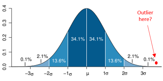
The diagram above is the familiar bell curve (normal distribution). If a score lies outside 3 standard deviations from the mean, you can see that that’s less than 0.1% of the population. So we can use a measure like this (eg: +/- more than 3 standard deviations or whatever threshold is set) as a means for exclusion.
Most software programs, fortunately, can compute a new standardised version of the variable for you (phew!) which tells you for each respondent how many standardised deviations they are from the mean. But in the standardised variable, you still need to detect and deal with the outliers:
a) scanning the data for extreme outliers (eg: those +/- 3 std dev’s from the mean)
b) identifying the outliers (eg: cross-reference an ID)
c) constructing a new variable that sets their data as missing
You may need to repeat this process for multiple variables throughout your datafile. As a result, you can see that such a process could easily become unwieldy. Furthermore, you then need to figure out how to isolate them and exclude them. Analysis software that can automatically detect and exclude outliers may not only save the integrity of your data, but also save you a lot of time.
Checking survey skips visually (eg; the Sankey diagram)
Programming and logical errors are common in survey routing. Consequently, a traditional approach has been to check the base size of individual questions. But you don’t know for sure if answering X at question A means they should skip question B.
We could take the analysis a step further and use a series of crosstabs to see how variables relate to each other (including how missing values line up). If the skips are complicated, and if there are lots of them, then you might be checking a lot of crosstabs. Furthermore, you could easily and accidentally miss a cell where someone has skipped incorrectly. In addition, you might want to consider more than just 2 questions in your crosstab. Despite our good intentions, the tedium here may tempt us to skip this step (unless you have some good crosstab software).
What if there was a visual way to track how skips are working? This is precisely what a Sankey diagram can do. It can track how responses (or non-response) between questions flow (or not) between each other. Consider the Sankey visualization below:
You can see that non-responses at Q1 (the left column) exclusively flow into the missing values (“NA”) of Q2 (the middle column). Also, it simultaneously shows that a bunch of students at Q2 flow into work categories of Q3 (right column) – that’s weird. Also weird is that a whole bunch of “part-time” workers (Q2) flow into missing responses at Q3 (right-column). So with the one diagram, we can quickly identify a few issues with the missing values, suggesting something might be amiss with the skips.
Certain visually-capable software packages can generate Sankey diagrams, with varying degrees of ease. The next time you’re checking your skips, try doing it visually with a Sankey diagram. See here for more on using Sankey diagram.
Checking for flat-liners
Flat-lining is the colloquial term for respondents who answer a series of rating scales (eg: 0-10, disagree to agree, etc) with the same answer in each. If they do this a lot, or all the time, it’s a reasonable supposition that they are not engaging with the survey (so we should discount their answers). Identifying them, and eliminating them, from the sample is best practice.
Identifying them manually would involve some convoluted computation:
a) you need to identify all the variables that belong to a same scale question
b) you then run computations to identify, in a new variable, which respondents gave flat-line answers (however you define what flat-lining is in this context)
c) optional: you run additional computations to create variables that identify if they were flat-lining elsewhere/everywhere in the survey with other scale questions)
d) now you’ve identified them, you may want to delete them from the data (involving an additional stage of deletion)
Writing some code to do all this, could be a little tricky. Consider this example of SPSS code I found online by googling “flat-liners”. If one character ends up out of place it won’t work correctly! I probably would be inclined to just ignore the flat-liners (too hard basket!) if I had to write or tweak code like that. However, a smart analytics package should be able to find and help you remove flat-liners at the push of a button. It would do this by having code already set up that is generic and flexible enough to run through the steps A to D above. So if you can, let the software take the pain out of finding these painful respondents.
Checking for HTML tags in variable labels
HTML creeping in to your variable labels is a common, pesky hangover from a survey platform. The programming from DIY survey platforms can spill into their output files, contaminating the variable labels, and making things harder to read.
Consider this awkward variable name:
Q6. Satisfaction: Sainbury’s <html> <p> – </p> How satisfied are you with the following <b>?</b> </html>
It should really just be:
Q6. Satisfaction: Sainbury’s – How satisfied are you with the following?
To fix manually, you’d need to scan down through the variable labels (if your software can do that) for the specific identifiers of HTML – the trademark greater-than and less-than characters (<>) that enclose HTML information. In long variable labels, they may be hard to spot, and then you may need to go in and backspace to get rid of them. If you’re working off a purely code-based system (like R), you may need to re-specify the entire variable label (what a bore!).
HTML tags aren’t going to ruin your data, but they can make things messy. It’s reasonably easy for a computer system to identify them as HTML, so in theory we should just be able to leave it to a computer system to just deal with. Tick. One less thing to do in your data tidying.
Checking for lots of other errors in data file construction
There are a seemingly endless list of potential “little” problems that may exist in your datafile. Here’s some additional things you could be doing as you go through your data. As you read them, consider – could automation help with these?
Does the variable type make sense for each variable? An average score of 1.5 doesn’t make a lot of sense on a numeric version of gender, but a categorical version with 50% male and 50% female does make sense.
Are all your binary variables set up correctly? Data for multiple response questions are typically stored as 0’s and 1’s. You want to be careful that the 0’s are in fact present in the data (else, is there actually a skip in the survey?). Perhaps a ‘don’t know’ response should be set to missing?
Do you have text variables that store multiple response data separated by commas? Multi-text responses ideally are split into different variables, which makes free-text coding much simpler.
Do any demographic variables have incomplete data? Generally these questions should not have a skip in them.
Do any variables contain only a single possible value? This may indicate a problem in the survey. Equally, it could be like a screener question, in which case a single value is what you expect.
Do any variables have a base size considered too low for analysis? You may like to know about this upfront or at least have it flagged as you do any analysis.
Some datafiles have thousands of variables or more. Consequently, going through this checklist manually would involve extensive systematic evaluation. Because a computer has much greater attention to detail in spotting holes and inconsistencies, automated procedures for the above are not only more efficient, but also more accurate.
What options are available to software and users?
What defines “automation” can vary (including in a data-checking context). Perhaps it’s a computation to identify a pattern (such as in the flatliner example). Or perhaps it’s a data visualization (as in the case of the Sankey diagram). Or perhaps it’s using a certain statistic (as in the case of standardised scores to identify outliers).
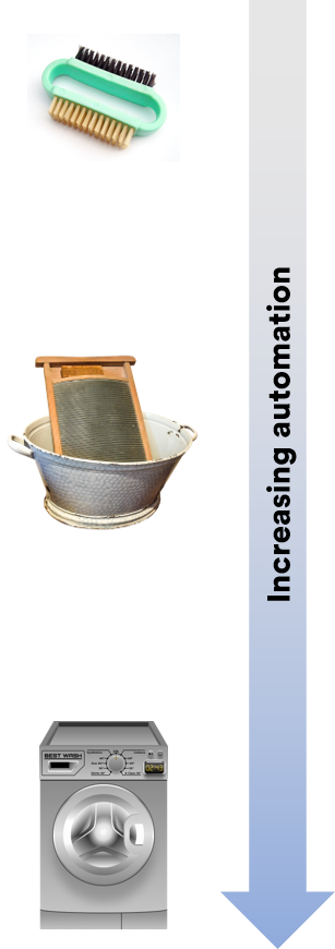
Automation also varies in how much time and effort the user puts in to make the task run (properly). This is where software can differ greatly. At the low end of automation, a software package can simply allow you to run some code that you input/execute. At the other end, the software has flexible function that takes care of the task from A to Z. And then there’s that middle-ground, where the software may offer a function or feature that takes you part of the way there.
Consider the following scale of automated functions that could help us with the automated checking for outliers using their standardised scores.
No automation – you need to calculate it all by hand on a case-by-case basis. Not practical.
Low automation – the software allows you to write some code that calculates the standardised score for each respondent in a new variable.
Medium automation – the software has a function you can call on that saves the standardised score. You may need to repeat the process for different variables.
High automation – the software has a specially designed script or wizard that scans through all the numeric variables it detects in the datafile. It asks you some questions (eg: how many standard deviations is the cut-off point) and perhaps whether you want to set their responses to “missing data” automatically.
If you’re doing the low-automation option with code, you need to a) know the code, b) know it well enough to feel you’re doing it right (no point in “mis-checking”) and, c) feel that the time invested in setting it up is worth the effort (the payoff). At the high automation end, all those points (a through c) get taken care of by the software’s scripts. Clearly the high automation in the above example would be ideal.
Automation in software tends to come hand-in-hand with specialization. If the software is specialized for survey-data analysis, then it follows that it’s going to have greater automation with respect to dealing with survey-related problems.
The different software rinse cycles
Q
Q has an advantage in that it is specialized for market research (and therefore survey analysis). It has a library of automated scripts designed specifically for the aforementioned issues. So it generally works at the “high-end” of automation with respect to data-checking. In many cases, Q can resolve the issue on the spot (such as outlier removal). Here’s some specific examples.
- Detecting (and removing) outliers – A script automatically creates new variables with outliers removed (and the user specifies outlier criteria).
- Checking survey skips – You can create an R-based Sankey visualisation just by specifying variables. Other survey skipping scripts and tools available too.
- Flat-liner detection – A script automatically identifies flat-liners, and facilitates subsequent removal.
- Removing HTML from variable labels – The default option for data import automatically removes HTML tags from all labels.
- A range of minor checking tasks – Automatic script(s) can simultaneously execute a range of checking tasks in one go.
Q also has the advantage of allowing you to write a custom script and/or editing an existing script it has set up in its library (Q uses JavaScript or R).
SPSS
Is a widely used generalist statistic program. Although it processes survey data well, it doesn’t have a library of automated scripts designed specifically for survey-related issues. Nonetheless, SPSS does have a lot of variable manipulation features and functions that automate a lot of relevant computations that can assist you in checking your data. Here’s an example where you can easily save standardised Scores as a new variable.
SPSS also has its own syntax (SPSS Syntax) that you can write from scratch or find an existing copy (online) and tweak. The syntax is very flexible, and, if used properly, automates a lot of data-checking (and cleaning). The downside is that you need to know, and have competency using, the syntax.
R
The most manual of the above, R, is simply code. Much like SPSS, it is a flexible tool that allows you to write your own code. You can find a lot of existing R code online in forums if you google around. For instance, you could leverage the chisq.out.test() function within the ‘outliers’ package – available for free from CRAN. You can also build neat visualisations in R, such as the Sankey diagram, but it takes a fair bit of know-how and manual programming!