

Save a lot of time by automatically summarizing significant data differences as overlays on a common chart type.
Finding the balance between detailed data and charting.
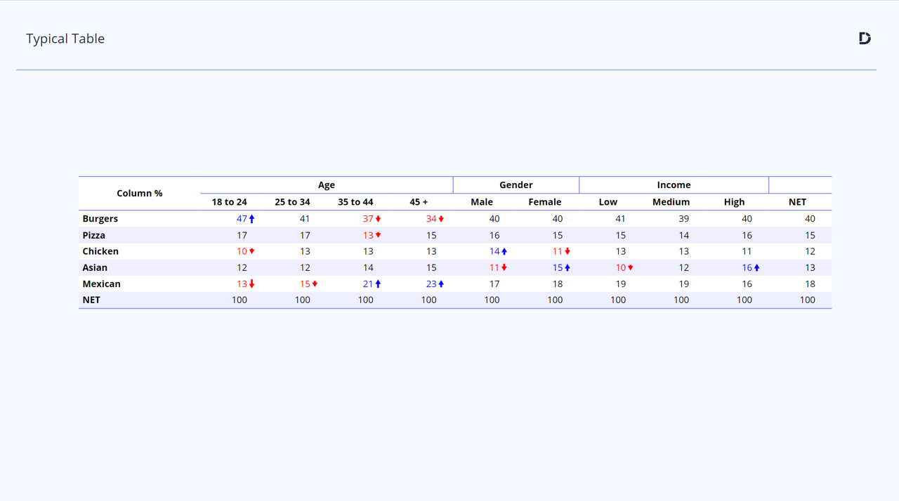
One of the dilemmas a researcher faces in building a report is to work out just how much detail to show. Consider a typical cross-tab (in this case using a banner) that has lots of interesting significant differences, as indicated by the blue and red number formatting
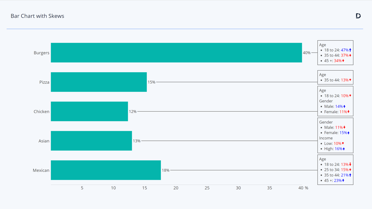
Of course, the key finding here is the Total or Net result, so we have to show it. Rather than asking the audience to study the cross-tab in detail a common way of visualizing this type of a result is a bar chart with call-outs or labels to highlight the key findings:
This takes a while to set up in PowerPoint. And in the case of a typical tracking study, where the results will change wave-to-wave, it can be a very tedious to update. Not anymore – Displayr’s visualization suite now contains an option to automate this type of chart, in seconds!. See it in action in this short video:
Try Bar Charts with Skews now
Existing customers will quickly see how much time they can save using this new visualization. Anyone else can book a demo or take a free trial.