

Within Displayr, there are different ways of visualizing your data. Before jumping into the detail, we acknowledge that ideally there would be only one system. As Displayr develops, the different charting systems will eventually converge.
At the moment there are three major types of charts in Displayr terminology: Visualizations, Charts and Plots. This post describes these different systems, explains their key differences, and provides recommendations about which to use and when.
A central reason for having these differences, as it stands, arises from the use of R. In simple terms, a Chart is created directly from your data set by first creating a table. No R is involved. Plots and Visualizations are both generated by R code. Don’t worry – you don’t usually need to write any code yourself! This is because many are already built into our menus, and even more will be introduced over time.
Charts
You create a chart in Q by transforming a table:
- Create a table by dragging questions set from the Data tree onto your page.
- Make sure the table is selected, and then in the Ribbon, click Insert > Chart to turn it into a chart. You can selected from a range of built-in chart types. The chart feature is also available under Home > Chart.
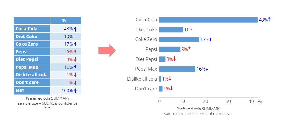
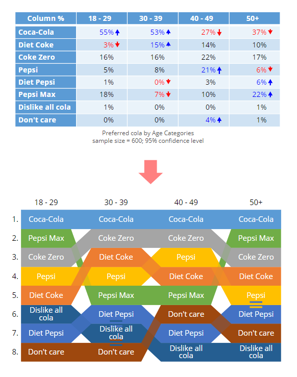
Two examples are shown below, showing the table first, and then what it looks like after its transformation into a chart.
The first is the humble bar chart.
The second is a Ranking Plot.
These charts have a number of features that are not available in Visualizations and Plots:
- Statistical test results are on nearly all of the chart types, via coloring, arrows, or lettering. This is controlled via the Ribbon: Appearance > Highlight Results (Significance).
- A chart automatically includes a footer that indicates the sample size and statistical testing information.
- You can click on different bits of the chart and their controls will be automatically selected in the Charts tab of the Object Inspector.
- These charts are fast to compute.
- You can change the statistics displayed (e.g. Average, Median, Column %), by selecting the chart and selecting the relevant option from Ribbon: Home > Statistics – Cells.
They also have one key limitation: in the main, they can only be created from a table created by dragging and dropping from the Data tree, whereas all the other visualizations can be created from any form of data (e.g. computed data rather than having a data set loaded).
Visualizations
Compared to charts, the visualizations tend to look prettier and often have the advantage of being interactive (e.g. showing tool-tips when you hover your mouse over them).
Visualizations are created from R code, but you do not need to write any of that yourself to make visualizations. Displayr generates all the R code for you in the background. For the technically-inclined, the technology used to generate these interactive plots is known as an htmlwidget.
Creating a visualization is generally a three-step process:
- You create a visualization on your page by clicking the Ribbon: Insert > Visualization (Analysis). The initial output is like an empty vessel into which you can load some data.
- Then over in the Object Inspector on the right, you load some data into the visualization (under the Inputs tab). That data could take a variety of forms: a table that already exists in the document, another R Output, a variable in the data set, or data that you paste in directly to the visualization.
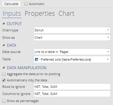
The example below takes the same Preferred Cola summary table above, but links it to a Donut visualization.
Over in the Object Inspector,the htmlwidget was linked to the Preferred Cola table as using these settings:
Here’s another example of a visualization created from linking to a table of Google Trends data for the term “Microsoft”. The visualization has an interactive slider, which you can move in the embed below:
You can also alter the visualization by clicking on the various tabs and options in the Object Inspector (which is actually changing the underlying R code). If you wanted to, you could change the R code manually, by going to the Properties tab of the Object Inspector.
You are not limited to the selection of visualizations available in the Ribbon either. If you wanted to, you could create a blank R Output (by going to Ribbon: Insert > R Output) and then write your own code (again pushing Calculate to ensure the visualization is generated).
Plots
Plots are simpler visualizations that don’t contain the prettiness or the interactivity of those described above. They are created in two ways in Displayr:
- As a by-product of an R Output, or
- Via menus in the Displayr.
In the first instance, you can write some code in an R Output (Ribbon: Insert > R Output) using some R CODE. For example, we can create the R version of the bar plot as shown below (using a variable called Age in the data set). For reasons known only to the legends that wrote R, a barplot produces both a table and a plot (and so both are shown in the example). You can choose to view just one of them by selecting Object Inspector > Properties > OUTPUT > Show as and choosing Plot or Table.
Other packages are available for creating plots, include the popular ggplot2 package:
Traditional R plots are also available via menus in Displayr. These tend to be for standard diagnostic plots which relate to other analyses that you can run in Displayr. For example, if you click on a regression output from within Displayr (such as the one above), and select Ribbon: Insert > More > Regression > Diagnostic > Plot > Influence Index you get the plot shown below.
Which to use when
In the main, you don’t need to choose between type (because a particular visualization is only available as either a visualiation, plot or chart). However sometimes, such as creating a bar chart, you need to choose between using Insert > Chart or Insert > Visualization. As a general guide to your selection, you could follow the below:
- To create something (more) beautiful, use Insert > Visualization.
- Use Insert > Chart when:
- There is a need to show statistical tests on a chart.
- You are in a rush.
- You want to create a special chart type that is not available in Visualizations. In particular:
- Ranking plots
- Grid of bars plots
- Gauge plots
- Mosaic plots
- Word clouds
We are working on making of the above a bit more consistent, so please be patient!
For now, the table below summarizes the key differences:
|
Visualizations |
Charts | Plots | |
| VISUAL APPEAL: | The most pretty, interesting and dynamic | Medium pretty (standard charts) |
Less pretty (more diagnostic focus) |
| PROGRAMMING: | Made with R (htmlwidgets*) |
No R involved | Made with R |
| CREATED BY: | Insert > Visualization
(and configure in the Object Inspector)
Insert > R Object
|
Made by turning a table into a chart
Select a table, then either: or Insert > Chart |
Insert > R Object (and write your own) Switching the output setting for an R object (if available): Object Inspector > Properties > OUTPUT > Show as or Menu selection for specific advanced analysis (typically a diagnostic plot) |
| MODIFICATIONS: | Via settings in Object Inspector (and in the underlying R code if you want) | Via settings in Object Inspector (menus only, no R code) | Only within the code |
| INTERACTIVITY: | Usually interactive | Typically not interactive (some exceptions such as a the ranking plot and word cloud) |
Not interactive (they act like a static picture) |
| KEY BENEFITS: | Looks awesome with cool interactivity
Good for lots of data points Highly customisable |
Significance indicators (statistical testing)
Some special charts suited to market research/survey data (e.g. word cloud, ranking plot) |
Simplicity
Suited to diagnostics |
A note on Htmlwidgets
You also see htmlwidgets as outputs for many analyses. For example, for most advanced analyses display an htmlwidget as an output. The table below is an htmlwidget from a Regression analysis (Ribbon: Insert > Regression (Analysis)).
